SYSTEM INFO:
	Obsidian version: v1.9.1
	Installer version: v1.8.10
	Operating system: Darwin Kernel Version 23.2.0: Wed Nov 15 21:53:18 PST 2023; root:xnu-10002.61.3~2/RELEASE_ARM64_T6000 23.2.0
	Login status: logged in
	Language: en
	Catalyst license: insider
	Insider build toggle: on
	Live preview: on
	Base theme: adapt to system
	Community theme: none
	Snippets enabled: 0
	Restricted mode: on

RECOMMENDATIONS:
	none
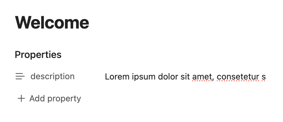
I also noticed this! I think this was introduced because of the new Bases-Feature in the insider-release- I still have an older Version of Obsidian on an Android-Tablet, where Text-Wrapping in Properties seems to be better, but still not ideal → there it shows multiple lines, before it cuts off
I totally agree with you and would propose the following UI-Solutions:
either show the complete text of a property by default in a note - that should not be a big issue, because the user can always choose to collapse the entire property-section if it becomes too much
or add an “expand-arrow” to the property-name that allows the user to expan the value-field of the property to show everything - but when not expanded the property only shows one line
or show only one line by default, but expand the value field to show everything when the user clicks into it to allow for easy reading/edits - see also: Bases: Expand property fields when clicked
I really hope that the Obsidian-Team finds a good UX-Solution to this soon, as for now the UX of working with longer property-values is not ideal
I actually like the behavior from v1.8 and hope it gets reverted / fixed back to this. It’s a good middle ground between showing all text (=> too much scrolling if you want to see the properties after it) and showing just a single line (=> hides content even if the property is just two lines of text).