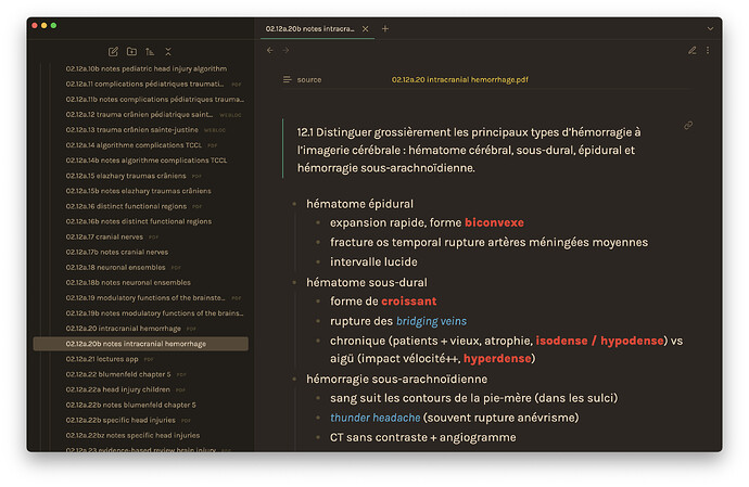
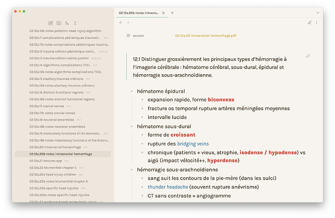
Thank you. Would not have guessed that it’d be this easy.
Sure ![]()
There was just an update to Primary, but I can’t see any changes on git or anywhere else. Does someone know if the theme is ready for Obsidian v1 ?
Not yet! I’m currently rebuilding the codebase so that it’ll be easier to contribute in so that when smaller updates come and I don’t have much time, Primary users can easily pitch in and contribute. I also have a few bugs due to some alignments so I’m still fixing those. I really apologize but I’m really juggling multiple things at once but it’s coming really soon!
Issok people always have personal work and problems and you don’t even have to update the theme to V1 if you don’t have time.
Hello - does someone know why I can’t find this on the obsidian app > themes to download from? Has it been removed?
NVM, found my answer a few posts above. Will wait for the update to enjoy such beautiful theme.
Looking forward for this lovely theme to release.
How is progress doing @Cecilia_May ? Any update to be expected soon?
Hey @Cecilia_May , is there any update? If the theme is dead, please say so so we can move on.
Thanks
How do you guys get this theme installed? I cannot find it in the Themes section…
It’s not in the Themes section because it hasn’t been updated since Obsidian overhauled its theme system. You’d need to go to the theme’s Github to download it and install it manually — but it probably won’t work well because it hasn’t been updated since Obsidian overhauled its theme system.
Thank you!
My favorite aspect of this theme are the different colors for italics, bold, & Linked text.
Are there other, more current, themes that similarly have different colors for different text styles? Preferably even a distinct color for text that is a mixture of the three styles.
@mikeknight That was my favourite aspect also. Turns out you can do that with any theme, even the default.
Just add a CSS snippet like this, and change the colour to anything you want:
body {
    --bold-color: #476af8;
    --italic-color: #ff0000;
    --link-color: #ffffcc;
    --link-external-color: #ffffcc;
}
You can choose your colours on a site like this: https://colorpicker.me/, use the “Hex code” value.
For anyone that uses the Minimal Theme but would like to use a color scheme similar to the Primary Theme, know that it is possible to do so using the Style Settings plugin. Here is my current setup, which includes both light and dark themes:
And here is the code. You can install it by using the “Import” option in Style Settings.
  {
  "minimal-style@@bg1@@dark": "#2C2621",
  "minimal-style@@bg2@@dark": "#221E1A",
  "minimal-style@@ui1@@dark": "#3C352A",
  "minimal-style@@ax1@@dark": "#DEB719",
  "minimal-style@@ax3@@dark": "#3E8D6B",
  "minimal-style@@ui2@@dark": "#695847",
  "minimal-style@@ui3@@dark": "#695847",
  "minimal-style@@ax2@@dark": "#F0D560",
  "minimal-style@@base@@dark": "#2C2621",
  "minimal-style@@bg3@@dark": "#564636",
  "minimal-style@@tx1@@dark": "#E6CFB3",
  "minimal-style@@tx2@@dark": "#AB916E",
  "minimal-style@@bold-color@@dark": "#E73729",
  "minimal-style@@bold-weight": 800,
  "minimal-style@@tx3@@dark": "#594D30",
  "minimal-style@@italic-color@@dark": "#48A1C6",
  "minimal-style@@link-unresolved-color@@dark": "#A69C8B",
  "minimal-style@@link-unresolved-decoration-color@@dark": "#A69C8B",
  "minimal-style@@trim-cols": true,
  "minimal-style@@link-external-color@@dark": "#A69C8B",
  "minimal-style@@link-external-color-hover@@dark": "#A69C8B",
  "minimal-style@@base@@light": "#F8F4EE",
  "minimal-style@@bg1@@light": "#F8F4EE",
  "minimal-style@@bg2@@light": "#EEE7DD",
  "minimal-style@@bg3@@light": "#E4DCD0",
  "minimal-style@@ui1@@light": "#E9E3DA",
  "minimal-style@@ui3@@light": "#E9E3DA",
  "minimal-style@@ui2@@light": "#D7CBB9",
  "minimal-style@@ax1@@light": "#D7A111",
  "minimal-style@@ax2@@light": "#EBB421",
  "minimal-style@@ax3@@light": "#72CEA6",
  "minimal-style@@tx1@@light": "#3F2E1C",
  "buttons-styles@@button-text@@light": "#FFFFFF",
  "minimal-style@@italic-color@@light": "#3382A4",
  "minimal-style@@bold-color@@light": "#DF483D",
  "minimal-style@@tx3@@light": "#CFC2AF",
  "minimal-style@@tx2@@light": "#83796D",
  "minimal-style@@tag-color@@light": "#3382A4",
  "minimal-style@@tag-color@@dark": "#48A1C6",
  "minimal-style@@link-unresolved-color@@light": "#C8B69D",
  "minimal-style@@link-unresolved-decoration-color@@light": "#C8B69D",
  "minimal-style@@callouts-style": "callouts-outlined",
}
Hello, thanks for this. I’ve been missing this colour scheme.
I tried pasting in your code, but unfortunately it didn’t work. I got an error message “Error importing style settings: SyntaxError: Expected double-quoted property name in JSON at position 1936”.
Not sure if that is due to some other setting or plugin I have.
Try removing the last comma, so:
"minimal-style@@callouts-style": "callouts-outlined"
}
JSON is picky.
Brilliant, thanks!

