Please restore the location of the Settings and Help buttons

We strongly recommend you to search the forum with possible keywords before making a new feature request. If your request is very similar to an existing one, consider liking it and/or making a comment rather than making a new one. Once you’ve searched and determined that this is a new request, delete this line.

Use case or problem

Proposed solution

Current workaround (optional)

Related feature requests (optional)

Please restore the location of the Settings and Help buttons

Hello! Version 1.6.2 has severely damaged the previous appearance style layout and the user’s habit of using it, it’s very bad, it’s a completely retrogressive design, please restore the UI style layout to the style layout of version 1.5.12.
image

14 Likes

We are sorry you don’t like it. Feel free to open a feature request for this.

1 Like

Do you mean “progressive”, because it changes something familiar into something new?

Personally I like the change, because I can get rid of the Ribbon. The left sidebar is always open on my desktop, because it is we’re all the navigation tools are.

6 Likes

You can probably put them back on the ribbon with the Commander plugin.

I disagree.

The new location is significantly more comfortable and adequate.

8 Likes

This is partially true since there is Open settings and Open help commands available but these icons will be located among other ribbon icons—how to restore settings and help to their original location?

I personally just stopped using the settings icon using Hider 1.4.0 with Hide vault name. Now I use mac’s menu bar Obsidian–>Settings to access settings. You can press and hold while navigating to menu items and then release to activate.

Hello Obsidian Community,
I am a long-time user of Obsidian and have been consistently impressed by the quality and functionality of the software. The developers have done a fantastic job in creating a versatile note-taking and knowledge management tool that has become an integral part of my workflow.

With the release of version 1.6.3, I noticed a change in the user interface that I believe could be reconsidered. The settings button, which was previously located in the bottom left corner, has now been moved to the folder bar. While I understand the desire to innovate and improve the user experience, I feel that this particular change may not align with the best practices of user interface design.

In UI design, it is generally recommended to group similar functionality together. The settings button, which is a control element for accessing and adjusting the application’s configuration, would be more logically placed in the toolbar area, alongside other similar control elements. This would maintain a consistent and intuitive user experience, allowing users to quickly and easily access the settings without having to navigate to a different part of the screen.

I appreciate the hard work and dedication of the Obsidian team and I am confident that your commitment to user feedback will lead to a continued improvement of the software. I hope that this feedback can be taken into consideration for future updates.

Thank you for creating such a fantastic tool and for being open to the community’s input.

6 Likes

I don’t care about the help button, but as a person who fiddle with settings a lot and prefers to keep sidebars closed I find the new change inconvenient. Now I have to make two clicks instead of one to reach settings, and it is bothersome.

6 Likes

Have you tried Commander obsidian://show-plugin?id=cmdr

I haven’t seen it mentioned yet, but Settings can be opened via Cmd/Ctrl + , (comma), the default hotkey for the Open settings command.

2 Likes

Personally prefer the new layout, although having always used CMD , to access settings in all macOS apps, I have never used the Settings icon in Obsidian. Like the new way to open user vaults and the sandbox vault.

I do, also, miss the Settings button, specifically in the ribbon :blush:

Trying to help others, debug things (with a plugin or another), etc… I often interact with Obsidian’s settings in a way or another.

I am only getting used now, as I type this post, after having access to Obsidian 1.6+ since its Insider release, to the new “workflow”:

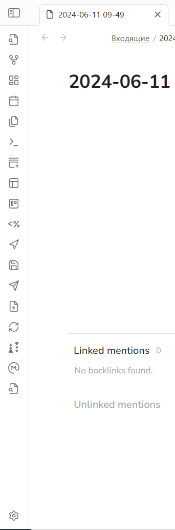
  1. click on the dedicated button to open the left sidebar (as, being on a MacBook Pro, I have a relatively small screen, so I don’t leave the sidebars open)
  2. click on the 
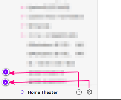
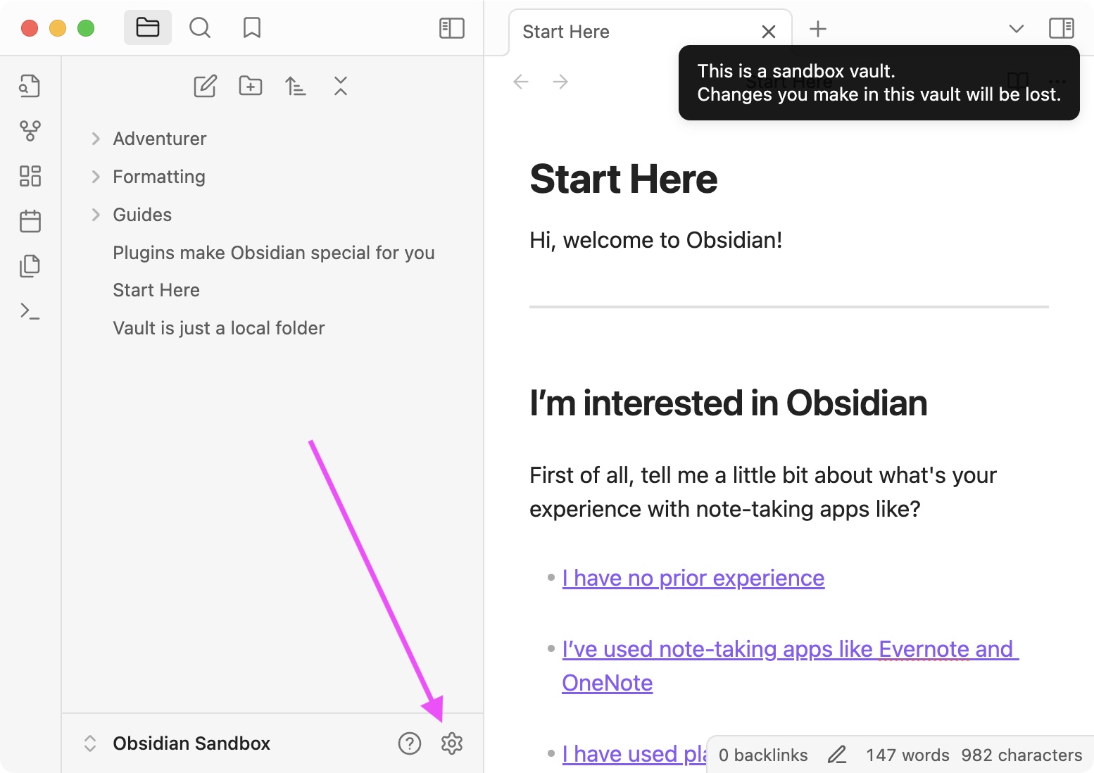
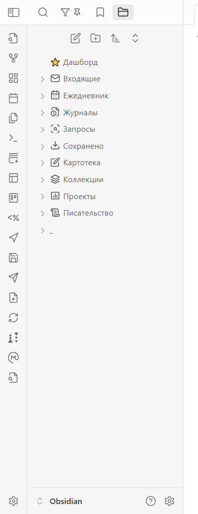
Settings button to open it

(2 clicks instead of one before… It’s a little bit annoying but I can live with that though :blush: )

For the past weeks, by reflex, each time I wanted to access the settings, I instinctively continued to direct my the pointer of my mouse to exactly where the settings button was only to realise then that it was moved…

I’m not here to advocate for restoring that set of buttons (vault switcher, settings, help) though, as I fully understand some prefer the ribbon as it is now :blush:

But I would personally find more interesting to have an optional native way to display these buttons back were they where, if one wishes (if possible) :innocent:

As by right clicking on the ribbon we can choose to display the ribbon or not and what appears in it, I think Settings, Vault switcher and Help could be options there too, with some dedicated space reserved for them at the bottom of the ribbon :blush:
That would be more flexible and anyone could set up, natively, how the ribbon looks like and what it can do.

This is just a thought, an idea and I absolutely don’t know if this is technically feasible on Obsidian’s side :blush:.

Another thought I have about the new vault switcher dropdown (and the settings and help buttons), is that it could be placed at the top of the file explorer so the general design would be more consistent with the mobile version of Obsidian :blush: … and that would also reduce the distance between the button to open/close the left sidebar and the settings button :innocent: .

Sorry for the length :see_no_evil: … and thanks for reading :smile: !

2 Likes

I understand that for those who are keyboard shortcut enthusiasts, the ability to hide the ribbon is a great feature. It allows for a cleaner workspace and quicker access to commands through shortcuts. However, I must say that as a user who primarily relies on mouse clicks for navigation and operation, the new UI has added an unnecessary layer of complexity to my workflow.

5 Likes

Hello. Why two clicks? Isn’t Settings still a single click away? Or do I have a different layout to the one you are using?

I mentioned that I keep the sidebar closed. My screen is not so big to keep it open all the time. Before the button was on ribbon, always availible. Now I have to first open sidebar and only then I can click on the settings button.

5 Likes

Thanks for the explanation … hadn’t noticed that the ‘ribbon’ at the bottom hides with the sidebar. :see_no_evil:

There are a few reasons for the change:

  1. The ribbon can now be turned off and in a future update will be set to off by default for new users. This is to reduce the cockpit effect that can be overwhelming to new users who aren’t familiar with all the un-labeled icons. We wanted the settings button to be accessible even when the ribbon is off.
  2. Provide a better experience for multi-vault users, so they can more easily see the current vault name, and group vault-level actions together. Previously vault name was visible in the file explorer, but now you can also see it if you switch sidebar tabs.
  3. Make the vault area more consistent with the mobile design.
  4. Give more space for customization of the ribbon to advanced users. See Settings → Appearance → Ribbon menu configuration

Aside from the button in the sidebar, you can also access Settings via:

  1. Command palette
  2. Hotkeys
  3. System menu (its location depends on your OS)

You can also use the Commander plugin to and add the Settings icon back to the ribbon, and you can hide the vault switcher using a snippet or Hider plugin.

10 Likes

I know the feeling because I only use obsidian on my laptop, so it is truly uncomfortable for a user who primarily relies on mouse clicks just like this :crazy_face: :crazy_face: :crazy_face: :crazy_face: :crazy_face:

2 Likes

Btw I actually love the new vault switcher, but the lack of the setting button on ribbon still bothers me. For me the ribbon is the main tool for using Obsidian. I also prefer the settings button to be on the bottom, separately of the rest.

So I made the solution using the Commander plugin and some css:

  • Install Commander ant add “Open settings” command to the ribbon.

  • Add this css-snippet:

.workspace-ribbon {
    padding-bottom: 8px;
}

.side-dock-actions {
    height: 100%;
    justify-content: flex-start;
}

.side-dock-settings {
    display: none;
}
    
div[aria-label = "Open settings"] { 
    order: 999; 
    margin-top: auto !important;
}
  • If you are using other language then English, replace “Open settings” in the snippet to whatever the command is called in your language.

The result:

3 Likes

The original UI was well-designed and clear, which made it very easy to use. However, the current version complicates things unnecessarily by requiring the installation of two additional plugins and the writing of custom CSS to achieve the same functionality. I still hope the design team can consider the habits of different users and revert to the previous UI. :rofl: :rofl: :rofl: :rofl:

4 Likes