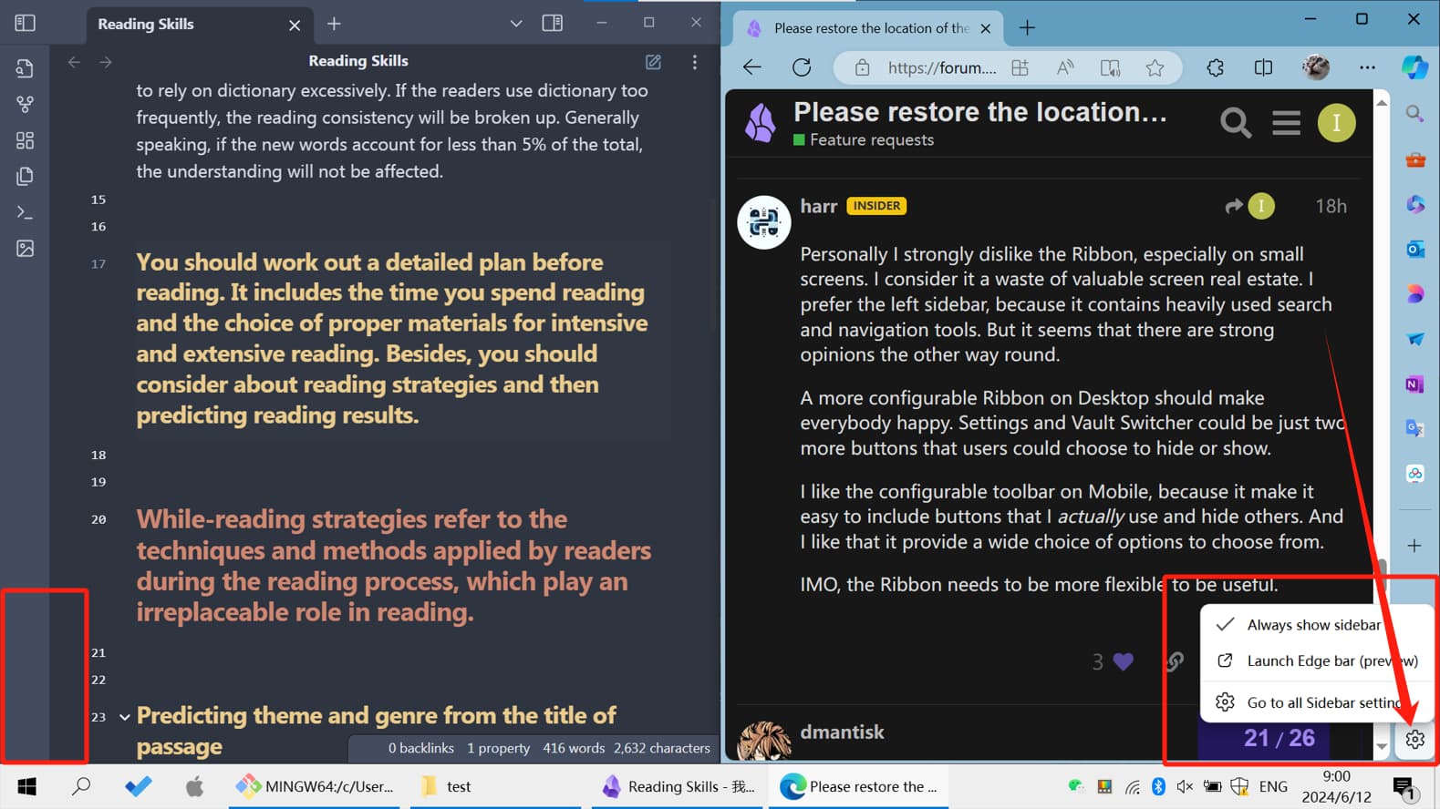
Personally I strongly dislike the Ribbon, especially on small screens. I consider it a waste of valuable screen real estate. I prefer the left sidebar, because it contains heavily used search and navigation tools. But it seems that there are strong opinions the other way round.
A more configurable Ribbon on Desktop should make everybody happy. Settings and Vault Switcher could be just two more buttons that users could choose to hide or show.
I like the configurable toolbar on Mobile, because it make it easy to include buttons that I actually use and hide others. And I like that it provide a wide choice of options to choose from.
IMO, the Ribbon needs to be more flexible to be useful.
The Ribbon has been a central design element of Obsidian for a long time. Removing a frequently used function from the Ribbon needs a good justifcation.
Personally I loathe the Ribbon in Obsidian and the icon bar in Edge. They eat up screen space. They look ugly. They show an arbitrary list of icons that doesn’t make much sense to me. I can’t remember what icon does what, so I always have to hover with the mouse to find what I’m looking for. Ctrl+P is so much faster. I find Obsidian much nicer without the Ribbon.
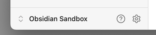
Personally I love having the name of the current vault always visible in the navigation sidebar, because it provides context for all those navigation tools: navigate files and folders in this vault, search in this vault, bookmarks in this vault, …), tags in this vault, properties in this vault. Personally I lalso ove having Settings close to the vaults name, because they this vault’s settings.
But none of my personal preferences are in conflict with also having Setting, Help and Vault Switcher in the Ribbon. I wouldn’t mind if they are redundant, because this functionality is so elemental.
TLDR: I vote for having Settings, Help and Vault Switcher by default in both locations, the left Sidebar and the Ribbon.
Ah, I think you mean you want them all the way at the bottom of the ribbon, and not just at the bottom of the icons that reside there. There’s a Ribbon Divider plugin, but afaik none that add blank spacers you could use to push those two icons to the bottom.
I found this thread searching for a way to re-enable the vault switcher icon in the ribbon. The suggestion to install Commander really doesn’t work for me. I have a number of vaults, so I would have to go to every one of them, enable the community plugin, and then add the icon back to the ribbon.
It seems that a simple solution would be to add the Vault Switch, Settings and Help icons back to the icons available be shown or hidden in the Ribbon menu configuration. Even if they are hidden by default, that would be fine.
I very much appreciate the efforts of everyone involved in creating Obsidian. It’s a very valuable tool for me that I use every day. I understand wanting to make the UI more new user friendly, and more pleasant on smaller screens. Making the UI more inconvenient for users like myself who primarily use the mouse to navigate, and have plenty of screen real estate is puzzling. I hope the developers will consider re-adding the possibility to display settings, vaults and help on the ribbon as a setting.
I may be the odd man out here, but I use the right-hand side bar. Any reason that there couldn’t be a configuration setting that would give the option of placing the value switcher, help and settings icons into the right-hand side bar?
I agree with the user of this post, it would be nice to at least have the option. I tend to keep the sidebar closed and just use the shortcut to open pages directly, and it is an extra hurdle to access settings when this is the case.
I’m really grateful of the work of @reaty who made the Commander+CSS solution to restore the original location of the settings button. It’s not a coincidence that Obsidian gives us such customisation capabilities. They have worked really hard to establish the current plugin and CSS framework.
OK, following the discussion, it appears that opinions are quite diverse. Someone prefer mouse-click operations, while others are fans of keyboard shortcuts. Some are inclined towards using multiple libraries, and others prefer organizing with multiple folders.
So in the next version maybe we can make the settings, help, and vaults switcher buttons movable, just like the folder, search, and bookmark buttons. This would allow those who prefer using the Ribbon to place these buttons there, and those who favor having them on the sidebar to position them accordingly.
Just like this:
(Disclaimer: this comment may appear emotional in some parts. Don’t take it personally. Any user experience feedback should be allowed to convey perceived emotions because that’s what a user experience interacting with an app and what motivates him to provide the feedback.)
I keep left sidebar collapsed by default because I only have 1920x1080 of screen real estate and I use two columns of content.
I use the expand button when I need to access Files or Search - it is easy, all buttons are located in the same corner.
Now, in order to access Settings button, I have to reach the top left corner, then bottom left corner.
I’m offended with such UX degradation.
Gear icon in the bottom left corner is pretty much standard in modern Windows applications following Fluent UI and in apps that use similar navigation control on the left.
When said control can be collapsed/expanded - it is common to show more details in expanded state and leave the icon button in collapsed state.
I think Obsidian team dropped the ball with this change.
I’m not satisfied with the official explanation.
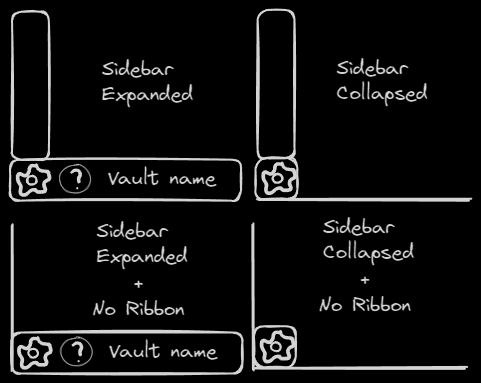
Like with other existing UI examples, the gear icon can be a part of both the ribbon and sidebar depending on collapsed/expanded state;
Vault name - same - show vault name when expanded, show vault switch button when collapsed. But I see why 1 and 2 might be difficult - even though it looks like some common pattern, Obsidian implementation was not thought out in the same way. You’d need a larger rework to make it happen;
Mobile and desktop apps still have controls in different places. Mobile UI is inferior when I need to find how to open the darn settings so it shouldn’t be the reference - it also needs improvement;
“Ribbon menu configuration” is currently insufficient. As an advanced user, I take the suggestion above with Commander extension and custom CSS to move the button to the bottom left corner. But I would’ve preferred “Ribbon menu configuration” was not pointed at, before it can allow to return the Settings button without any 3rd party extension and custom CSS. You can do it - allow to add commands, add third list - top, bottom and disabled. But, other things considered, maybe you can solve this differently with a special area at the bottom, shared across the ribbon and sidebar.
Regarding other existing ways to access Settings:
Command palette and hotkeys require certain level of prior knowledge. You can’t assume it for something as important as access to Settings;
This has been the only issue I’ve had with the newer version of the update. I appreciate giving us the ability to switch between different vaults now with a much easier layout. However, the settings being out into the sidebar is a hassle when paired with themes that auto-hides the ribbon. I need the settings button to be on the ribbon again.
There is, but I don’t want that because I don’t want to have a plug-in for something as simple as this. IDK, feels like too many moving parts for something simple.