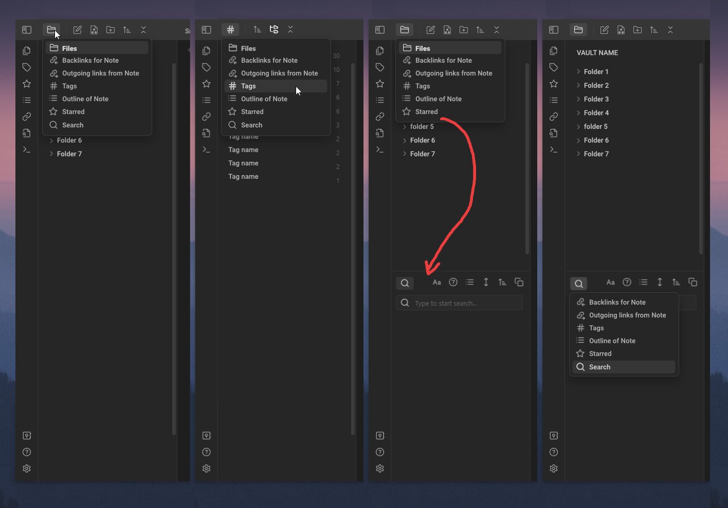
I would like to suggest changing the way icons are displayed on panels in two rows. Where the first row is the panel icons and the second row is the tool icons for these panels.
This option is not so much a problem as a visual imbalance, and then not for everyone. But you will probably be interested in the display option that I offer and it will also seem more convenient to you
I suggest removing a number of panel icons in the menu. And the icon will only display the current panel. The rest of the icons in the row will be tool icons for this panel.
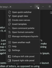
Clicking on the panel icon displays a menu with available panels.
Clicking on another panel in the menu :
1- Opens another panel in the current window.
2- Changes the display of the icon of the opening menu to the icon of the new panel.
3- changes all tool icons to those that correspond to the new window
Dragging the panel to a new window is also saved. To do this, open the Panel Menu and drag the panel from the list and place it in the right place
In the new window, the panel will also have a menu of panels in a row with tool icons, in addition to saving space, this will allow you to quickly change the type of a new panel from the menu and not drag another window to the second place.
I haven’t seen anything like this in the mobile app and specifically checked again.
The difference between what is now and what I propose is the same difference as clicking on a button or an item in the menu.
You’re right that two clicks is more than 1, but how often do you need it? the majority should already decide here. But as far as I can see, my ideas are not particularly interesting to the public. apparently my lot is custom side .
The dragging stuff isn’t in mobile, but the stuff that adds an extra click is. It’s presented a little differently — instead of a drop-down menu, the list takes over the whole sidebar.
It varies, but the mobile implementation irritated me every time I used it. It’s less bad now that I have a snippet to speed the animation.
Most of my FRs haven’t gotten much attention, either. The life of a feature requester is a hard one.
the mobile implementation of obsidian is not the best solution from the point of view of UX , but what I 'm talking about can easily be viewed in any program , for example in a browser . you can click on the link or open the folder and click on the link if there are 5-6 links in the folder it will be very easy
I came up with a solution to not press twice to switch. You can use a plugin for Ap Ribbon for example Customizable Sidebar and display icons there for single click movement
hi everybody. I have made significant progress and done all this in css, the only thing I can 't do is display the icon of the active panel in the row instead of the one that is first in the list. For this, I need the help of those who can do this in javascript .
It is necessary to make any active element become the first in the column after its selection.
Now the drop-down menu is working and you can drag icons directly from to any area as usual. But there are a few problems:
It is necessary that the icon of the active element is always the first in the column, then it will be displayed on the panel. I haven’t found a way to do this in pure css.
from hiding .workspace-tab-header-container in the topbar, dragging the program window using empty spaces between icons has broken.
in the original idea, it was so that in each window there would be a menu with all the icons and you could select any panel and it would open in this window and you wouldn’t need to drag it from another window, it would move automatically. You will need to drag the panels only when there is no panel in this place yet otherwise use a simple switching menu. This cannot be done in css. Need help type script
Just wanted to give feedback on this issue. Hiding the tab bar will be more aesthetically pleasing, and moving forward or backward can load the status bar
