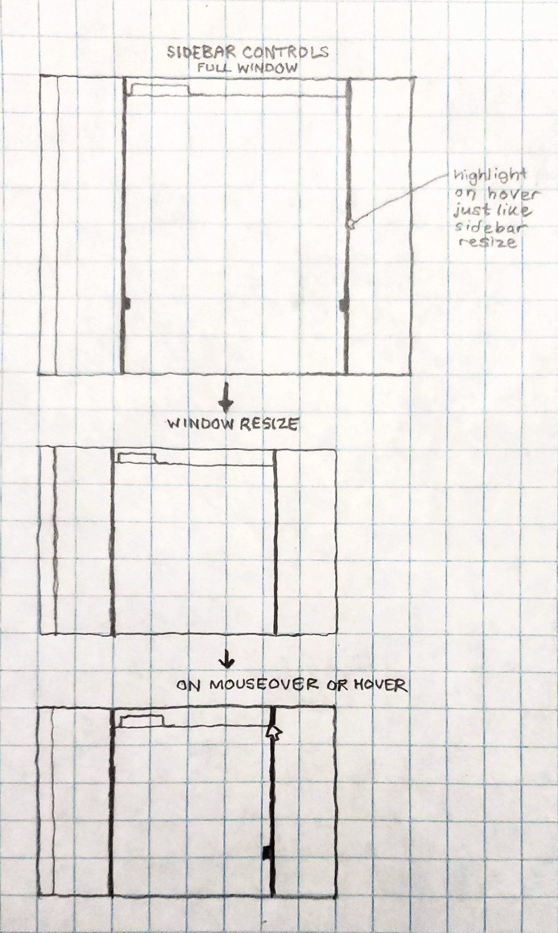
Problem
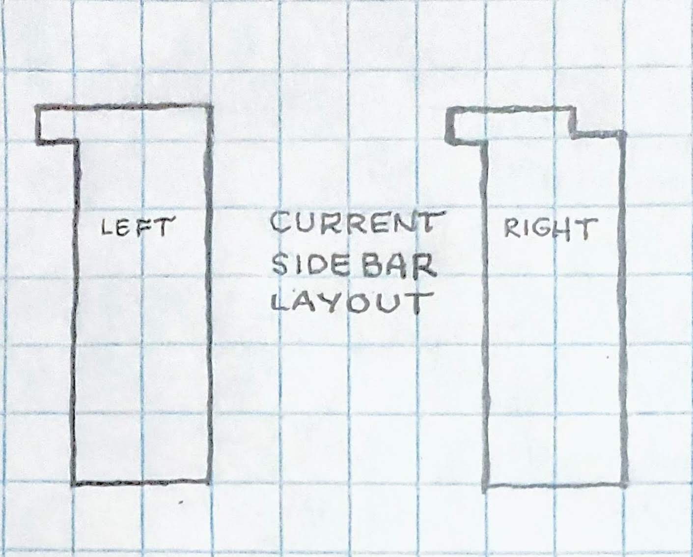
This is the current sidebar layout:
- The sidebar toggle controls are disconnected from the intuitive rectangle space of the sidebar.
- The sidebar icon itself does not give any indication of movement.
- On the right sidebar, the icon is visually cut off by a separator. Many plugins using the right sidebar must include a disclaimer about where to find their interface - users don’t know the right sidebar exists.
Solution
Move the sidebar toggle control and change the icon:
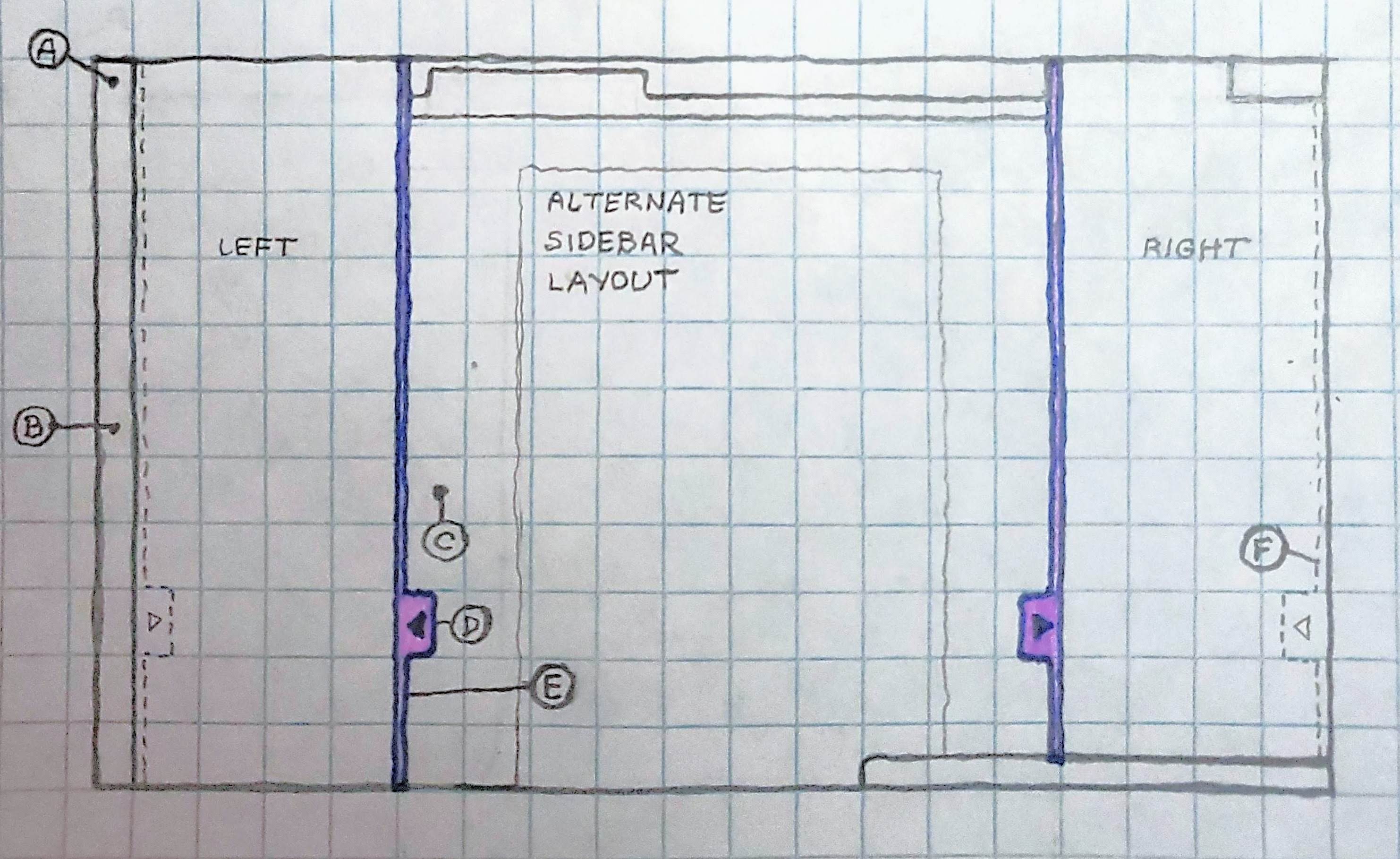
A - The sidebar toggle control is no longer hidden among tools.
B - The ribbon is now a distinct entity from the sidebar.
C - The sidebar toggle control makes use of whitespace in the editor.
D - The arrow icon indicates movement.
E - A thin vertical line shows the area of movement.
F - The icon and thin line remain visible when the sidebar is collapsed, indicating the presence of the sidebar.