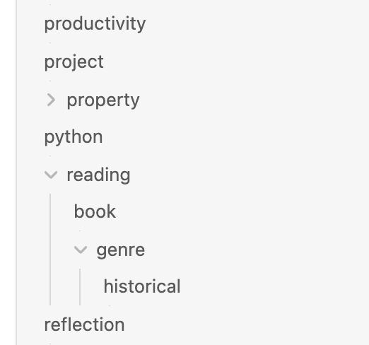
When a user has a mix of tags and nested tags, it creates a confusing visual hierarchy due to the collapse/expand icon displaying to the left of the nested tag parents. When scanning down the list of tags, it is easy to mistake a nested tag parent for a child of the tag above it.
See screenshot below demonstrating how ‘property’ looks like a child tag of ‘project’ and ‘reading’ looks like a child tag of ‘python’ due to the indentation as a result of the collapse/expand icon.
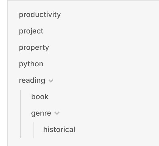
Proposed solution
Move the expand/collapse icon to the right hand side of the tag name. See mockup below demonstrating cleaner visual hierarchy.
Tho I don’t think anyone’s mentioned it in the context of the tags list yet.
Rather than moving the collapse/expand icon to the right, I guess the eventual fix will be to outdent it (same as it is in the body of a note when folding is enabled).