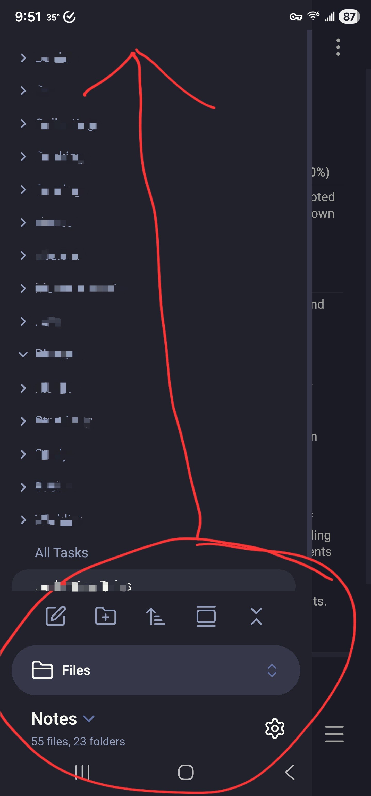
The iOS UI overhaul moves the left sidebar top menu items to the bottom of the screen which creates a reachability nightmare since you have to reach over them to get to all the stuff you want to interact with.
Give us the option to revert this change.
Also, why is this forum so overcomplicated??? There are little windows popping up so I can’t even see what I’m writing and this auto-complete as well. Turn that off!
First of all, I see some of what you are saying about the forum. There have been some UI changes that are making things weird and difficult to do on mobile. This forum runs on “Discourse” software, and every version update has slight changes. I’ll mention it to the devs.
Second, I’ll remind you again to please try to keep it more civil on this forum. People won’t be able to help you if your posts get flagged and removed.
I just wanted to agree with the OP’s point here - can the devs either revert this change please or give us the option to choose whether we have menu in top left or bottom left. I understand that this change was made for ergonomic reasons - but it makes the UI look cluttered and horrible. Was fine as it was.