Overview
What is this snippet all about?
Modular CSS Layout (MCL) is a CSS snippets collection that are meant to provide a useful layout options as a complement to the default theme or your chosen community theme. It uses Obsidian’s default CSS classes and HTML structure to achieve the intended layout (I don’t intend to do any color-theme changes)
Do log issues in MCL github repo (link below) if you encounter any compatibility issues with your theme.
How to get started?
Since this is actually just a CSS snippets collection, it isn’t an installation per se, but rather download and enable in Obsidian. As I might update this snippets from time to time, the best way is to use Mara Li’s Snippet Downloader. Anyhow, you can read through documentation on how to do so (link below)
Download the snippets here
Documentation/How to here
Features / Modules
Wide Views
CSS snippet:
MCL Wide Views.css
This snippet provides you the following features:
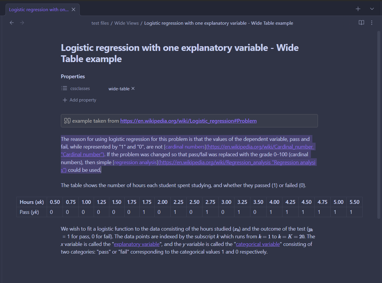
- Full width page or blocks (dataview, table and backlinks) per page/note basis by specifying custom
cssClassat the frontmatter (YAML)wide-pagewide-dataview– require Contextual Typography pluginwide-table– require Contextual Typography pluginwide-backlinks
- Narrow width page per page/note basis for vault with RLL disabled by specifying custom
cssClassat the frontmatter (YAML)narrow-page
- Adjustable RLL (custom css class toggle) applicable to entire vault
- Disabled by default. Enable it via Style Settings plugin
For wide-dataview and wide-table, you will need to install Contextual Typography plugin.
Example & Screenshot
---
cssClass: wide-page
---

<the rest of your note>
screenshot for wide-page and wide-table

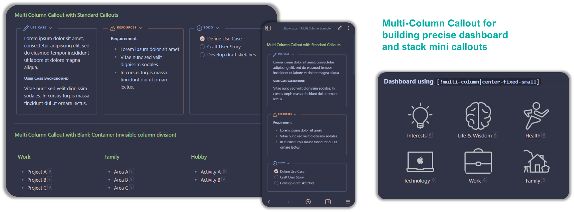
Multi Column
CSS snippet:
MCL Multi Column.css
This snippet provides you the following features:
- Multi column layout using Callout using the following custom data-callout
> [!multi-column]> [!blank-container]
- Allow you to control the width of the sub-callout using custom callout-metadata
> [!<anycallout>|<wide-3|wide-2>]for flexibly increase relative width, and> [!<anycallout>|min-0]to remove mininum width for multi-column sub-callout (default: 200px)
- Multi column layout using (Unordered) List
- Via custom
cssClassat the frontmatter. But note that this will apply to all list in that notetwo-column-listthree-column-listtwo-column-grid-listthree-column-grid-list
- Using Markdown Attributes plugin but able to apply at block level (inside your note)
multi-column-list-block– require Markdown Attributes plugin
- Via custom
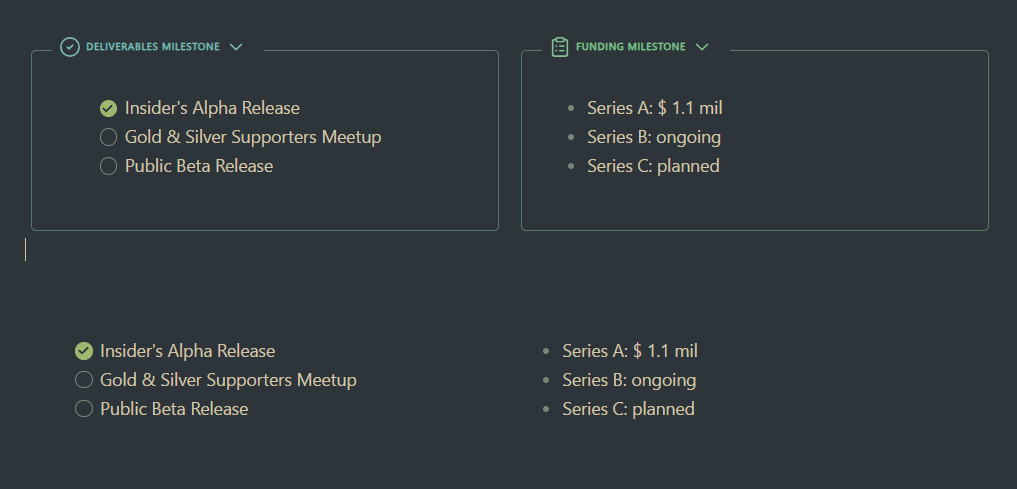
- Side / Floating Column using Callout
> [!<anycallout>|<left|right>-<small|medium|large>]> [!blank-container||<left|right>-<small|medium|large>]
<anycallout>refers to any of the standard (or even your own custom) callout e.g. note, tldr, quote
Example and Screenshot
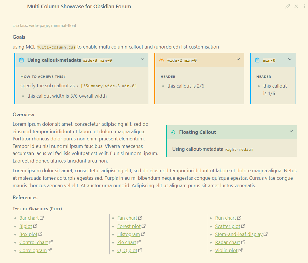
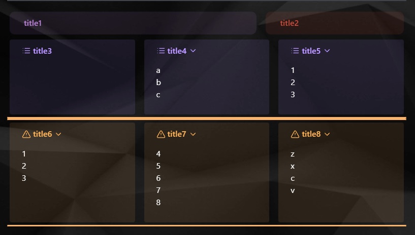
for multi-column callout
> [!multi-column]
>
>> [!Summary|wide-3 min-0]+ Using callout-metadata `wide-3 min-0`
>> #### How to achieve this?
>> specify the sub callout as `> [!Summary|wide-3 min-0]`
>> - this callout width is 3/6 overall width
>
>> [!warning|wide-2 min-0]+  `wide-2 min-0`
>> #### header
>> - this callout is 2/6
>
>> [!summary|min-0]+ `min-0`
>> #### header
>> - this callout is 1/6
note that when you insert callout within callout, the line separating the callouts should only use single angle bracket (“>”)
for multi-column list
#### Type of Graphics (Plot)
- [Bar chart](https://en.wikipedia.org/wiki/Bar_chart "Bar chart")
- [Biplot](https://en.wikipedia.org/wiki/Biplot "Biplot")
- [Box plot](https://en.wikipedia.org/wiki/Box_plot "Box plot")
- [Control chart](https://en.wikipedia.org/wiki/Control_chart "Control chart")
- [Correlogram](https://en.wikipedia.org/wiki/Correlogram "Correlogram")
- [Fan chart](https://en.wikipedia.org/wiki/Fan_chart_(statistics) "Fan chart (statistics)")
- [Forest plot](https://en.wikipedia.org/wiki/Forest_plot "Forest plot")
- [Histogram](https://en.wikipedia.org/wiki/Histogram "Histogram")
- [Pie chart](https://en.wikipedia.org/wiki/Pie_chart "Pie chart")
- [Q–Q plot](https://en.wikipedia.org/wiki/Q%E2%80%93Q_plot "Q–Q plot")
- [Run chart](https://en.wikipedia.org/wiki/Run_chart "Run chart")
- [Scatter plot](https://en.wikipedia.org/wiki/Scatter_plot "Scatter plot")
- [Stem-and-leaf display](https://en.wikipedia.org/wiki/Stem-and-leaf_display "Stem-and-leaf display")
- [Radar chart](https://en.wikipedia.org/wiki/Radar_chart "Radar chart")
- [Violin plot](https://en.wikipedia.org/wiki/Violin_plot "Violin plot")
{ .multi-column-list-block }
screenshot
Gallery Cards
CSS snippet:
MCL Gallery Cards.css
This snippet provides you the following features:
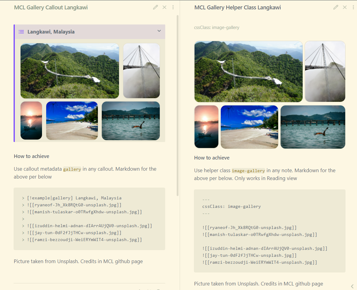
-
Image gallery using callout by specifying the callout-metadata
gallerye.g.> [!NOTE|gallery]- Transcluded/embedded images will be stacked side by side. Add empty lines in between the images to create new row
-
Image gallery using YAML/frontmatter .
cssClass: image-gallery- Specify the following frontmatter at the very top of your markdown notes
- Similar to using callout, transcluded/embedded images will be stacked side by side. Add empty lines in between the images to create new row
-
Dimension control for images in bullet list
- Enabled by default. To disable, go to Style Settings and under
Modular CSS Layout - Gallery Cards > Image and Gallery Settingsenable the “Disable Image Control in Lists”
- Enabled by default. To disable, go to Style Settings and under
-
Image Zoom
- Disabled by default. To enable this feature, go to Style Settings and under
Modular CSS Layout - Gallery Cards > Image and Gallery Settingsenable the “Enable Image Zoom via CSS in Lists”
- Disabled by default. To enable this feature, go to Style Settings and under
Example and Screenshot
Support Me
I do this on my free time for personal joy. However, a cup of coffee or two would motivate me further! If you like what I do, and want to contribute back, you can support me via Ko-fi
