Use case or problem
UPDATE: The button also appears in Note Composer’s merge confirmation dialog. I didn’t notice because I had turned those confirmations off at some point — probably by accident.
I want Obsidian to ask for confirmation, but every single time I delete or merge a file, it asks me if I’d like it to stop asking for confirmation. What I’d like it to stop asking me is if I’d like it to stop asking me. Do users change their minds about this setting so often to require this choice at every deletion? I doubt it.
Desktop Obsidian had a similar button which was changed years ago to the common convention of a checkbox instead of a button, per Delete and don't ask again should have checkbox to change setting. (Note Composer’s confirmation was also changed.)
Mobile Obsidian never received this change because the team was unable to find “UI examples, especially on iOS, of “Delete and Don’t Ask Again” (or similar actions) implemented with a checkbox on mobile” (Mobile: "Delete and don't ask again" is a button instead of a checkbox - #3 by WhiteNoise). They found this example of a confirmation dialog with a button:
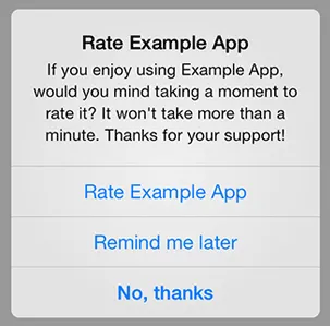
But this is a very different use case from file deletion or merging: it’s an unprompted dialogue asking a one-time favor of the user. Here, the button makes sense. In contrast, file deletion and merging are user requested actions that may happen many times, during which the user’s preference is unlikely to change, making the button a likely nuisance and a potential source of surprising behavior (if tapped by accident, which is easy to do).
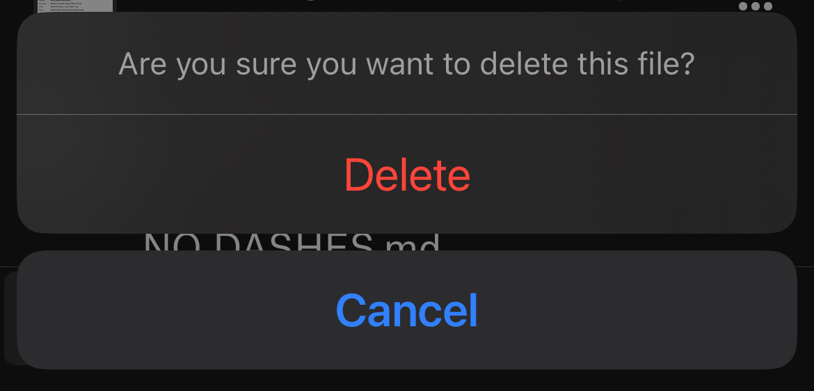
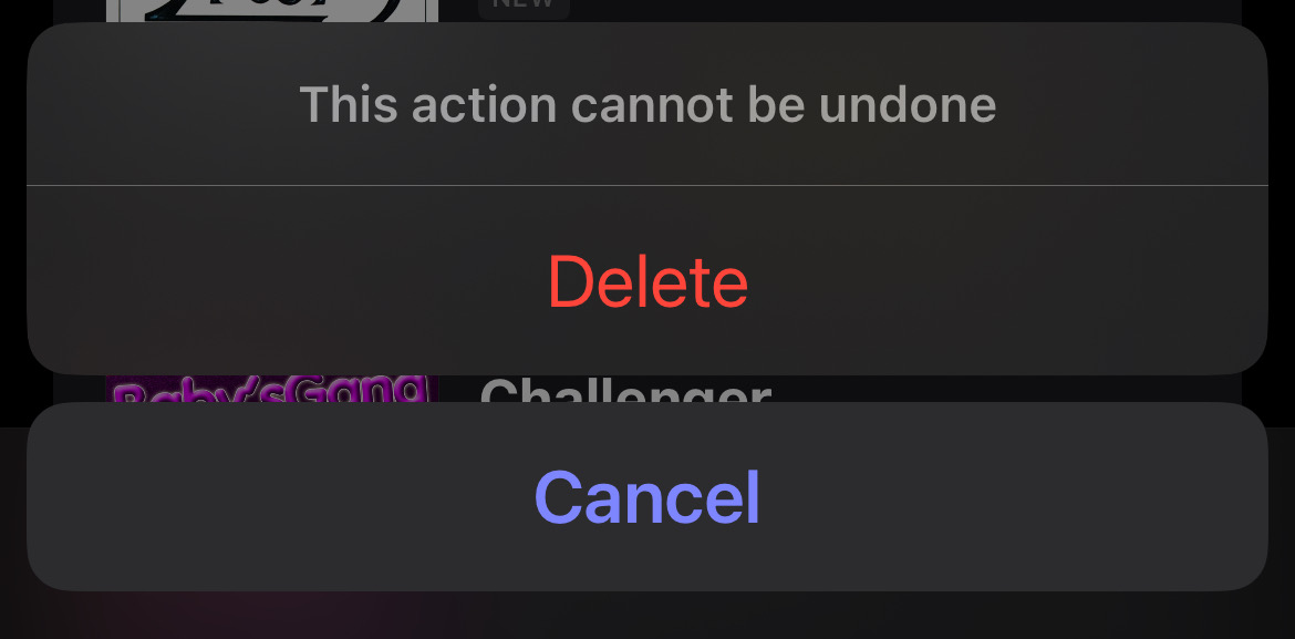
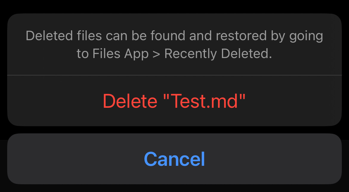
I reviewed the file deletion behavior of 13 iOS apps:
- Only 1 (Mail) allows the user to choose whether to confirm deletions, and the toggle for that exists only in Settings, not in the confirmation dialog.
- 6 always ask for confirmation; 6 never ask.
- About half of the askers and most of the non-askers were text editors.
- Of the askers, about half include an informative note in the dialog.
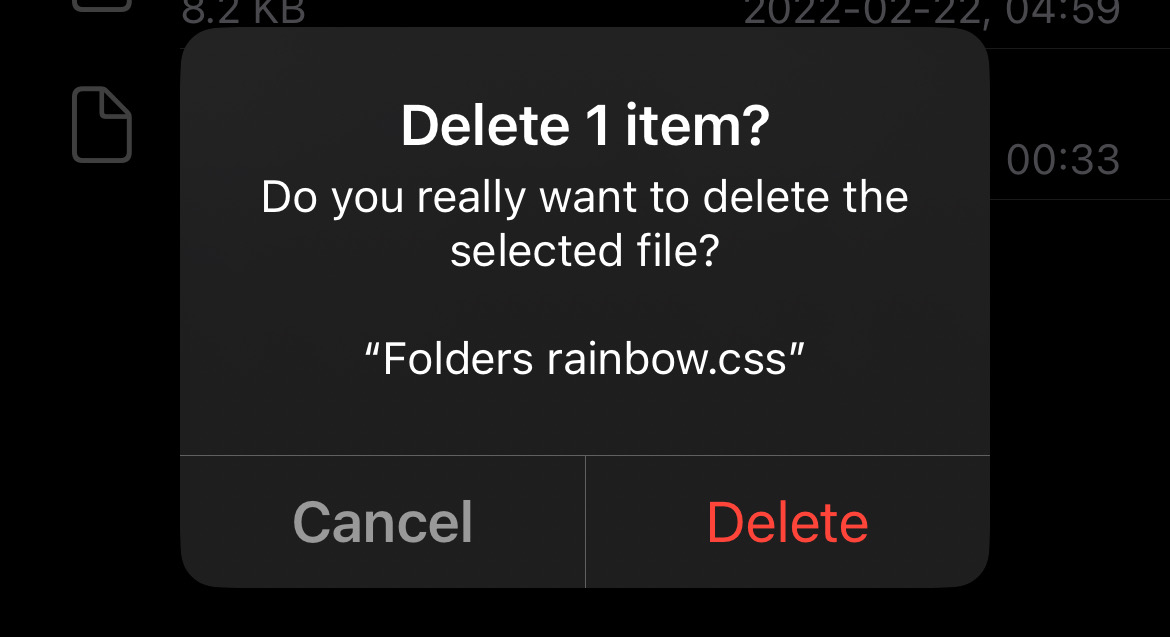
Dropbox:
Koder:

Mail:
[The option to confirm deletions worked inconsistently, and now seems to not work at all, so I was unable to get a screenshot.]
MusicBox (note: action can’t be undone):
Photos (note: where files go & how long they’re kept):

Taio (note: where files go):
Textastic:
These never ask to confirm:
- 1Writer
- Drafts
- Files
- IA Writer
- Notes
- Runestone
(Some of the never-confirms may have showed a message on first deletion; I don’t remember because I’ve had them all too long.)
Proposed solution
Remove the “Delete and don’t ask again” and buttons from the Delete and Merge confirmation dialogs.
Perhaps add text saying where the setting is (formatted less prominently like the hotkey hints at the bottom of Quick Switcher), but I think leaving it out is fine, and maybe better. The deletion dialog already has multiple lines of text.
This is most in line with the existing interfaces I reviewed while still allowing the user to choose whether to confirm deletions.
Current workaround (optional)
A CSS snippet.
Previously: Wearisome vigilance.
Related feature requests (optional)
(Already linked in main text.)
Updates
- 2025-09-14: Added mentions of Note Composer’s merge confirmation dialog, which has the button too.