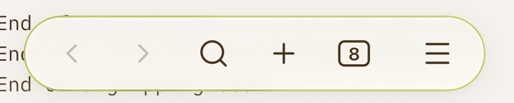
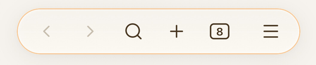
After trying a few different options over the past weeks, I’ve settled on this version for now. I wanted success and syncing to be fairly subtle; something glanceable but not really drawing my attention or taking up space. Paused and error more noticeable, of course, to make me look.
sync success:

syncing:

paused/error state:


/* mobile toolbar - colors/adds border to keyboard dismiss icon based on sync state --------------*/
.is-mobile .app-container:has(.sync-status-icon.mod-success) .mobile-toolbar-floating-options .mobile-toolbar-option {
   color: var(--text-success); }

.is-mobile .app-container:has(.sync-status-icon.mod-working) .mobile-toolbar-floating-options .mobile-toolbar-option {
   color: var(--color-orange); }

.is-mobile .app-container:has(.svg-icon.paused) .mobile-toolbar-floating-options {
   border: 2px dashed rgba(var(--color-red-rgb), 0.8); }

.is-mobile .app-container:has(.sync-status-icon.mod-error) .mobile-toolbar-floating-options {
   border: 2px dotted rgba(var(--color-red-rgb), 1); }

/* floating nav bar ------------------------------------------------------------*/
.is-phone .app-container:has(.mod-success) .mobile-navbar {
    border: 1.5px solid rgba(var(--color-green-rgb), 0.6); }

.is-phone .app-container:has(.mod-working) .mobile-navbar {
    border: 1.5px solid rgba(var(--color-orange-rgb), 0.6); }

.is-phone .app-container:has(.svg-icon.paused) .mobile-navbar {
    border: 2px solid rgba(var(--color-red-rgb), 0.8); }

.is-phone .app-container:has(.mod-error) .mobile-navbar {
    border: 2px dotted rgba(var(--color-red-rgb), 1); }
Thanks to everyone for putting the work in! A fun project to tinker around with.