[Mobile] Make Sync icon always visible

I’m thinking it would make sense to put the icon in the lower right, exactly where it is when the sidebar is open. EDIT: That might be a problem when the keyboard is open.

In the meantime, I’m using this:

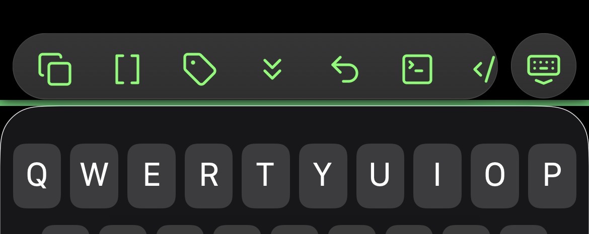
(When the keyboard is closed, the status stripe is at the bottom edge of the app.)

It’s a bit janky (and missing the error state) but it gets the job done.

/* Add color stripe to indicate Sync status when right sidebar is closed.

A stopgap for https://forum.obsidian.md/t/mobile-make-sync-icon-always-visible/31780 until we repair the status-icon–moving snippet that Obsidian v1.11's new mobile design broke.

Selectors courtesy of AForAnglerFishRights (@honeydewmelonbordercollie) https://discord.com/channels/686053708261228577/702656734631821413/1414345624983179304 and @Ariehen https://forum.obsidian.md/t/mobile-make-sync-icon-always-visible/31780/61?u=cawlinteffid
*/

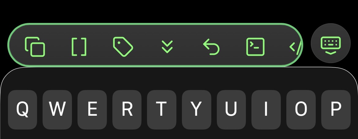
.app-container:has(.plugin-sync[aria-label="Fully synced"]) {
  border-bottom: 4px solid var(--color-green);
}
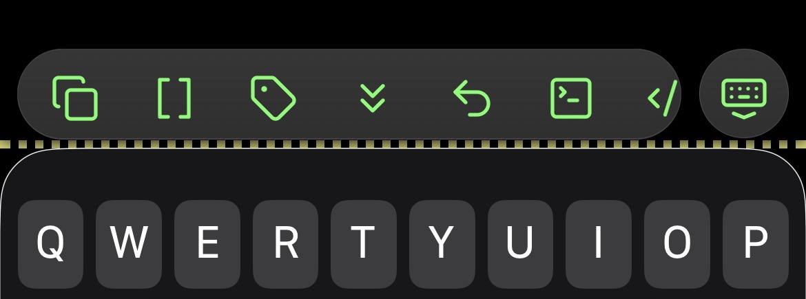
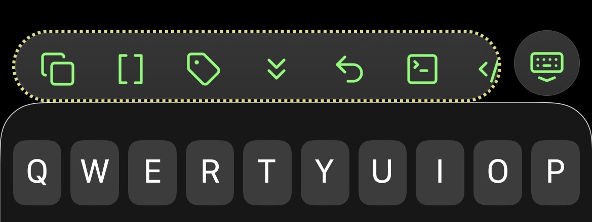
.app-container:has(.mod-working) {
  border-bottom: 4px dotted var(--color-yellow);
}
.app-container:has(.plugin-sync[aria-label="Paused"]) {
  border-bottom: 4px dashed var(--color-orange);
}

/*
TODO: Get selector for the error state.
*/

Ooh, a better way might be to use Ariehen’s way paired with the same thing applied to the mobile toolbar (and its keyboard dismissal button). But the navbar doesn’t appear on tablets, so they would need something when the keyboard is closed. Or maybe not, since if the keyboard is closed you’re probably not changing the file.

1 Like

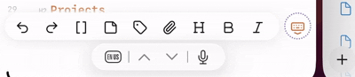
I happened across the selector for the main part of the toolbar, so here’s a version using its border (I don’t have the one for the keyboard button yet), plus side borders for “paused”. EDIT: The selector for the keyboard dismissal button is .mobile-toolbar-floating-options. (It’s not incorporated into this snippet.)

/* Add mobile toolbar border to indicate Sync status.

Selector courtesy of AForAnglerFishRights / @honeydewmelonbordercollie https://discord.com/channels/686053708261228577/702656734631821413/1414345624983179304
*/

.app-container:has(.plugin-sync[aria-label="Fully synced"]) .mobile-toolbar-options-list-container {
  border: 2px solid var(--text-success);
}
.app-container:has(.mod-working) .mobile-toolbar-options-list-container {
  border: 2px dotted var(--text-accent);
}
.app-container:has(.plugin-sync[aria-label="Paused"]) .mobile-toolbar-options-list-container {
  border: 2px dashed var(--text-warning);
}

.app-container:has(.plugin-sync[aria-label="Paused"]) {
  border-left: 4px dashed var(--text-warning);
  border-right: 4px dashed var(--text-warning);
}

“Final” version of my workaround CSS snippet; details in its opening comment.

/* Add Sync status indicators to main view as a workaround for https://forum.obsidian.md/t/mobile-make-sync-icon-always-visible/31780.

Snippet URL: https://forum.obsidian.md/t/mobile-make-sync-icon-always-visible/31780/64?u=cawlinteffid

* Adds a status symbol in the lower right corner.
* When Sync is paused, adds borders to the sides of the app (to prevent forgetting to unpause).

To adjust the icon's position, change the padding-bottom and/or padding-right numbers. Padding-right appears in 2 places. The first (commented out by default) is for when the keyboard is closed, and the second is for when it's open.

Status symbols (in same colors as official Sync icon):
* Synced: ✓
* Working: ⇅
* Paused: ⏸︎
* Error: ⚠
*/

.is-mobile {
	
	/* Icon layout */
	
	.status-bar > .plugin-sync::before {
		font-size: var(--font-ui-large);
		font-weight: bold;
		margin-right: -2px;
	  /*padding-right: 2px;*/
	  padding-bottom: 44px;
	}
	
	.status-bar {
	    display: flex;
	    background-color: unset;
	    border: unset;
	  }
	
	.app-container:has(.mobile-toolbar) {
		.status-bar {
			bottom: var(--safe-area-inset-bottom);
			padding-right: 16px;
			padding-bottom: 16px;
	    }
	}
	
	.status-bar > .status-bar-item:not(.plugin-sync) {
	    display: none;
	}
	
	.status-bar > .plugin-sync {
	    display: inline-flex;
	}
	
	/* Statuses */
	
	.app-container:has(.sync-status-icon.mod-success) {
		/*.mobile-toolbar-floating-options {
	  border: 2px solid var(--text-success);
	    }*/
		  .status-bar > .plugin-sync::before {
		color: var(--text-success);
	    content: "✓";
	    }
	}
	
	.app-container:has(.sync-status-icon.mod-working) {
		/*.mobile-toolbar-floating-options {
	  border: 2px dotted var(--text-accent);
	    }*/
		.status-bar > .plugin-sync::before {
		color: var(--text-accent);
	    content: "⇅";
	    }
	
	}
	
	.app-container:has(.plugin-sync[aria-label="Paused"]) {
		/*.mobile-toolbar-floating-options {
			border: 2px dashed var(--text-warning);
	   }*/
		.status-bar > .plugin-sync::before {
		color: var(--text-warning);
	  content: "⏸︎";
	  }
	}
	
	.app-container:has(.sync-status-icon.mod-error) {
		/*.mobile-toolbar-floating-options {
		border: 2px double var(--text-error);
	    }*/
		.status-bar > .plugin-sync::before {
		color: var(--text-error);
	    content: "⚠";
	    }
	}

}

This snippet exists thanks to the combined and slightly modified work of:

4 Likes

should probably be “floating-options”?

and the last bracket seems to have no corresponding open bracket

1 Like

Oof, thanks! I think it’s .mobile-toolbar-floating-options, as commented a bit before that. And the stray bracket is the one after the border, not the last one. But that whole bottom block seems to be an accidental partial duplicate, so I can just delete it. Thanks again! EDIT: Updated to my current version, which removes the extra effect for paused state (belongs in its own snippet) and reorganizes the code a bit.

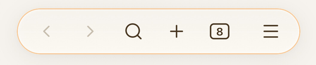
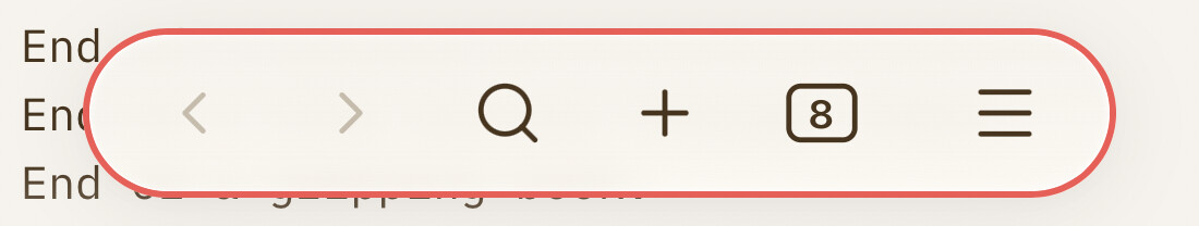
After trying a few different options over the past weeks, I’ve settled on this version for now. I wanted success and syncing to be fairly subtle; something glanceable but not really drawing my attention or taking up space. Paused and error more noticeable, of course, to make me look.

sync success:

syncing:

paused/error state:

/* mobile toolbar - colors/adds border to keyboard dismiss icon based on sync state --------------*/
.is-mobile .app-container:has(.sync-status-icon.mod-success) .mobile-toolbar-floating-options .mobile-toolbar-option {
   color: var(--text-success); }

.is-mobile .app-container:has(.sync-status-icon.mod-working) .mobile-toolbar-floating-options .mobile-toolbar-option {
   color: var(--color-orange); }

.is-mobile .app-container:has(.svg-icon.paused) .mobile-toolbar-floating-options {
   border: 2px dashed rgba(var(--color-red-rgb), 0.8); }

.is-mobile .app-container:has(.sync-status-icon.mod-error) .mobile-toolbar-floating-options {
   border: 2px dotted rgba(var(--color-red-rgb), 1); } 

/* floating nav bar ------------------------------------------------------------*/
.is-phone .app-container:has(.mod-success) .mobile-navbar {
    border: 1.5px solid rgba(var(--color-green-rgb), 0.6); }

.is-phone .app-container:has(.mod-working) .mobile-navbar {
    border: 1.5px solid rgba(var(--color-orange-rgb), 0.6); }

.is-phone .app-container:has(.svg-icon.paused) .mobile-navbar {
    border: 2px solid rgba(var(--color-red-rgb), 0.8); }

.is-phone .app-container:has(.mod-error) .mobile-navbar {
    border: 2px dotted rgba(var(--color-red-rgb), 1); }

Thanks to everyone for putting the work in! A fun project to tinker around with.

3 Likes

This is really fantastic! Thanks for the work on it. Is there any way for it to have a display of merge conflicts?

Unfortunately Sync doesn’t have a status for that. It mentions them in its activity log, and the log has a tab so you can see just those, but checking it all the time is a hassle, and the log is cleared when the app restarts.

What I’ve done for now is changed Sync’s settings so it creates conflict files instead of trying to automatically merge, and I’ve bookmarked a search for File:"conflicted copy". It still has to be checked manually (I guess on desktop you could keep it open), but it’s easier than checking the logs. I’ve also embedded the search on my home page (tho I don’t actually use my home page much).

2 Likes

Thanks for the tip. Somehow I’d overlooked that Sync can make conflict files rather than (poorly) merging. I’ve lost data a number of times to bad merges, so this is much better.

Now to figure out a way to generate an alert or UI change when conflict files exist. I’m sure a plugin could do it, but maybe there’s a simpler method before resorting to plugin authoring.

2 Likes

Thanks for clarifying this. I already set things to create conflict files and periodically searched manually for them. But I forgot about bookmarking searches! I’ll do that for now.

Just want to say THANK YOU for your work and contribution! This CSS snippet saves me a lot of headache (sync conflicts) every day. Kind greetings from Sweden :slight_smile:

2 Likes

The discussion here inspired me to start using my daily note (which is actually a weekly note) as a homepage with the conflict file search embedded in it, and have it open when the app starts. That should bring them to my attention relatively quickly (at least on mobile, where the app reloads often).

1 Like

Maybe Tasker could monitor for “conflicted copy” files and show an alert.

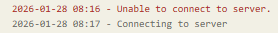
When replacing some home network gear, I remembered there’s another state: for the first time in a while or for when Obsidian is trying to connect to the sync server but can’t (usually when you have no connection): “Connecting to server”

Screenshot 2026-01-28 091204

Decided to have some fun, but will need to disable it for extended out of network/wi-fi situations. :grinning_face_with_smiling_eyes:

.is-mobile .app-container:has(.plugin-sync[aria-label="Connecting to server"]) .mobile-toolbar-floating-options {
   border: 2px dotted rgba(var(--color-purple-rgb), 1); 
   animation: border-pulse 1.5s ease-out infinite; } 

@keyframes border-pulse {
	0% { box-shadow: 0 0 0 0 rgba(var(--color-purple-rgb), 0.7); }
	70% { box-shadow: 0 0 0 10px rgba(var(--color-purple-rgb), 0); }
	100% { box-shadow: 0 0 0 0 rgba(var(--color-purple-rgb), 0); }
}

ScreenRecording_01-28-2026 08-45-27_1

update1: kinda fixed original version using an aria-label

3 Likes

Nice! I added ⇅? in error color for it.

…And removed it because it’s showing during normal sync activity. I guess I can mess with it later.

Doh! Yeah, my bad. Should have tested it with an actual internet connection. Probaby .mod-spin being the wrong thing to target. Will edit later. :man_facepalming:

This looks alright but does kick in for a second in the first session:

.is-mobile .app-container:has(.plugin-sync[aria-label="Connecting to server"]) .mobile-toolbar-floating-options { ... }

Forgot about the slight spin (.mod-spin) when it is actually syncing. Edited the above full snippet as well.

I’ll be interested if you find something! Despite the log message, visually Sync’s icon just looks like it’s syncing when it can’t connect (and my snippet does the same). It’d be nicer to have something distinct for that case. I have an error state and have seen it occasionally but don’t recall under what circumstances.

Just tried on my phone. This is genius.

1 Like