“Final” version of my workaround CSS snippet; details in its opening comment.

/* Add Sync status indicators to main view as a workaround for https://forum.obsidian.md/t/mobile-make-sync-icon-always-visible/31780.
Snippet URL: https://forum.obsidian.md/t/mobile-make-sync-icon-always-visible/31780/64?u=cawlinteffid
* Adds a status symbol in the lower right corner.
* When Sync is paused, adds borders to the sides of the app (to prevent forgetting to unpause).
To adjust the icon's position, change the padding-bottom and/or padding-right numbers. Padding-right appears in 2 places. The first (commented out by default) is for when the keyboard is closed, and the second is for when it's open.
Status symbols (in same colors as official Sync icon):
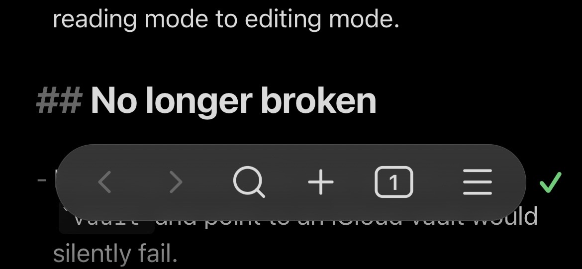
* Synced: ✓
* Working: ⇅
* Paused: ⏸︎
* Error: ⚠
*/
.is-mobile {
/* Icon layout */
.status-bar > .plugin-sync::before {
font-size: var(--font-ui-large);
font-weight: bold;
margin-right: -2px;
/*padding-right: 2px;*/
padding-bottom: 44px;
}
.status-bar {
display: flex;
background-color: unset;
border: unset;
}
.app-container:has(.mobile-toolbar) {
.status-bar {
bottom: var(--safe-area-inset-bottom);
padding-right: 16px;
padding-bottom: 16px;
}
}
.status-bar > .status-bar-item:not(.plugin-sync) {
display: none;
}
.status-bar > .plugin-sync {
display: inline-flex;
}
/* Statuses */
.app-container:has(.sync-status-icon.mod-success) {
/*.mobile-toolbar-floating-options {
border: 2px solid var(--text-success);
}*/
.status-bar > .plugin-sync::before {
color: var(--text-success);
content: "✓";
}
}
.app-container:has(.sync-status-icon.mod-working) {
/*.mobile-toolbar-floating-options {
border: 2px dotted var(--text-accent);
}*/
.status-bar > .plugin-sync::before {
color: var(--text-accent);
content: "⇅";
}
}
.app-container:has(.plugin-sync[aria-label="Paused"]) {
/*.mobile-toolbar-floating-options {
border: 2px dashed var(--text-warning);
}*/
.status-bar > .plugin-sync::before {
color: var(--text-warning);
content: "⏸︎";
}
}
.app-container:has(.sync-status-icon.mod-error) {
/*.mobile-toolbar-floating-options {
border: 2px double var(--text-error);
}*/
.status-bar > .plugin-sync::before {
color: var(--text-error);
content: "⚠";
}
}
}
This snippet exists thanks to the combined and slightly modified work of:
- AForAnglerFishRights / honeydewmelonbordercollie on Discord:
- purple penguin / mx_emoji on Discord: Discord (You can get recreations of the actual Sync icons here; I didn’t use them because I kept thinking I could tap them to open the Sync menu.)
- Ariehen on the forum: [Mobile] Make Sync icon always visible - #61 by ariehen