Feature Request: Faster access to search bar in the mobile app. Currently,it takes 1-2 taps around the screen to navigate to find the search button, and then you tap the search button.
Ideally, the search button should always be visible so you can tap and start searching.
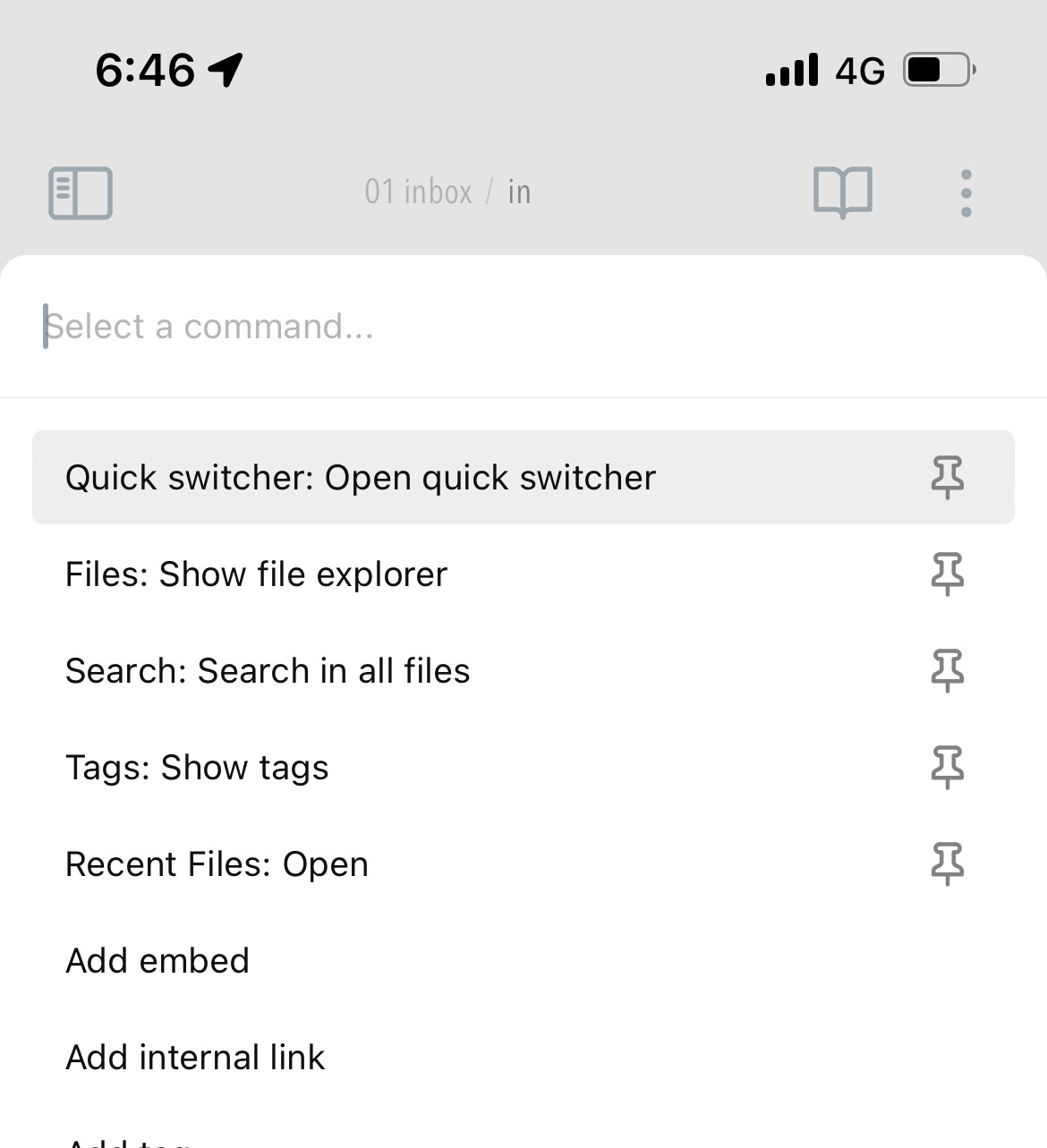
While waiting for improvement you may find the Commander plugin useful. (I haven’t tried it yet, but apparently it’s the successor to the Customizable Sidebar plugin that I’ve been using.)
In the mobile app, search is not an always available function. I have to swipe left, and potentially tap a button (if I was viewing recent files for example). It would be super helpful if search was accessible more easily. Also, search defaults to case-sensitive, which makes things hard to find.
Proposed solution
Maybe provide the option to add a search box to the main window. And default to case-insensitive search with an option for case-sensitive.
Swiping up would make sense to open search considering that swiping down opens the command pallette. Is there an official feature request for this? Do you know something?
The + sign only searches through filenames I wanted a vault search. I have to tap the hamburger and select from there the Search vault command (added with Commander plugin).
I was thinking that a built-in search-the-vault gesture would make sense, it’s a very basic thing everyone does. As is the Open command pallete, which already has a gesture.
Thanks for the suggestions, I’ll try the last for sure, I guess this can be done with Commander.
Ah, I see. Apologies Should have my coffee and carefully read the big title at the top before I post.
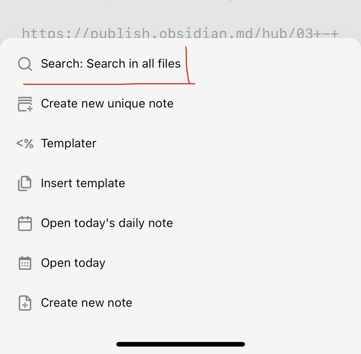
One thing I’ve done is pin my left sidebar items to the command palette. That gets to global search ("Search: search in all files) pretty quick. Swipe down, one tap.
I use search (& mobile) quite a lot as well. Not sure if this is helpful or not but what I have done is set my mobile quick actions to search
By doing so I have avoided the clicking issues you mentioned (drove me nuts too )
Now I just swipe down without clicking & I start my search. I have found this very fluid & productive
On the android app, every time I have to open the side tab, switch to search, find what I want, then press the side tab again in order to go back to my notes.
Solution: put a search icon next to the gear icon in the side tab.
Big, big +1. The current layout strikes for uniformity between desktop and mobile UIs, not for ease of access. But the app can achieve both if instead of the drop down menu at the top of the sidebars, there were tab icons (just like on desktop), as another request here suggests:
The + button is very useful because it let’s you jump from
one note to another but it doesn’t search the content of
notes, only titles.
Why not replace it with the search function? R
It’s inconvenient to search on mobile, you gotta open the
sidebar, change the menu from files to search and then yo
have to set it all back
Otherwise the search function could be put in place of thos
left and right arrows. Not once I’ve used those in the mobil
app.
Big +1 for this whole Thread and the last Suggestion
please just replace the main search-icon with a full search
The current solution is really counter-intuitive for me. It made me believe something went wrong with syncing to mobile until I understood the big search-icon in the middle of the main screen which is easy to click will not give me the full search but only search for note-titles.
finding the full search is kind of hard then and too far for daily use as mobile has no Hotkeys too..
Adding it as one Option on the New Tab-Page would be nice too
searching is such a common action for navigating through the vault