Could it be possible to place the the icons for Search, Files, Tags & Bookmarks in the sidebar to switch more quickly?
Obsidian for Android, Version 1.4.16 (114)
Could it be possible to place the the icons for Search, Files, Tags & Bookmarks in the sidebar to switch more quickly?
Obsidian for Android, Version 1.4.16 (114)
Or maybe offer swipe left/right actions to quickly switch view modes.
More specific version of same complaint (only referring to search): [Mobile] Faster access to search bar in mobile app
A workaround:
I have the exact same request for the iOS version.
I think the right margin in the case of the left sidebar (or the left margin in the case of the right sidebar) could also be used for icon placement.
Changed title and tag to “mobile” instead of “Android”.
+1 for this request and still hoping it comes through…it’s pretty counter-intuitive to have to click that double arrow icon to find the search button, and doing that also breaks the rhythm/workflow.
I think having 0 or 1 tap access to the search bar is a well accepted convention for any app with a search bar.
Yes, getting to search in one step (when you don’t have a keyboard shortcut) is critical
This is already possible by pressing + icon from the bottom.
They could easily improve mobile sidebar experience by offering bottom press and hold switching similar to how you can quickly switch languages when typing on iOS. In practice this could be implemented by switching current sidebar bottom quick actions to top OR introducing permanent bottom quick action which when pressed and hold could offer quick switching between files, search and bookmarks which themselves are each very powerful.
Wow, I never imagined a + would signify this! Makes sense, since it can also create. But not sure about the icon.
The + icon opens Quick Switcher, not Search (the difference being it only searches note names, not their contents).
I’d like to propose a usability change. I know such proposals can get to be religious in thinking, so I’ll present my rationale for the change.
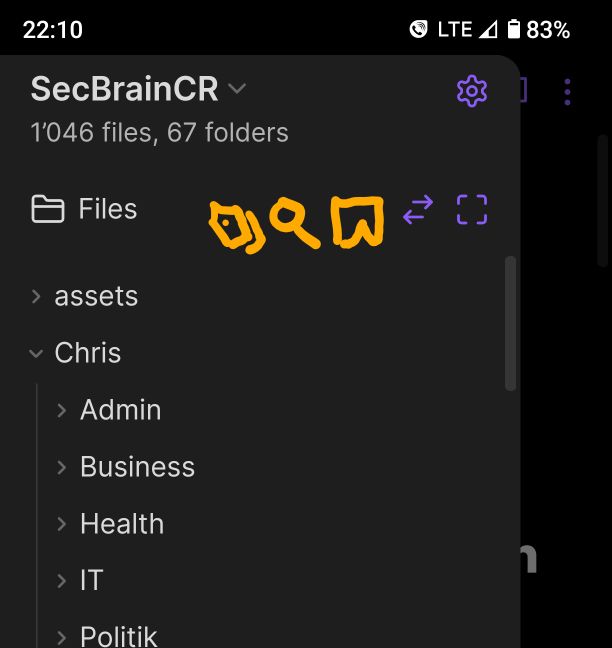
One of the most common set of actions you take while using Obsidian is to switch between “Files”,“Search”, “Tags”, “Bookmarks”, and “Recent Files” in the left sidebar. In fact, outside of the command keyboard shortcut, this is the primary tool I use to retrieve and load notes.
Unfortunately, on the mobile version of the app, these different options are hidden from access. Unlike on the desktop version where at least the icons for each of these options are alway visible, they are not visible by default. Even now, I still do a double take to figure out how to move from “Files” to “Search”, as I look for the magnifying class to switch modes. Multiply the double take 10’s of times day in and day out, and the UI takes on a less-than-smooth feel.
Even harder still, you have to reclick the “Files” icon in order to reveal the “Search” option - which I would argue is very non-intuitive. (I want to leave the “Files” mode and yet have to click on it to reveal where I want to go).
I do realize that screen real estate is at a premium, but given that moving between these modes are the (or amongst the) most critical and frequently used commands, I think that they warrant being included in the permanent set of options on the left sidebar in some location (preferably at/near the top to mirror the desktop version).
Provide icon buttons for Files, Search, Bookmarks, etc. modes on the top of the left sidebar in a way that they are permanently visible to allow for fast switching between modes. This is more important than report the number of files/folders - so I’d suggest including them at that location. Ideally, the buttons should be highlighted for when each mode is selected, giving a tab like feel (again, modeling the desktop version).
The work around is to just use the current ui method that is implemented, requiring you to ask yourself “where is that secret button hidden away?”. For new users, in particular, this is not obvious at all.
I could not find this feature request referenced elsewhere.
Fast switching between Files, Search, Tags, and Bookmarks would make a huge difference on mobile. Right now, it’s way too many taps to get between these views, which slows things down a lot. Adding visible icons for these in the sidebar would make navigation way faster and improve the flow.
To summarize:
(option 1)
Horizontal set of icons which already have a graphical design:
(option 2)
Offer swipe left/right actions on the icon to quickly switch between different views.
(option 3)
Offer long press + drag motion on the icon to quickly switch between different views.