Minimal Theme

I’m getting this effect with plain Minimal (selected through ‘Community Themes’), with no plugins or snippets.

@Jeffurry I am seeing the same thing. but only if I have file in the edit mode. If in preview mode it highlights the entire line/block. @argentum I have seen that type of result before, I don’t remember the condition that caused it.

Thanks for the beautiful theme! Minor issue: when I have an equation bracketed in $$ on a level 4 (say) title, which capitalises the letter automatically, I cannot enter a simple equation such as $x^2$

Thanks for your help I think I figured it out. If you download the latest version from community themes it should look better.

2 Likes

Well, this is weird, I made sure I had the latest version of minimal before posting, but it seems that I didn’t. After (re-) updating it does go to the highlight version and not the boxes.

Just in case someone bumps into this and wanted to know about the spaces: I had the Show Whitspace plugin activated and I’m using spaces instead of tabs (this is a core preference). None of it was related to my problem above, it seems I just had an outdated version.

Hi @kepano. First of all, thank you for this great theme.
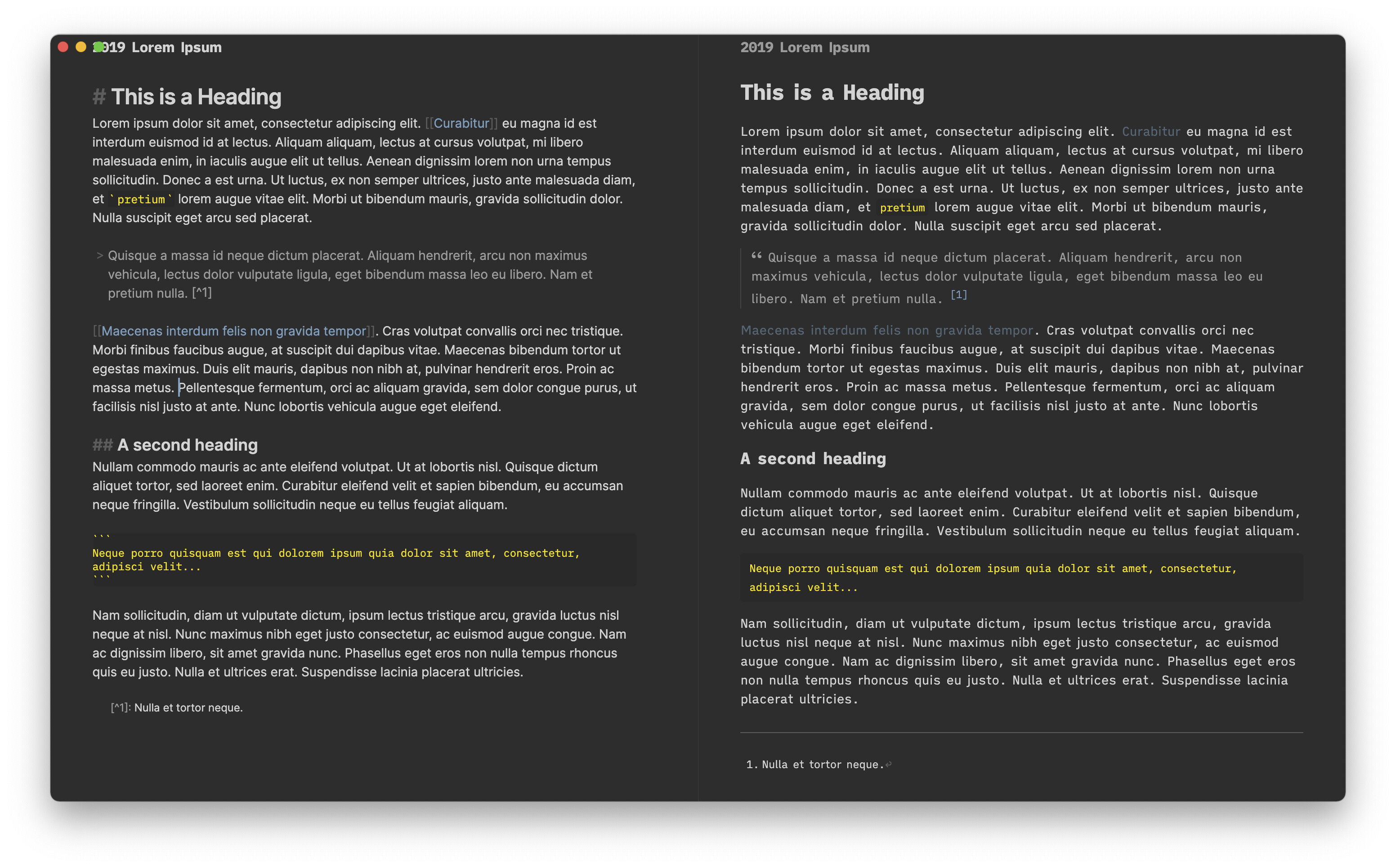
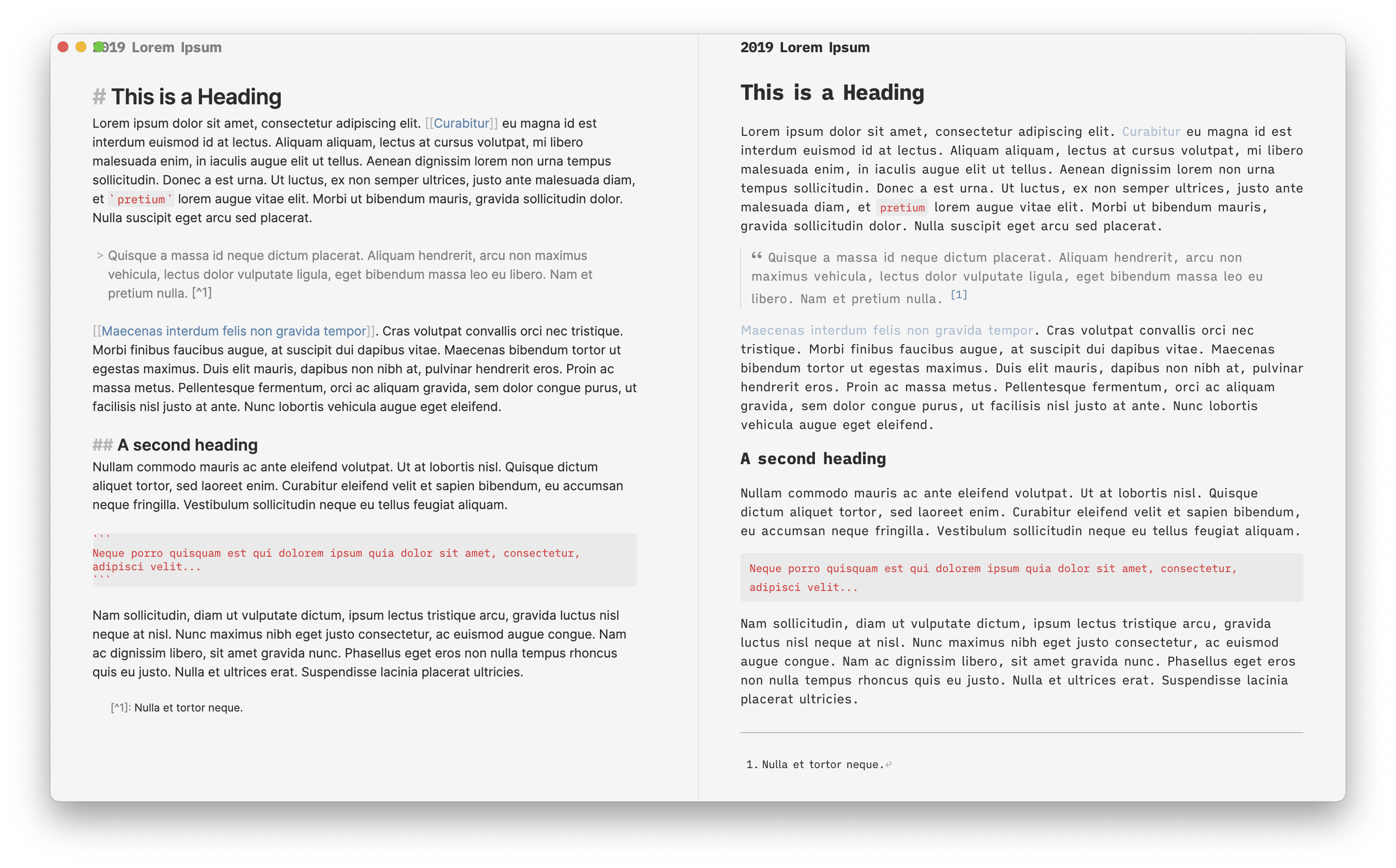
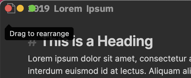
There is another topic to share our Minimal Theme personal screenshot/configuration but I share it here to signal a small ‘bug’ on the header: the icon and the title are in conflict with the red/yellow/green buttons in title bar (with the “hide title bar” of Hider plugin activated, of course).
Thanks.

3_Minimal_bug

This is fixed if you update to the latest version. This was quite complex to solve given the number of different possible scenarios. Let me know if it works for you now.

1 Like

It works perfectly. Thank you so much.
[with the latest version I only had two ‘surprises’: 1) the changing of the settings tab font (from text UI to preview font - solved with a css snippet); 2) the changing of the settings graph tab]
Just one more question: Why does the graph change the appearance (font size, line thickness, etc.) when using an external display?
Thanks

Hello, I encounter a bug on macOS Big Sur.
I have the plugin and the theme enabled.

I enabled auto-switch between day and night in order to test the option the first day, and deactivated it (mostly because I love the white theme). But since then, each night, it goes to the black theme, and I have to keep reverting it.

This could be due to one of these issues:

  1. Your Obsidian Settings are set to the Dark theme (change it to Light in Settings > Appearance)
  2. You have another plugin e.g. California Coast, that is overriding your settings

Obsidian settings are always in white.
The only plugins I have are git, sliding panes and the minimal theme settings.

I deleted every other css themes, even that I think it’s not related

A reminder that Minimal Theme, and my plugins (Hider, System Dark Mode, Advanced Appearance and Minimal Theme Settings), are offered as pay what you want software.

I develop them in my spare time because I love using Obsidian.

If you’ve enjoyed using my theme and plugins, please consider supporting my work.

You can back me for as little as $1/mo on Patreon or send a one time tip via
Buy me a coffee.

2 Likes

I’m having trouble with some weird spacings when Andy mode is enabled. Can’t even imagine why!

If I disable frameless mode on Hider plugin, those spaces show just fine:

I just pushed a quick fix for this. Might need some more refinements but it should help.

1 Like

It worked, except for the page icon that’s now under the traffic light buttons :wink:

Captura de Tela 2021-01-20 às 19.50.57

That’s on my radar. I will think about how to make that better.

I broke the Vim cursor, It’s no longer a block. In visual mode it is correct. See attached pictures.

I added the advance appearance plugin and the cursor became skinny. I’m using the Monaco typeface for all fonts under the minimal theme settings.

I tried to remove the advance appearance plugin: no change.

Normal mode

Visual mode

Right now Advanced Appearance and Minimal Theme Settings are not working perfectly together. I am going to update them both soon, but have been too busy. I the meantime I would recommend only using just the Minimal Theme Settings on its own.

The problem stems from the fact that Advanced Appearance replicates most of the functionality of Minimal Theme Settings but has been genericized to work with other themes.

yeah, I kinda came to that conclusion when the options were same as the minimal theme settings. FYI: thanks for the support! :grinning:

Could someone post a CSS snippet that shows increased font size for different headings in Minimal? I am unclear on which selectors to use for both edit and view mode. Thanks in advance!