Minimal Theme

@ajgxyz

  1. I agree. I just updated this if you grab the most recent version of the theme.
  2. As of 2.2 you can set preview/editor/mono fonts separately. To be clear you’re suggesting a fourth font setting for interface elements (e.g. sidebars, status bar, tooltips, etc)? This gets tricky as it relates to things like the graph, files and calendar plugin which can be placed in the sidebar… It would be fairly easy to add a setting that affects everything except the main workspace panels but beyond that it gets too granular IMO.
  3. I think this is too small of a detail to be in the Settings. There are a lot of these small decisions throughout Minimal and I don’t think every one of them should be a user-controllable setting. For now this is the realm of custom CSS. Obsidian devs will soon be releasing a feature to have multiple CSS files which will allow you to retain customization of these smaller details.

@mano can you share a screenshot? I am not sure I understand what you mean.

1 Like

notice that the ribbon that would have been there on the left is gone (highlighted in yellow), while the ribbon on the right is still there (highlighted in orange).

This is on windows 10, obsidian version 0.9.15. I have enabled ‘hide app ribbon’

(there’s some text in the yellow highlight coming in from an app in the background. Please ignore that.)

Minimal 2.3 is out

  • Added support for Calendar plugin 1.3.1
  • Added new settings for reducing borders in sidebars (even more minimal!)

Hider 1.0.2 is also available fixing the issue with the right ribbon (cc @mano)

Sponsor my work on Patreon

2 Likes

I see it. Thanks :slight_smile:

Minimal 2.4: System dark mode, “All White” style and new hotkeys

Support my work on Patreon

What’s new?

  • A new option allows you to use the system setting for light vs. dark mode. On newer operating systems this allows you to automatically switch based on time of day, and match your other apps.
  • New “All white” style for light mode
  • New hotkey commands
    • Switch between light and dark mode with a single hotkey
    • Cycle between light mode styles
    • Cycle between dark mode styles
    • Toggle sidebar borders

Improvements

  • Graphs now extend to the top of the pane, to provide a more immersive experience
  • Better readability for the “True black” style, particularly popovers
  • Images in dark mode are set to reduced opacity, hover for full opacity

Small fixes and changes

  • Accent colors can now access the full range of hues
  • Border settings are now an on/off toggle
5 Likes

Any pointers on how to make my tags not-transparent?

This is how they used to look:
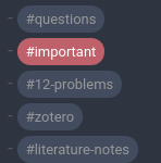
image

This is how they look at the moment with my current colour-scheme:
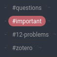
image

The CSS I use to override my tags is here: Meta Post - Common CSS Hacks

Edit: Forgot to add what I tried so far:

  • commenting all instances of background-color: transparent in the theme
  • overriding that with e.g. .tag { background-color: var(--nord3)} in my tags.css

Theme is incredible! Take my money!

In the edit mode, the line numbering is slight misaligned.

This line should work .tag { background-color: var(--nord3)} just make sure it comes after the Minimal theme code. You’ll also want to add .cm-s-obsidian span.cm-hashtag for edit mode so:

.cm-s-obsidian span.cm-hashtag,
.tag { 
background-color: var(--nord3);
}

Thanks, this will be fixed in the next release.

1 Like

That, unfortunately, didn’t work. I did a little digging and checked the commits around the tag lines in the CSS and I found that it’s actually related to the specificity of the cm-hashtag-begin and cm-hashtag-end (see here). Adding the following lines in my tags css did the trick:

span.cm-hashtag.cm-hashtag-end,
span.cm-hashtag.cm-hashtag-begin {
  background-color:var(--nord1);
}

@kepano I’m really liking the new plugin settings, and I’m almost ready to fully switch over. Is there any chance that we can toggle the tooltips in the quick switcher and other modals as part of the Hider plugin?

Sorry I am not sure what you mean about tooltips in the quick switcher and modals. Can you share a screenshot?

Edit: Oh! do you mean the instructions? (Tooltips typically refer to pop ups you see on hover)

Exactly! I also didn’t know how to name them :sweat_smile:. For me these two are stuff that I sometimes forget, and that sometimes helps when new features are added:

With the quick switcher ctrl + o:

image

When linking:
image

The command palette also has one, but (at least for now) I don’t find as useful.

@argentum FWIW, I’m also a fan of those instructions.

@kepano think of keeping them available as “cognitively minimal”? :wink:

Minimal Theme 2.4.1 and Hider Plugin 1.0.4 are now available.

  • Instructions have now moved into Hider so you can show or hide them
  • Fixes for 0.9.19, and styling for new metadata block
  • More future-proof code for Calendar thanks to liamcain
  • New icon style for links to Obsidian searches. If you use Obsidian URIs that start with obsidian://search the link will be considered an internal link and have a special search icon. See Obsidian documentation on how to format these links.

Screen Shot 2020-11-23 at 16.57.20

5 Likes

Not sure if you fixed it or not, but Using “Menlo” on mac works great!
Obisdian: 9.17
MacOS: 11

Hi @kepano!

I’m super excited to work with your plugin and theme. I’ve run into an issue that I don’t know how to solve:

When I change the body font-size to 36, the headings in the editor are still at the default (16pt I believe)

Is there any way I can fix this myself?

Here’s what I mean:

And here are my configurations:

Custom CSS:

All other plugins disabled:

Great find, thanks! If you update to the latest version of Minimal Theme this should be fixed.

1 Like

Works! Thank you.

Hi all,
not sure if this is the right place to mention this, so please excuse me if it’s not.

I’ve recently tried moving a note of mine about the basics of HTML from Notion to Obsidian and noticed something strange (to me at least).

As the note is about HTML, I have lots of code blocks within the note. Now these came across perfectly with a simple copy-paste from Notion, but what’s strange is how these code blocks are rendered in preview mode. In preview mode these code snippets are displayed as clickable tags:

Edit mode

Preview mode
Preview mode

Is this a theme issue or something on Obsidian’s end?

Also, I’m really pleased to see the syntax highlighting in the preview mode - is this a coincidence because its HTML or is this supported in Obsidian? or a theming thing?