Hi!
So… I don’t like Obsidian app icon. It looks quite… unfinished? (At least comparing to other app icons on my Mac.
Am I alone? ![]()
Hi!
So… I don’t like Obsidian app icon. It looks quite… unfinished? (At least comparing to other app icons on my Mac.
Am I alone? ![]()
I particularly like it. It doesn’t stand out with any bright colours but it’s recognizable and the icon matches the name (obsidian is a type of rock). Although I never access my software from the desktop,because I try to keep it as clean as possible. I search them up from the windows 10 file/folder/application search functionality.
Someone made a magenta flower icon, though. Search up “Obsidian flower” in the off-topic channel.
Yes you could always change it on your system if you don’t like it.
I think it’s unique, visible, and well-done.
I’d actually like to get a handle on who likes the icon and who doesn’t, and compare that against what OS they use…
I’m a Windows user myself, but from what I’m hearing I suspect the icon does not pair well with MacOS aesthetics.
I’m on a Mac and I like the icon – it’s clean and simple, easily recognizable without screaming “I’m here!!”.
Edit: like @s-kyy I keep my desktop clean and use the spotlight function to search and open any program I want to use.
I personally like the app icon - clean, modern, yet understated - a gem in the making.
Yes… you are alone.
I like it very much
As a person who is quite picky about what they see on their (macOS) dock, I have to say I like it a lot. It’s a color not frequently used, it’s clean, minimalist, yet not cheaply put together.
Sorry, think you’re alone on this one 
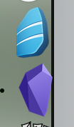
I can be quite sensitive to icons as well but really like this one:
It stands out from the rest, looks timeless and polished while at the same time not overdone in a “hey look at me I’m the shiniest thing on your screen” - kinda way
Same here. MacOS user and I’m quite happy with the icon.
I like it a lot but notice that I keep confusing Obsidian and Microsoft Teams on my Windows computer as they are both purple icons.
Every time I see it I think of the Dark Crystal. So yeah, I like it.
And here I am just thanking the devs that it’s not yet another blue icon (seriously, I have so many blue icons…)
I think it would help to place the icon against a black square.
Thanks for the info, did not know Microsoft Teams has a purple icon.
You’re so correct. Dynalist logo is the typical productivity blue, and no matter what symbol or shape we use, it looks like 1024 other apps. Dynalist looks almost identical to Coursera, specifically.
I like it but I do find it confusingly similar to amethyst (a macOS windows manager that mimics xmonad). That software may not be sufficiently popular to matter, though.
Not a problem. MSTeams:Obsidian::MSWord:Drafts really, not confusing at all.
My question is: when can we order black T-shirts with the icon (and no text)?!?
I currently have Obsidian in the dock next to Rosetta Stone. Lots of rocks in the pile