It is fine, there are other things to work on that are more important.
Wow, a rock collector! ![]()
Put TextEdit besides it and find one for scissors next!
I like dragon-glass! Though real obsidian is deep black to blackish green.
Super late to the conversation @Valery_Kondakoff but I thought I’d throw in my own icon edit. Yes I’m on MacOS and yes most of my dock icons are circles, so Obsidian’s default icon looked funky to me. I played with a few ideas using a round background here
Hope that’s helpful!
Edit: wordpress link is broken. Find the files at github
For me, on a Mac, this is a low priority issue. I quite like the Icon. I hope the developers will focus on high priority issues - one for me is a Typora like interface. I am quite satisfied already with what we can do.
I like Obsidian’s logo.
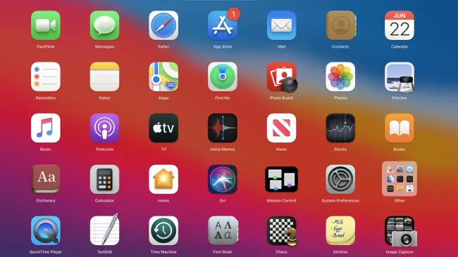
I think that standart Mac icons right now tend to be more busy because of Apple’s predisposition toward Skeuomorphism tend to be more busy/detailed.
I mean look at this
Honestly I don’t like it personally. I (I prefer more simple designs in general (I don’t hate simplistic skeuomorphism, though–like what is shown in this tutorial https://www.youtube.com/watch?v=yQa_aXsLn0E)
Overall, I think that the current Mac icons are a bit too detailed and realistic. It looks like they just figured out how to do shadows so they put them everywhere.
But that is just my opinion, some people like it.
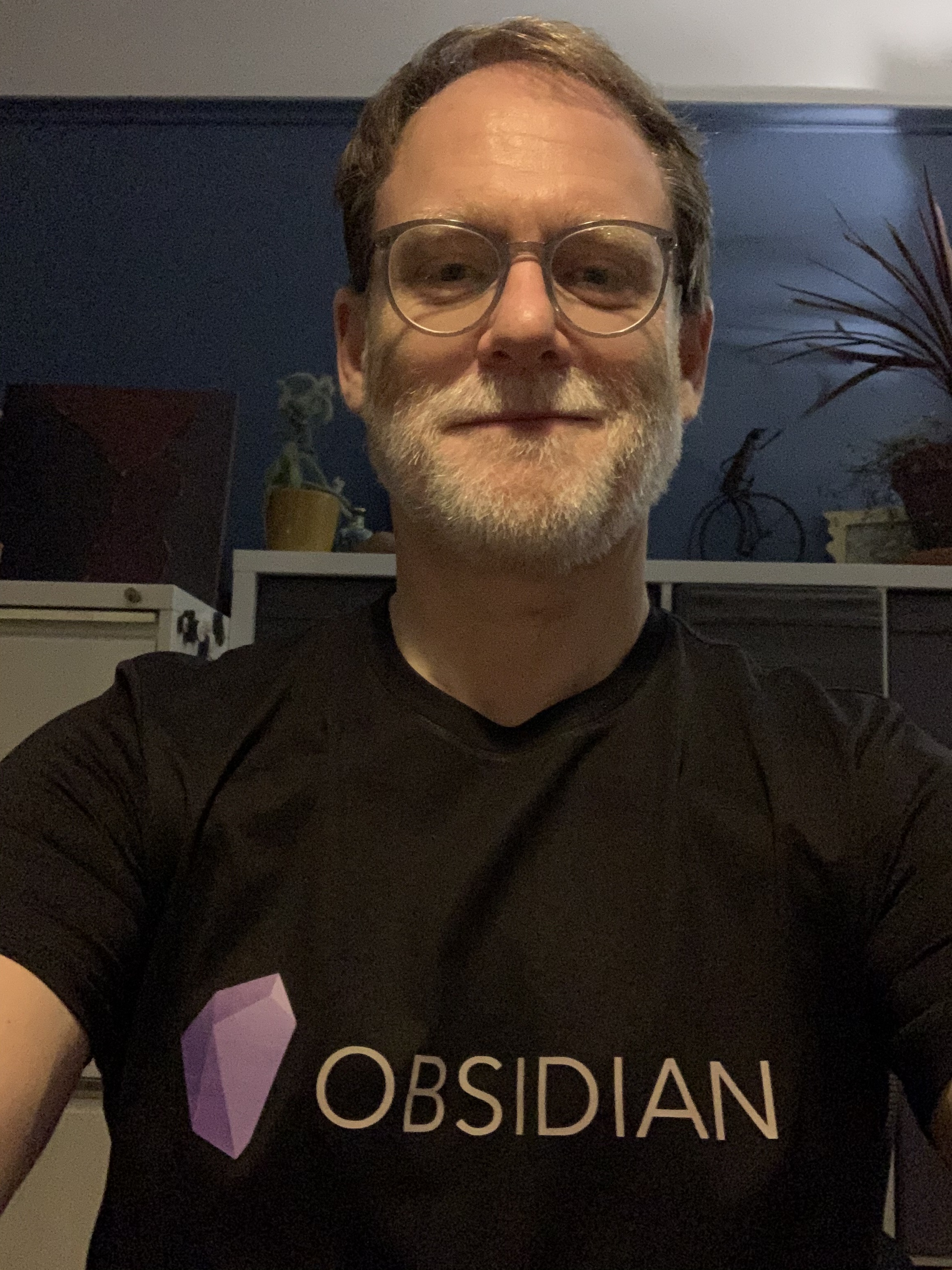
I think I’ve raised this before… I love the design. Does anyone know where I can get a high res version of the graphics? I’d love to have it silkscreened on a black T-shirt!
I like the Obsidian icon! It stands out in a good way against other macOS icons.
Like others, I use the app switcher and spotlight to open/switch apps. Not looking forward to the Big Sur style with the round rectification of shapes and excessive shadows.
Add me to the list of current icon lovers. Looks great on Catalina, but it might start to stick out oddly when Big Sur rolls into town.
Great idea! T-shirts / hoodies/ tech accessories with the logo would be pretty nice.
(Large vinyl stickers?)
I love the concept/direction - crystalizing thoughts/obsidian stone, but I admit the shape feels a bit narrow to me, and thus looks awkward next to all the other app icons on my mac.
I certainly don’t think a re-do is warranted, but I’d be in support or a refinement with a bit of a different crystal structure…
The icon file is 512px. Out of curiosity I looked up online vector makers and it worked sort of okay. One didn’t quite capture the different colors, another smoothed the edges to look more illustrated. It would be for personal use only but maybe you could play with your own vector version?
I really like the icon. I find it elegant!
As a linux user with a Window Manager I don’t ever see the icons of apps haha, I guess Mac users are more concerns about these things, but even in a Mac I think Obsidian looks great!
For Christmas, my daughter took matters into her own hands, and now I’m the proud owner of a one-off custom black Obsidian T-shirt!
The app icon represents the name obsidian naturally.
That’s a nice looking shirt MashaAllah, fits perfectly! Now I’m Jealous.
I’m sure the devs do not want the hassle of selling t-shirts but I do think it a way to support them. I would appreciate any ideas on getting my own Obsidian t-shirt!
I love the icon!
Lin/Mac/Win/iOS