Bring Notion-style layouts with blocks side-by-side, resizable markdown blocks that support full Obsidian syntax including images, embeds, and internal links.
Features
Side-by-side markdown blocks using horizontal code block
Resizable columns with a draggable divider
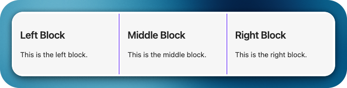
Dynamic layout — support for 2 or more columns using --- separator
Auto-scaling images inside blocks
Block width persistence — remembers layout when you return
Examples
Code 1:
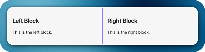
horizontal ### Block 1 This is the left block. --- ### Block 2 This is the right block.
horizontal ### Left Block This is free text - Item 1 - [ ] Item 2 - **Item 3** This is a ***formatted*** **text** --- ### Right Image Block ![[test_image.png]]
New trigger command hblock as an alias to horizontal, enabling the same Notion-style horizontal layout using a shorter code block fence.
Live editing for page and section embeds inside blocks. Embedded markdown notes (e.g., ![[Note]] or ![[Note#Heading]]) can now be edited inline; changes are saved back to the source file, and section edits are merged precisely into the corresponding heading section.
Styling settings tab to customize horizontal blocks globally without CSS:
Divider: color, thickness, opacity, and style (solid | dashed | dotted | transparent), plus hover accent and drag-active highlight.
Blocks: text color option to customize foreground text inside blocks.
Blocks: title text color option for block headers.
Spacing: inner padding and gap between blocks.
Toolbar: global visibility toggle for an optional .hblock-toolbar region.
Theme-aware mode to auto-inherit theme colors.
Per-block toolbar in each column with quick actions: width +/- controls, and per-block background/text color pickers (applies instantly and persists overrides per block).
Right-click context menu on blocks to toggle visibility settings globally (toolbar, borders, alternating shading).
Changed
Removed extra top and bottom spacing from embedded views to produce a cleaner, more compact layout inside horizontal blocks.
CSS refactor to use variables and global classes so themes/snippets can override styles; settings apply live without restart.
Notes
No breaking changes. The existing horizontal trigger remains fully supported.
Hi! The new update is great, but I would like to add a few suggestions.
Setting the block colors is great, but it would be nice to have an option to make them completely transparent and also remove box-shadow.
When you set divider as transparent, it would be better if it still become visible on hover, makes easier to find it.
Embed blocks also have borders, maybe add the option to remove it too.
It’s all not super important, since it can be easily changed with css, but since you are already adding the style settings, maybe it is something to consider.
Also the sliders in the settings should have tooltips, so the user can see the actual numbers they are chosing.
Thank you so much for your suggestions. It really helps. I will add it to my queue right away. Kindly be a with me for slow upgrades. Will try to release as soon as I can.
Congratulations on the update! I merged your update post into the original plugin thread (and removed the “new” from the original’s title) because we find it works best to have a single thread thread for each plugin.
Great Plugin!
Is it possible to have block-background change for the block bundle?
Idea is to have multiple block bundles in a note with different backgrounds.
Example
```hblock horizontal-blocks-embed.background-color:red
 Horizontal Blocks Plugin
 Features
 Side-by-side markdown blocks using
  Resizable columns with a draggable divider
 Dynamic layout — support for 2 or more columns using
  Auto-scaling images inside blocks
 Block width persistence — remembers layout when you return
 Examples