Use case or problem
A UX issue when images are pasted/shared in sequence — especially long chains of images. The current behavior makes these posts very long and difficult to consume, because each image is stacked vertically with large gaps, leading to a lot of scrolling and visual noise.
When I paste or upload 5–10 images in a note, each one gets rendered full width and stacked vertically. This creates:
- Excessive scrolling
- Difficulty comparing images
- Harder navigation and context switching
- “Wall of images” effect that loses meaning
Example:
Proposed solution
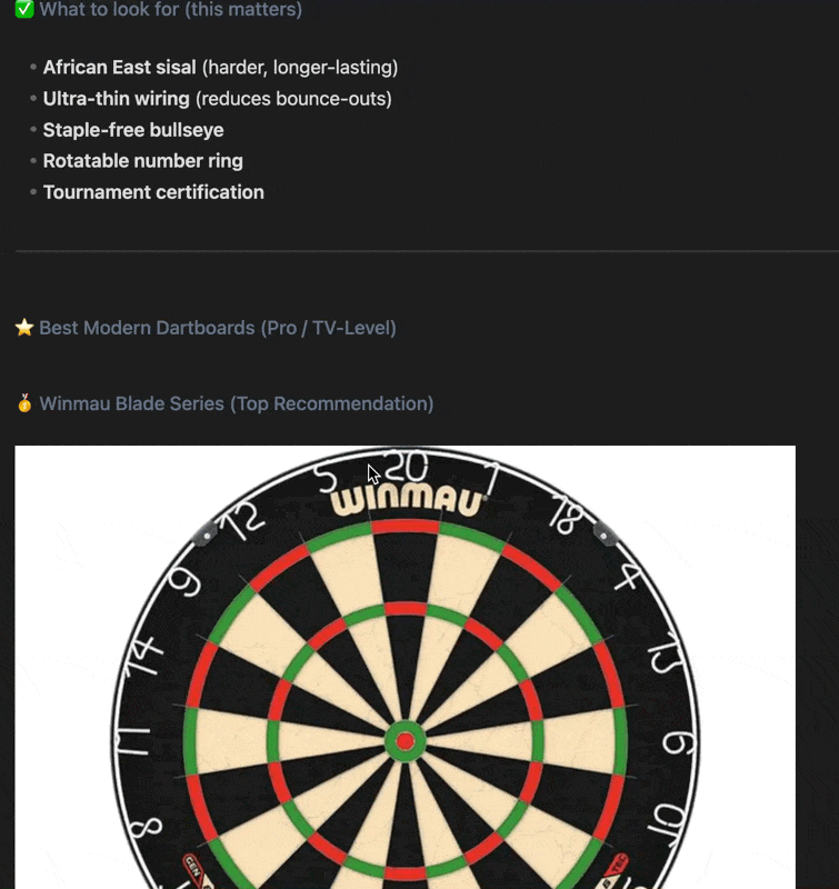
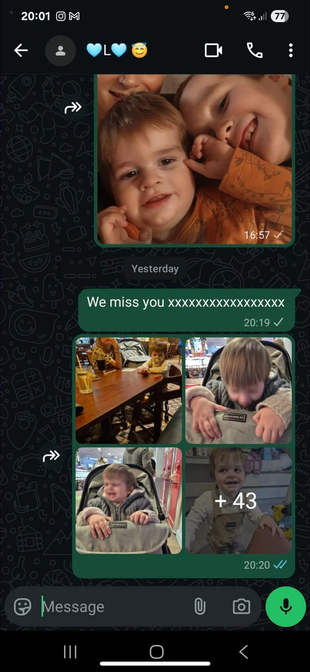
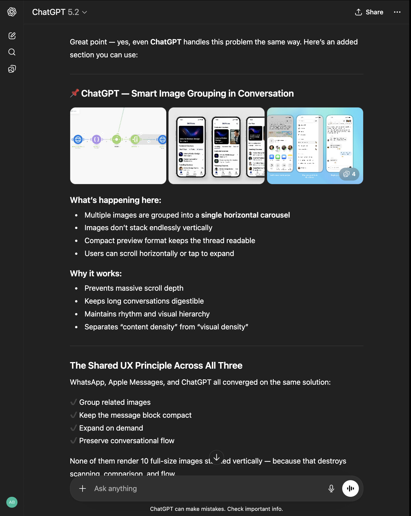
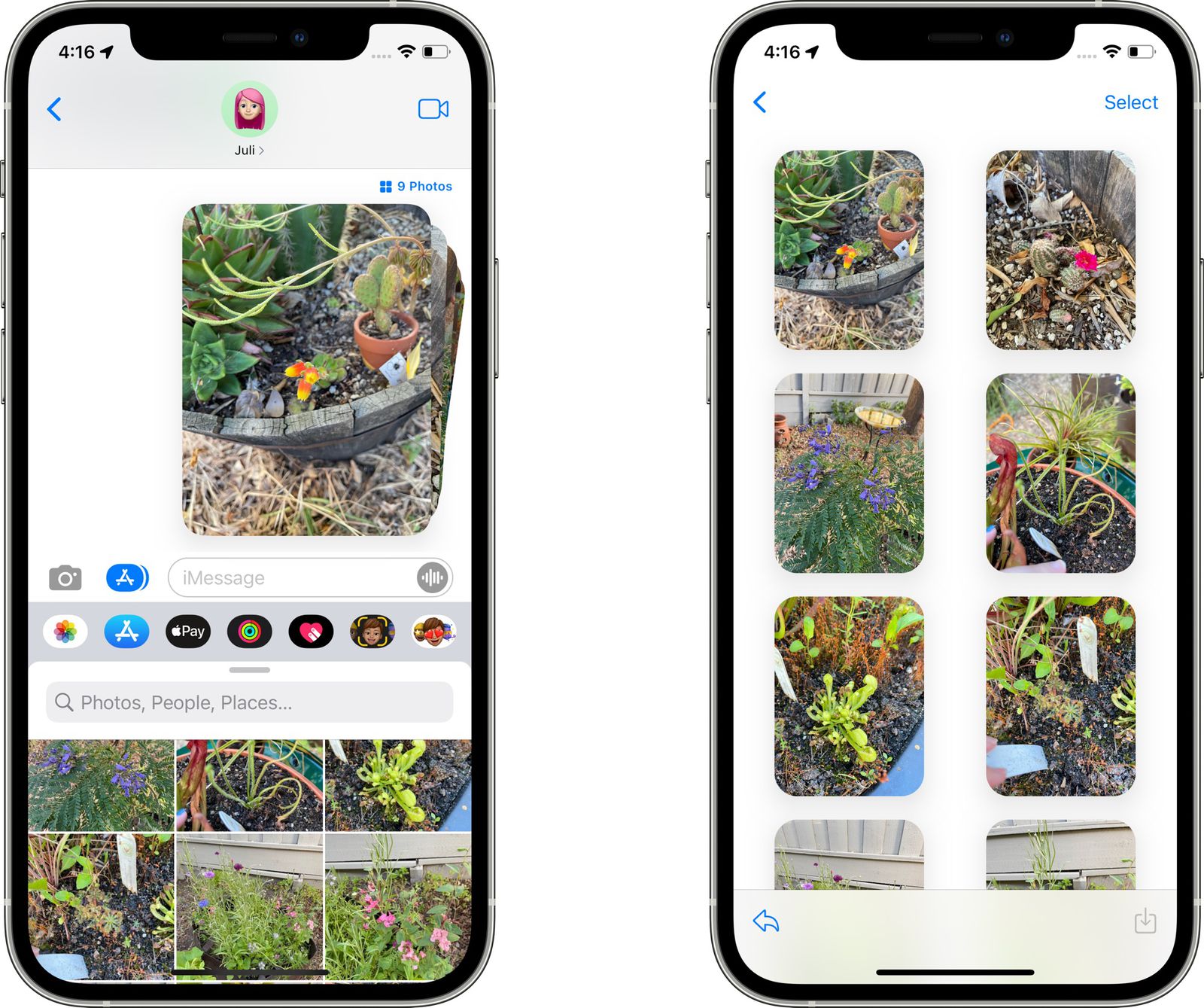
Major platforms like WhatsApp, Apple Messages, and even ChatGPT already solved this by grouping image attachments into compact previews that expand on demand.
Groups multiple shared images into a grid/preview stack. Uses light spacing and compact layout. Lets users expand images if they want detail.
Result: Users get context at a glance without endless scrolling.
This feature would cater to writers, designers, filmmakers, and brand builders — who want to use Obsidian as a visual inspiration hub.
Having one clean note that holds a script draft, screenshots, and visual inspiration all in one place.
But right now, once multiple images are added, the note quickly turns into a long, broken scroll of oversized visuals that disrupt flow and make comparison difficult.
A compact image grouping system would change that entirely — allowing visuals to support the narrative instead of overwhelming it.
Templates and Attachments already exist, this is the final piece that would take visual creation inside Obsidian to the next level. And would truly make it a single, unified hub for a seamless one-app workflow.
Thank you for reading.