@ush I’m not sure this is exactly a duplicate. Yours was a bug about not being able to click. This thread seems to be an objection(?) to seeing the data at all.
By the way, have you tried recently? It seems to be contained in a scroll-field for me now (tested on MacOS). Which might resolve your bug report, even though they said “wontfix”.
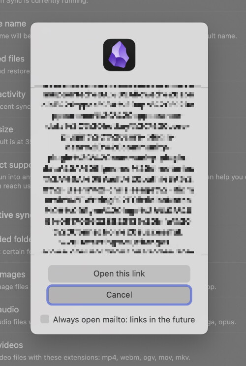
@bfc3 This is your Debug Info encoded as text inside the mailto: link so that info can be sent to the Obsidian team.
What exactly are you saying shouldn’t happen? The popup itself? Or the display of the data in the link? It’s not easily readable, but it allows you to see the data that will be sent before you send it. In my opinion, that’s a good thing.
And hopefully you shouldn’t be needing to click this support button very often. So (again in my opinion) I think the transparency is much better than the occasional inconvenience.
I’m just saying that it looks like an unwelcoming (scary?) long wall of text, for something that should be a perfectly safe operation.
Nothing against transparency, but perhaps there is a better way of presenting this info (like an expandable more info ... link which then expands to the full text)