I’m a strong user of Obsidian mobile, in both my iPhone and my iPad.
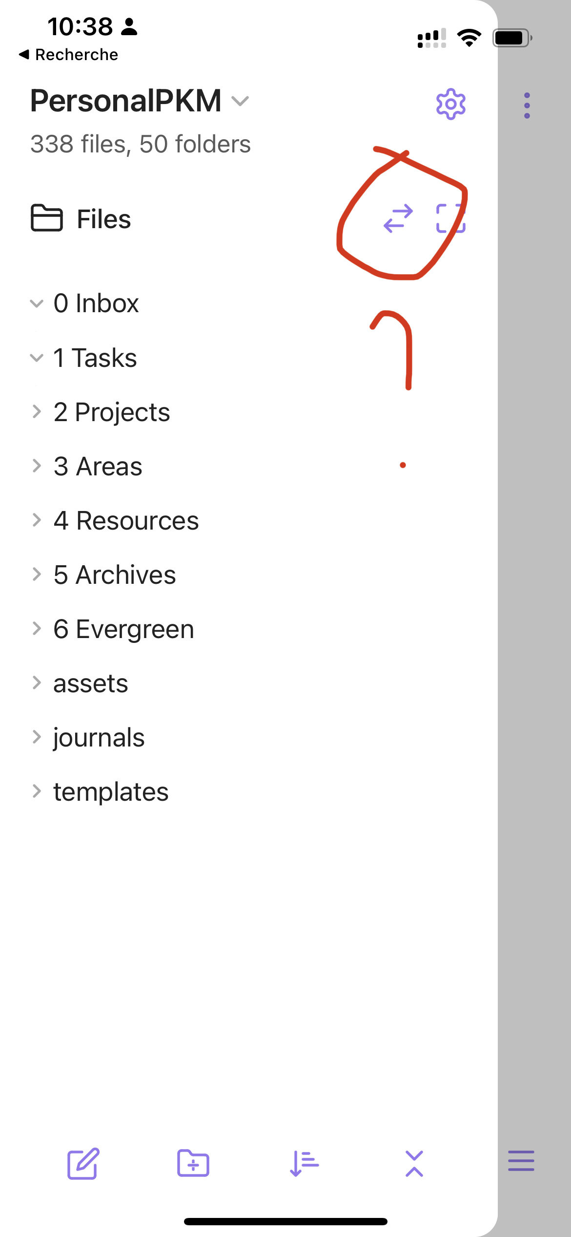
When I would like to switch from “File” to “Search” or “Favorite”, I’m always confused/lost with the “double arrow” icon that doesn’t mean anything for me (cf. screenshot).
Can’t we add another logic, like two level of panes or explicit buttons to move from File/Search/Favorite?
This may only be a personal opinion though, let me know what do you think.
Also I’m not a UI specialist so I cannot really propose a solution. I’m just sharing the issue I have.
I agree. The icon is quite confusing, and even more confusing that its not on the left side behind “Files”, which would normally indicate “go back”.
Even even more confusing is that there is no button to show the right panel on mobile. There is no visual indicator that it even exists unless you swipe right to left.
UI isn’t clear, agreed. FWIW, tapping anywhere in this area does the same thing: brings you up/back a level to Files, Search,… so you don’t need to target the double arrows.
YES. Both the icon and its placement are non-standard. I still hesitate in confusion every time I need to use it.
Plus having to switch between search and the file explorer is annoying — it takes 2 taps, with a slow animation each time.
It’s more normal on iOS to have the search bar atop the file list (see Apple Notes, Files, Mail, Reminders; or third-party app 1Writer) or have the file list with a search button (Bear and iA Writer). Same for the tag list and Favorites/Starred, which in all of those Apple apps and iA Writer appears below the file list (in 1Writer, tags get a separate tab but it has a faster animation and only needs 1 tap),
If we can’t have the full contents of all of these in the sidebar, I’d like to at least have the links so I can go to the directly instead of first going to a list.
I will add that the whole row where the back button is located could alternatively be entirely replaced with a row of icons for each sidebar item like it is found on tablet or desktop.
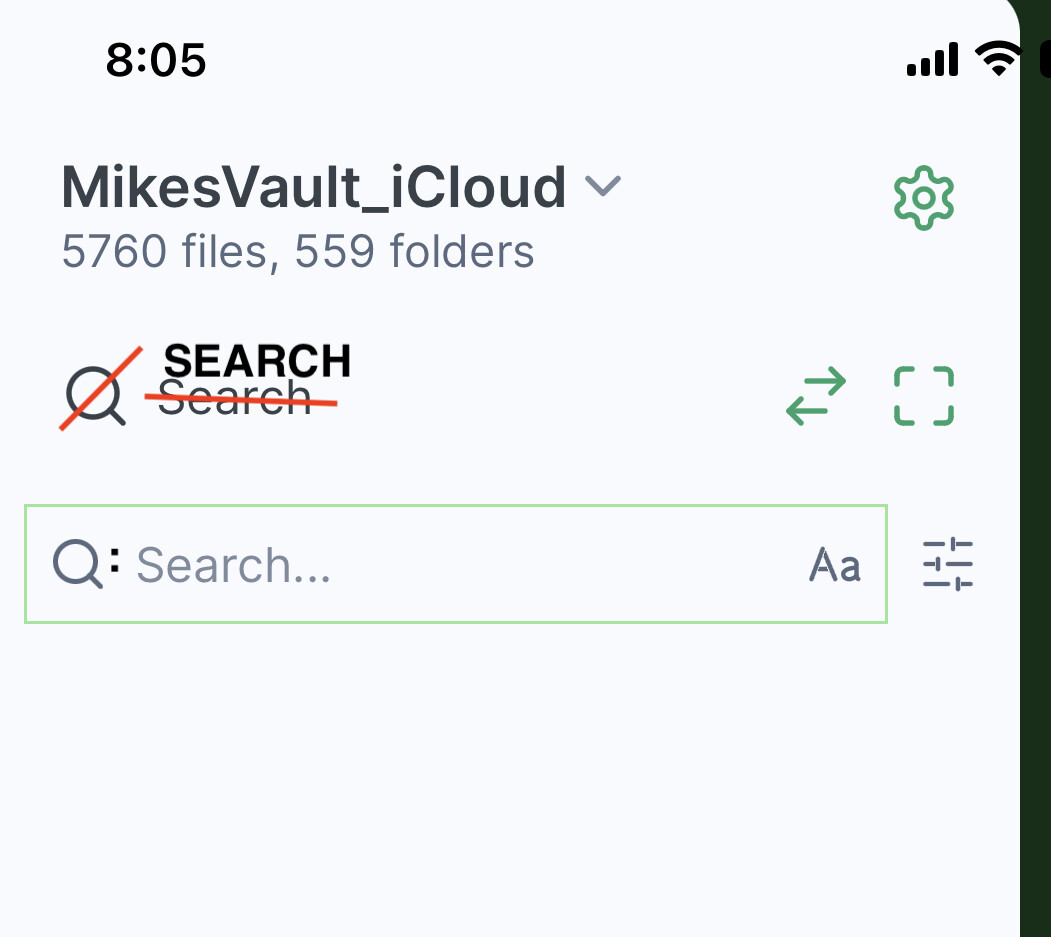
An additional counter intuitive UI issue with the search view on iOS: when it first opens there are two entries with the magnifying glass icon and the word ‘Search’, yet only the second one is active to enter the search terms. The magnifying glass icon should only be shown on the entry line and the Top line 'Search" word should not have the icon (it’s not needed at this point) and be bold or larger uppercase text etc. to indicate the page you are on is the Search page The field with the magnifying glass could also have a colon to indicate more clearly where the search terms are to be entered after you have entered something and come back later and the ‘Search…’ prompt is no longer shown.