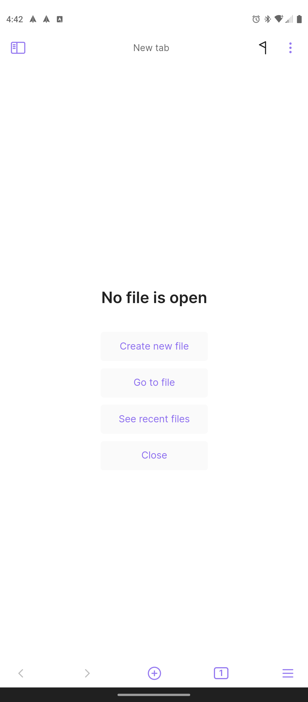
As the screenshot shows, the background color for the home navigation bar is a darkish grey, which does not match up at all against either light or dark color schemes.
The top status bar area properly matches the current color scheme.
I don’t know. I have checked a few apps on my phone and few of them have this navigation bar customized. I don’t consider this a bug. You are requesting a minor esthetical improvement.
I wonder how that’s done then, I’m not versed in Android development. I know apps like Discord and Twitter do this. Certain other apps like Syncthing have the bottom navigation area as pure black.
That thin black bar at the very bottom with the white line is about the “accessibility” feature of your phone, this handle is unrelated to Obsidian, so you can’t change its look.
Pretty sure Apps can change it, since I’ve seen other apps do it. All of my phone’s stock apps change the background color at the very bottom to blend in with the app’s color. Other apps do similar.
Some apps even integrate with the bottom bar: examples include Discord, Geometric Weather, Infinity Reddit, and Spark Mail.
If applications are able to change that handle, great!
Tbh, i didn’t pay too much attention to this handle, i just noticed it to be out of place with light themes. The current theme template seems not supporting styling for that handle bar
Yes apps can modify, since most apps have transparent gesture / navigation bar. It would be a nice feature, it can be immersion breaking in some themes.
Yes, this needs to be done, as it seemingly will be enforced at some point in the future. The iOS version of the app surely has this in some way, so why not just implement it on Android too?