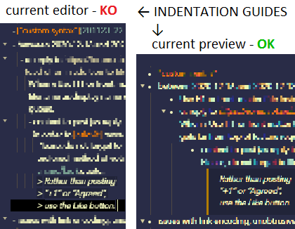
TLDR: implement the HTML object model in a way that enables the creation of a custom CSS to present a note with an outliner look with headings (as top-level items) and list items (as deeper level items) indented. We already have fold functionality, line move functionality, indent/unindent functionality, it’s only a display mode we lack.
I personally like outliners for a structured view of information and used Dynalist before coming to Obsidian (for tables, native links, offline MD storage, embedding, etc).
I have seen info on developers trying to integrate as many outliner features as possible without breaking the main point of Obsidian and I’d like to suggest a possible way of implementing a more structured outliner-like look for those interested (actually, enabling to define it in CSS).
Currently, we have indentations for lists in editor mode hardcoded in HTML file, different width on different list levels.
If content lines of lists were classified by depth, there would be a way to make natural indentations of preferred width and more robust connecting lines between points (current ways to make lines I found and use has breaks on multiline list items).
Also, it seems natural for me to use headings as topmost levels of lists for my outline-like note. If the same approach (classify content lines following heading by heading class) were applied, it would be possible to make headers a top levels of lists with appropriate indentations. And - viola - we got outlined list in our document, which could be viewed in outlined or traditional style based on selected CSS.
I see two way of implementing it:
- make per-line classes
h1-content,h2-content, …,list1-content,list2-contentetc, it seems to be easier to implement, but limit list depth and makes it harder for CSS developer to handle situations likeh1-content+list2-contenton same line - make multi-line containers for headings and list level, with tree-like embedded structure, like
h1-contentmultiline container includesh2line and thenh2-contentmultiline container, which includeslist1-contentcontainer and so on. - maybe another way to do it
Any thoughts?
