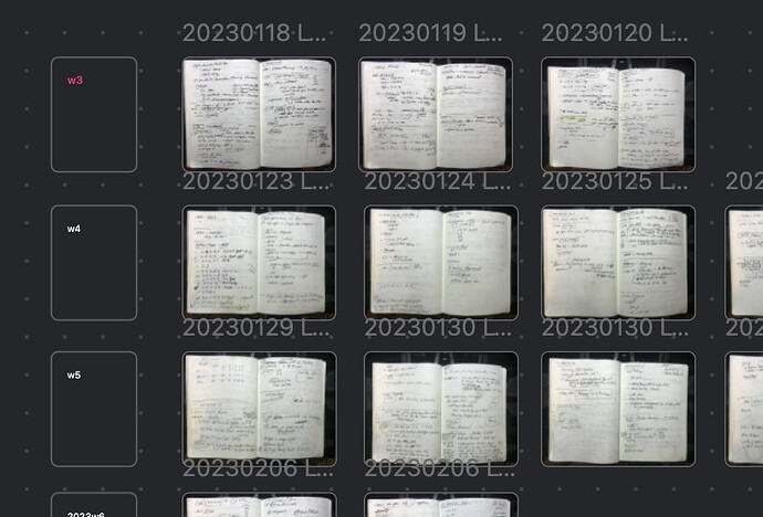
The text in a card is way small compared to the note title, thats why im asking if is possible ? thanks in advance
Pretty same question here. The font size for the card is too hard to read even with H1.
There still a lot need to be approve for the canvas plugin, such as more customzed color for card, add section from notes like what we did usually.
As far as I can tell, the note title is dynamic. So a potential solution for you would be to make your cards smaller, and zoom in closer. That will make the card contents text “bigger”, relatively.
If you zoom in more, then the note title ends up being smaller than the note contents.
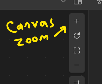
Keep in mind also, that zooming in the Canvas is separate from “Font Size” and “Zoom Settings” in the Obsidian UI or font scaling. So you might have to find a balance between all those settings.
Appearance Settings:
Canvas Zoom

I think a better approach in the next updates for the canvas, is making the card text increase together with the card size, like when you touch the edges and move (increasing the size of the card) should make the text inside the card increase as well
I completely side with @ Thatstheway. Increasing the card size should make text relatively larger. As it stands text gets often way too small compared to everything else on my boards, forcing me to type text in other applications and paste them as pictures.
Same applies to line thickness (and dotted line would be great too!) and labels.
I don’t think it should be automatic. It would be impossible to do something as simple as resize a note just to make room for more text.
Maybe a per-card zoom. Or maybe some people have already figured out the canvas-specific CSS snippets to make it bigger there.
Perhaps the text behavior inside the card can have justification settings (left, center, right, top, middle, bottom, and full). Full justification would fill the card with text such that font size is adjusted to fill the frame in the horizontal dimension.
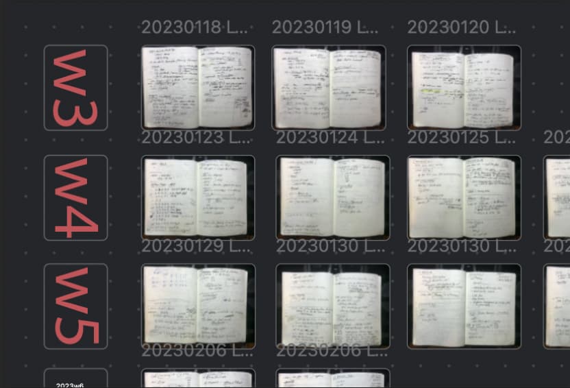
Thus, for example, the left cards in this canvas (notebook pages arranged by week) would increase the size of the text (“w3” in red here) to fill the card frame by setting it to full justification. Full would not only fill the frame as much as possible, but also center the text both horizontally and vertically.
One more ask would be to add a text direction setting to the card, with the default being horizontal, but vertical being an option so that the text can be viewed sideways.
The end result…
same question, does anyone find the solution?
I ended up just using HTML syntax for the card
Like this:
<p style="font-size: 24px">INSERT TEXT HERE<p>
You can use the CSS codes below to adjust the font size of titles inside canvas cards
.canvas-node-container .markdown-rendered h1 {
    font-size: 26px;
}
or the font size of simple words
.canvas-node-container p {
    font-size: 20px;
}
Briefly speaking, you can the the prefix .canvas-node-container to select anything inside of canvas cards, for example .canvas-node-container li {} which is bullets inside of cards
This topic was automatically closed 90 days after the last reply. New replies are no longer allowed.


