Use case or problem
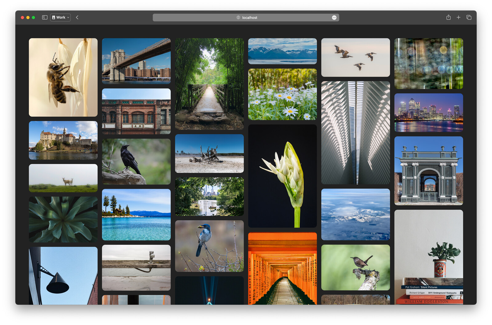
The current Cards View for Bases doesn’t work well for my workflow for two main reasons:
- Many of my notes don’t have a cover image, which creates large, empty placeholders in the grid that waste space.
- The fixed aspect ratio crops my images, so I can’t see the full picture.
Proposed solution
I propose implementing a Masonry (or “Waterfall”) layout. This would improve my experience by:
- Hiding the image area entirely for my notes that don’t have a cover image.
- Showing my full, uncropped image by allowing card heights to be dynamic.
- Creating a more compact grid that lets me see more of my notes at once.
3 Likes
Related:
To always use the first image in note as a cover image: