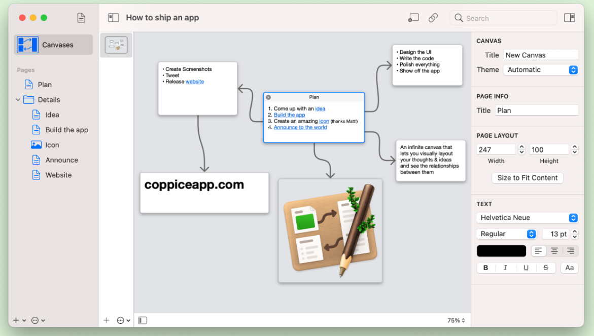
Here’s another example of visually laying out notes. I’m really tempted to start learning how to create plug-ins (I’m a React.js and Java programmer so hopefully I could pick this up ![]() ) in order to try to build something like this. I would ideally like something like this where I could choose for each note to show either the front-matter on the card (as a summary for when the content is too long) or the content where it is short.
) in order to try to build something like this. I would ideally like something like this where I could choose for each note to show either the front-matter on the card (as a summary for when the content is too long) or the content where it is short.
The website is coppiceapp.com