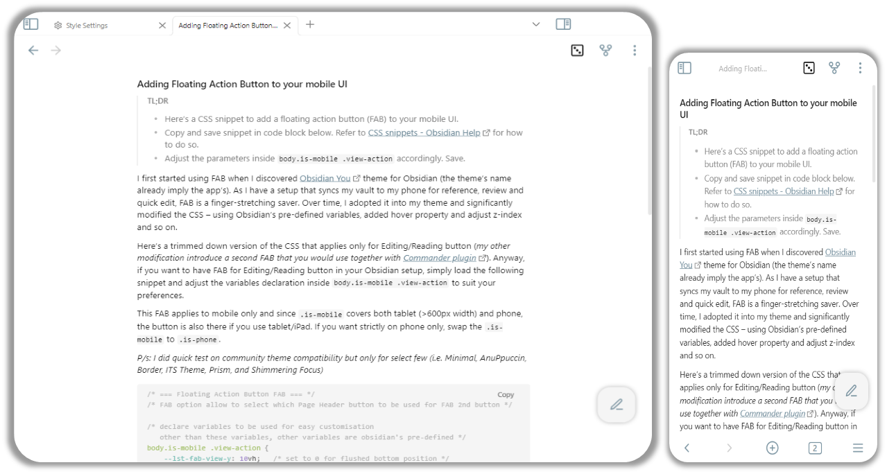
I first started using FAB when I discovered Obsidian You theme for Obsidian (the theme’s name already imply the app’s). As I have a setup that syncs my vault to my phone for reference, review and quick edit, FAB is a finger-stretching saver. Over time, I adopted it into my theme and significantly modified the CSS – using Obsidian’s pre-defined variables, added hover property and adjust z-index and so on.
Here’s a trimmed down version of the CSS that applies only for Editing/Reading button (my other modification introduce a second FAB that you would use together with Commander plugin). Anyway, if you want to have FAB for Editing/Reading button in your Obsidian setup, simply load the following snippet and adjust the variables declaration inside body.is-mobile .view-action to suit your preferences.
This FAB applies to mobile only and since .is-mobile covers both tablet (>600px width) and phone, the button is also there if you use tablet/iPad. If you want strictly on phone only, swap the .is-mobile to .is-phone.
P/s: I did quick test on community theme compatibility but only for select few (i.e. Minimal, AnuPpuccin, Border, ITS Theme, Prism, and Shimmering Focus)
/* === Floating Action Button FAB === */
/* FAB option allow to select which Page Header button to be used for FAB 2nd button */

/* declare variables to be used for easy customisation
   other than these variables, other variables are obsidian's pre-defined */
body.is-mobile .view-action {
	--lst-fab-view-y: 10vh;   /* set to 0 for flushed bottom position */
	--lst-fab-view-x: 2vw;   /* set to 0 for flushed right position */
	--lst-fab-button-size: 60px;   /* set button box size */
	--lst-fab-button-radius: calc(var(--lst-fab-button-size) / 3);   /* divide 3 for square circle, divide 2 for circle */
	--lst-fab-toolbar-y-adj: 80px;
}

/* make the button "floating" and define customisation */
body.is-mobile div.view-actions > .view-action[aria-label^="Current view"] {
	position: absolute;
	top: calc(88vh - var(--lst-fab-view-y));
	right: calc(0vw + var(--lst-fab-view-x));
	width: var(--lst-fab-button-size);
	aspect-ratio: 1;
    transform: translate(-40%, 5%);
	border-radius: var(--lst-fab-button-radius);
	background-color: var(--background-secondary);
	box-shadow: 0px 0px var(--size-4-2) rgba(0,0,0,0.3);
}
body.is-mobile.mod-toolbar-open div.view-actions > .view-action[aria-label^="Current view"] {
	top: calc(88vh - var(--lst-fab-view-y) - var(--lst-fab-toolbar-y-adj));
}

/* make sure FAB is higher than backlinks control */
body.is-mobile .view-header {
	z-index: 30;
}

/* change background-color when hover */
body.is-mobile div.view-actions > .view-action.clickable-icon:hover {
	background-color: var(--background-accent);
}
update 27June2023 – added variable (i.e. --lst-fab-toolbar-y-adj) to adjust vertical position when mobile toolbar appear on the screen. this is to avoid FAB become hidden behind it partially. adjust accordingly, the 80px is to compensate for two rows of mobile toolbar.
Quick question regarding the FAB when the keyboard is open on mobile. I have 2 rows for the mobile toolbar and notice that the FAB is hidden behind the toolbar when the keyboard is open. I’m a bit of a noob with customising the CSS. How would I go about making sure it isn’t covered by the toolbar?
well, i think that’s possible but rather i would be tackling based on mobile toolbar (easier). when ur on screen keyboard appear, normally the mobile toolbar also appear (based on my testing).
On my phone I found the button wasn’t quite positioned consistently, so I made a small change to the CSS:
Change the Y position to be calc(100vh - 120px)
Remove the body.is-mobile.mod-toolbar-open div.view-actions > .view-action[aria-label^="Current view"] section
Now my button is perfectly aligned in any view.
/* FAB option allow to select which Page Header button to be used for FAB 2nd button */
/* declare variables to be used for easy customisation
   other than these variables, other variables are obsidian's pre-defined */
   body.is-mobile .view-action {
	--lst-fab-view-y: calc(100vh - 120px);  /* change the 120px value to move it up/down */
	--lst-fab-view-x: 2vw;   /* set to 0 for flushed right position */
	--lst-fab-button-size: 50px;   /* set button box size */
	--lst-fab-button-radius: calc(var(--lst-fab-button-size) / 3);   /* divide 3 for square circle, divide 2 for circle */
	--lst-fab-toolbar-y-adj: 0px;
}

/* make the button "floating" and define customisation */
body.is-mobile div.view-actions > .view-action[aria-label^="Current view"] {
	position: absolute;
	top: var(--lst-fab-view-y);
	right: calc(0vw + var(--lst-fab-view-x));
	width: var(--lst-fab-button-size);
	aspect-ratio: 1;
    transform: translate(-40%, 5%);
	border-radius: var(--lst-fab-button-radius);
	background-color: var(--background-secondary);
	box-shadow: 0px 0px var(--size-4-2) rgba(0,0,0,0.3);
}

/* make sure FAB is higher than backlinks control */
body.is-mobile .view-header {
	z-index: 30;
}

/* change background-color when hover */
body.is-mobile div.view-actions > .view-action.clickable-icon:hover {
	background-color: var(--background-accent);
}
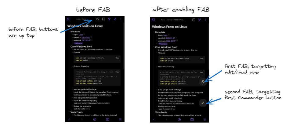
I’m not sure abt uri but any command u can add the button using Commander plugin should be doable. As per my original post, I have two FAB as my setup with second FAB is the custom button for opening random notes.
You just need to tweak the CSS a bit to target that button. I’ll share the snippets later
Thank you, that would be great!
About the second FAB, I wasn’t able to figure out how to get that to display. Didn’t show in the commander plug-in, if that was the idea.
Looking forward to your snippets!
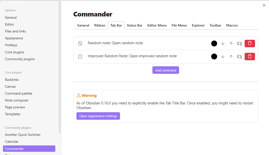
just a bit of background, i use this approach coz i cannot figure if obsidian side ribbon can be repositioned in phone view. i found using Commander plugin and adding Tab Bar buttons let’s me have custom function button positioned in note’s view for easy access.
Commander plugin button
install Commander plugin and add Tab Bar button. it’s the only button i know how to reposition them easily.
use the updated snippet below and once enable you should have two FAB.
adjust the --lst-fab1-view-y for the edit/view button and --lst-fab2-view-y for the first Commander Tab Bar button.
change 1 of .cmdr-page-header to 2 of .cmdr-page-header if you want the 2nd Commander button instead of the first one. if i were to do this, it would FAB the “Improved Random Note” instead of “Random Note”
change the color property to your preferred color. since Commander uses js to color the button, i’m just too lazy and put !important for the Commander FAB. or you can use the Commander settings to change the color that matches your other FAB
if you don’t need any of the other button, you can simply comment it out.
/* === Floating Action Button FAB V3 === */
/* FAB option allow to select which Page Header button to be used for FAB 2nd button */

/* declare variables to be used for easy customisation
   other than these variables, other variables are obsidian's pre-defined */
body.is-mobile .view-action {
	--lst-fab1-view-y: 10vh;   /* set to 0 for flushed bottom position */
    --lst-fab2-view-y: 30vh;   /* set to 0 for flushed bottom position */
	--lst-fab-view-x: 2vw;   /* set to 0 for flushed right position */
	--lst-fab-button-size: 60px;   /* set button box size */
	--lst-fab-button-radius: calc(var(--lst-fab-button-size) / 3);   /* divide 3 for square circle, divide 2 for circle */
}

/* make the button "floating" and define customisation */
body.is-mobile div.view-actions > .view-action[aria-label^="Current view"] {
    color: lightyellow;
    position: absolute;
	top: calc(88vh - var(--lst-fab1-view-y));
	right: calc(0vw + var(--lst-fab-view-x));
	width: var(--lst-fab-button-size);
	aspect-ratio: 1;
	border-radius: var(--lst-fab-button-radius);
	background-color: var(--background-secondary);
	box-shadow: 0px 0px var(--size-4-2) rgba(0,0,0,0.3);
}

/* make the 1st added commander button as FAB as well. change 1 to 2 for 2nd commander button */
body.is-mobile div.view-actions > .view-action:nth-child(1 of .cmdr-page-header) {
    color: lightyellow !important;
    position: absolute;
	top: calc(88vh - var(--lst-fab2-view-y));
	right: calc(0vw + var(--lst-fab-view-x));
	width: var(--lst-fab-button-size);
	aspect-ratio: 1;
	border-radius: var(--lst-fab-button-radius);
	background-color: var(--background-secondary);
	box-shadow: 0px 0px var(--size-4-2) rgba(0,0,0,0.3);
}

/* make sure FAB is higher than backlinks control */
body.is-mobile .view-header {
	z-index: 2;
}

/* change background-color when hover */
body.is-mobile div.view-actions > .view-action.clickable-icon:hover {
	background-color: var(--background-accent);
}
In case it’s interesting for someone, this is my use case: The FAB opens my pinned home note, and the ribbon button underneath closes the current note. I find this to enable the most pleasant way of navigating around notes on mobile.
I keep my home note pinned in tab 1 [actually, it’s not the home note but a more flexible one called “currently open tabs”, which is everything I have in current rotation OR want to have handy.]
The FAB opens the command “Go to tab #1”, so I go back to my pinned home note
I used commander to modify the ribbon button, so that now it closes the current tab
I’m still loving this action button.
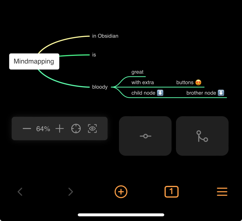
In fact I added a second one, so that I have buttons for child node and brother node when mind mapping in markmind on the phone.
Using chatgpt I changed the positioning of the buttons a little so that they are on the right place when the keyboard is shown.
Unfortunately, the new update to the app broke the FAB. I was able to tweak it for my phone (Moto 5G 2023). It appeared to be missing, but really it was off the screen. So I changed the line
--lst-fab-view-y: calc(100vh - 120px);
to:
--lst-fab-view-y: calc(100vh - 210px);
There are three remaining problems. First, the positioning is not great in landscape mode, but that’s not a big deal. Second, and more annoying, the button no longer hovers above the on-screen keyboard when the keyboard is activated. That makes it necessary to hide the keyboard to then click the button, which is slightly annoying. Third, and I think relatedly, sometimes an empty bar will appear above the on-screen keyboard.
I’m not good enough with css to figure out how to fix for these issues.