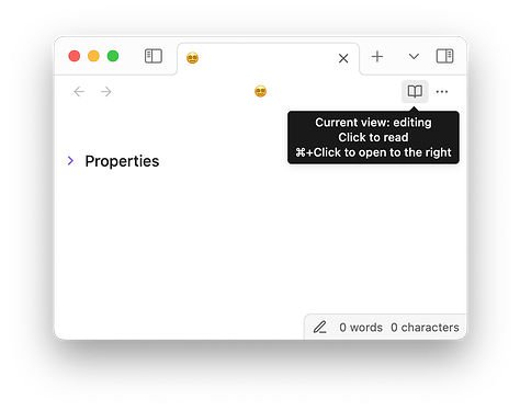
Use case or problem
With ‘Show editing mode in status bar’ set to ON in Editor settings, three problems arise:
- While the icon in the status bar reflects the current view, the top-right icon shows the mode you will switch to if you press it. Visually, the two icons conflict, which often leads to confusion, even if you’re an experienced user. (“Wait, what mode am I in again? Am I reading or editing?”) This is poor design. This sentiment is shared, for example, here and here.
- There’s no reason why these two toggles should be separate at all as they accomplish the same function; the second button is redundant. (Currently, the top-right toggle offers a binary choice of ‘Reading’ vs ‘Live Preview’, while the status bar toggle also offers “Source mode”.)
- It takes an additional click to switch to source mode, when a single click should do.
)
Proposed solution
All three of these issues would be solved by a segmented button. Here’s a quick mock-up:
![]()
Ideally, one should be able to configure to display it in either top right or in the status bar.
