source: A look into Heptabase's split writing experience | Reorx's Forge
Heptabase is the most promising note-taking app for me in recent years. The idea of combining bi-directional links, cards, and whiteboards together is mind-blowing. The word note-taking or knowledge base is not accurate to define it, in fact, it’s more like a tool that aims for boosting the process of thinking.
Traditional note-taking tools are keen on providing more than enough ways for dumping your thoughts into notes, but lack methodologies on how to retrieve and use notes. The way Heptabase organizes and interacts with the data is what really empowers the user to think and write more efficiently.
Back to the video at the beginning, after watching it I noticed a very interesting feature. I can’t stop thinking of it and really wish to have something similar in other note-taking or PMK tools like Obsidian (yeah, I’m an Obsidian fan).
The feature
Here’s the walk though of that amazing feature:
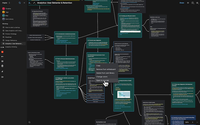
- On a whiteboard, select several cards you would like to refer to
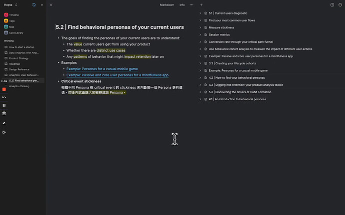
- Right-click on them and choose “Open in new tab”, a new page with a left-right split layout appears. The first card selected shows on the left; others show on the right as a folded list.
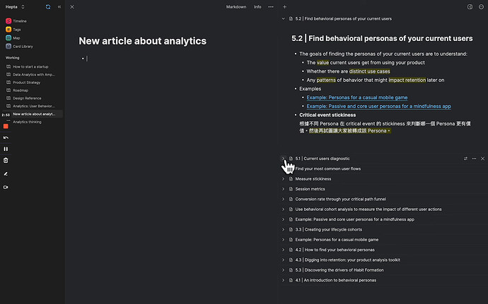
- Click on the
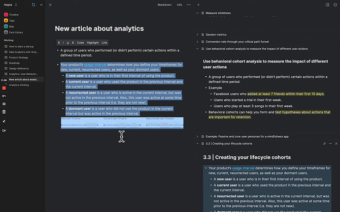
+sign button on the top menu bar; a new card is created on the left side, and the card that previously shows on the left is automatically moved to the card list on the right. - You can fold/unfold notes while browsing the right side, and drag’n drop blocks to copy them to the left side.
This is the best way I’ve ever seen to think and write a note while referring to many other notes. In other note-taking tools, take Obsidian for example, I can split the panes, but it is not convenient to organize the workspace well for more than 3 notes. As new panes are growing, it will become more and more interruptive to switch back and forth.
Even if I managed to build up a tidy workspace, it’s still very frustrating to switch to another context. Obsidian has the functionality to manage workspaces, but you have to manually save before switching, otherwise, the context will be missing. In Heptabase, all the workspaces are clearly shown in the sidebar, switching around is fast and easy as a breath.
Conclusion
It’s a shock to me how easy and intuitive it could be in Heptabase to create a workspace and focus on writing. I believe anybody with note-taking experience could learn something from Heptabase’s design.
Obsidian is still the best PKM tool for me. I’m going to create a plugin to achieve a similar workflow in Obsidian, possibly by creating a special pane that can add and show notes in an accordion. Stay tuned for the updates.


