Your favourite fonts choice and why? thread

Yeah, that could be it. I just installed this single variable font. But it may work differently on windows. Like you said, you may have to use one of those other font names

1 Like

I just love it. I spend a lot of time in terminals and I just prefer monospace type in general. I like Karla as well, someone mentioned that already.

I like Operator Mono as well. Especially Italic.

1 Like

Obsidian is good I’m also using it. My most favourite one is Open Sans because I offer typography services and most of my clients like it. I also like to explore other fonts. Sometimes I also use Soin Sans Pro for headings and Georgia for body text.

I use “Ivy Mode” for Heading and Vault fonts, “Recursive Sans Casual” for normal text, and “Recursive Mono Casual” for code. The reason for these selections is because they appear easily readable to me.

3 Likes

I really like the Cascadia Mono Font:

2 Likes

I was about to start a typography topic, but I’m glad to find there’s already one open. I was unaware there had been such development in the market of monospace fonts, and I really want to try some of the ones you guys suggested.

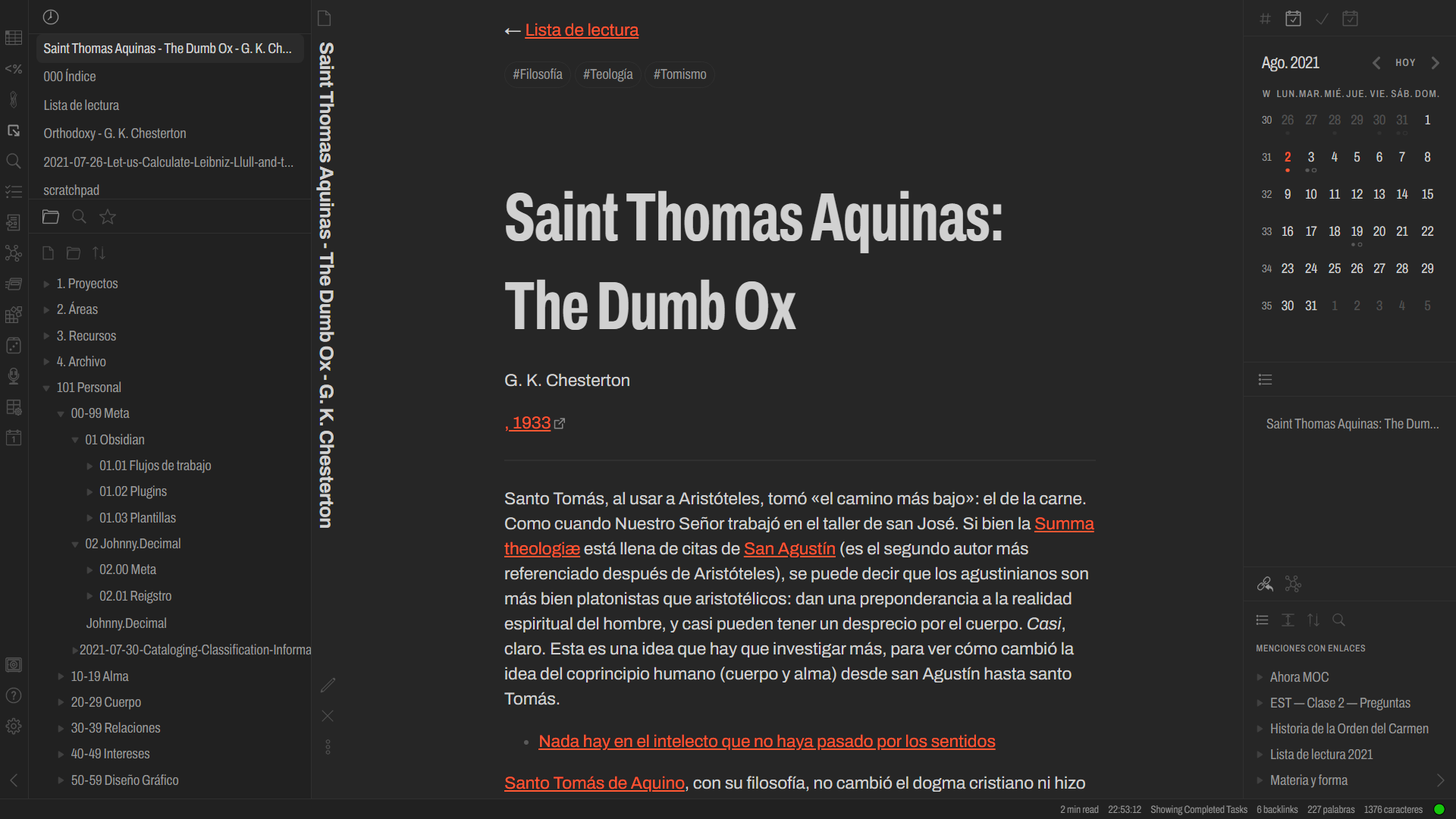
I’m somewhat of a typography nerd and I have two rather opinionated looks which I’ve been really enjoying lately: the first is Times New Roman, with an all white theme and those 1991 HTML vibes. This is basically my palate cleanser, because I tend to spend lots of time customizing Obsidian just because I can, which can be rather distracting and time consuming. I tend to revert to this when I have a font-related itch and I just don’t have time to fix the CSS or try a newer and fresher typeface.

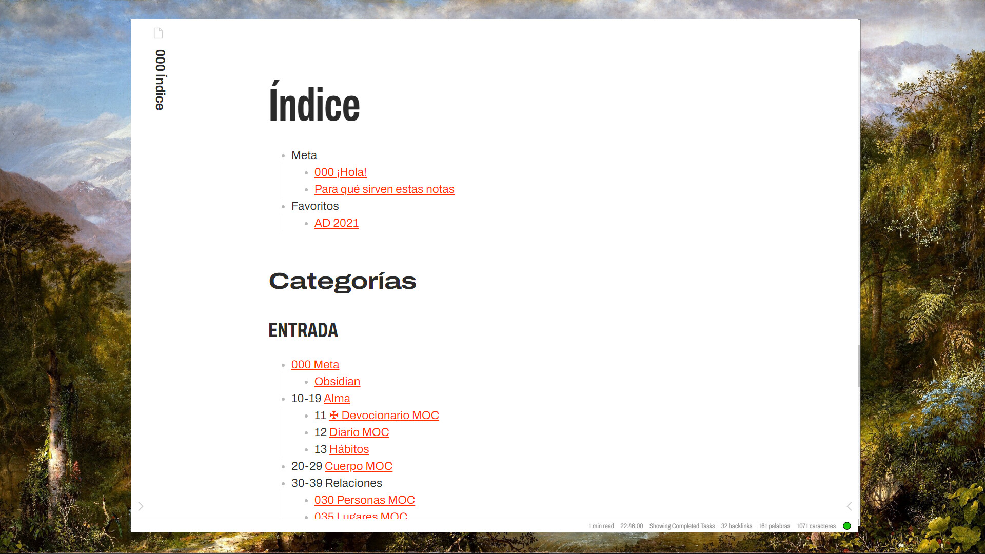
And my actual favorite vault font as of now is Archivo, an amazing grotesque sans-serif by an Argentinian type-foundry. I love it because it has a lot of weight and width variants, so I set it up to:

  • Extra Condensed for my h1, because I tend to use phrases (like Nick suggests) and this allows me to fit them in less lines.
    • I also use Extra Condensed for the UI, which is the real game changer, because I work on a small 17" monitor and this allows me to keep my sidebars really narrow. When I’m working fullscreen, I get to have them both open at the same time without affecting the line width of my main note.
  • Expanded for the h2 and Extra Condensed uppercase for h3, so I can easily differentiate them without huge point size differences.
  • Regular for my text, because I don’t like getting fancy with my body text, and Archivo has a good x-height which makes for great readability.

1 Like

@AtrusRiven : I have read that elsewhere a number of times, but I do not agree with it. I recently discovered Monaco and really like it in Edt and in Preview mode. In fact, I find a lot easier to read than any variable width font.

In my browser I use the Dark Reader extension, in which you can choose the font that web pages are rendered in. Guess what …… I chose Monaco.

Sorry, for the rant, but I think monospaced fonts are dismissed too easily as not being suitable for Preview.

1 Like

I use Minimal Theme and iA Mono for the font.

Reason? I love iA Writer and now I can use Obsidian with the same feeling as I am using iA Writer!

Thanks for you opinion. Of course you can have a distinct preference. I just referred to

  1. the design intention of monospaced fonts
  2. which is based on the assumption that fonts with equal character spacing are much more difficult to read for the ordinary user. Different spacings are a problem for the orientation of the eyes along the line (keywords: spacing and kerning). The more text you use the more difficult it get. Basically it’s the same for you but evntually you have another preference based on another use case.

I don’t know Monaco but eventually it’s a middle way and not a “pure” monospaced font?

@AtrusRiven I experimented with 2 more monospaced fonts, Space Mono and MonoLisa, which are both also very pleasant fonts to use. I have a slight preference now for the latter because of how it renders certain symbols.

Whether Monaco is not a pure monospaced font might be true because, although better than variable width fonts, I found it not quite a pleasant as Space Mono and MonolLisa.

I find that when I use one of the monospaced fonts my eyes do not hurt anymore at the end of a day. I find them a lot more calming because the letters are wider spaced from one another, and consistent.

With a variable width fonts I find I have to make more of an effort to read, even having to squint a bit at times.

I used to hate monospaced, and whenever an Obsidian theme I tried out had a monospaced font for Edit mode, I used to change it immediately to the variable width font of Preview - also for the WYSIWYG experience. I now do the inverse: MonoLisa for both Edit and Preview.

Be that as it may, most people will disagree with me, much preferring a variable width font any time.

1 Like

Ranille - display font, reminds me of vibrant family-friendly 80s; great for titles.
Harlow Solid - display font, very pretty cursive that looks especially great for writing species’ scientific name;
Quicksand - sans-serif, very sleek but with some nice details; great for UI.
Petrona - serif, in my opinion by far the best font for reading, and the most good-looking (especially italics).

Can you please do an export from the style settings plugin? Thanks :slight_smile:

Firstly, thanks for sharing this - It would not have occurred to me to google something of this nature. I wonder how you even came across it / the subject line?

All the personal vanity aside for preferences, should this not be the ideal for most people given its been primed for that?

e.g. Yellow / Orange used for emergency / hazard safety - Is yellow the most conspicuous color? - Skeptics Stack Exchange.

Is this the first they have worked on and selected or have/ had they made some kind of preferred short list before this. I am sure before they designed this, they must’ve studied a bunch of candidates to take from.

Sky-blue Verdana text on a black background.
Feels like writing in a dream.

And short line-height to compress the paragraphs.

p { 
font-family: Verdana,Geneva,sans-serif !important; 
color: #b9f2ff !important; line-height: 17pt; 
font-size: 1.2rem; font-weight: 500 !important; }

Verdana is subtly-artistic and very readable.

4 Likes

@Chetachi I’ve been using Karla for about a week now, what a game changer! I love this font. It’s really easy to read but also has relaxed feel to it that almost reminds me of handwriting, perfect for notes.

Now I just need to find a UI font that I love.

1 Like

Here are my personal top 7:

  1. All the iA Writer fonts! Especially iA Serif. It’s beautiful, enables fast reading, and the letter Q looks so elegant. I love it.
  2. Spectral - It just looks nice.
  3. Readex Pro (Lexend) - It is nearly as legible as a serif font. It’s also very prominent-looking. Great for headings and body text.
  4. Courier Prime Sans - It’s sooooo…I can’t describe it. Cozy? Friendly? I think it’s pretty impressive that one font can evoke such…calmness. I like to use it for screenwriting.
  5. Klee One - It looks okay in English, but I think it’s a great Japanese font. Very smooth and clean looking.
  6. Noto Serif - Looks like a generic serif font. But it’s pretty, it’s clean, it’s easy to read. Noto Serif JP is also good for the same reasons.
  7. UD Digi Kyokasho - A round font with hand-drawn charm. This used to be my main font. To me, it looks perfect in English and Japanese.

And then Lucida Sans is just…ahhh. It’s not particularly legible or anything, but I see it and say…“Ahhhh.” I don’t understand how, but it’s just so beautiful.

5 Likes

Hi, I have a css that contain like:

@import
url('https://fonts.googleapis.com/css2?family=JetBrains+Mono:ital,wght@0,100;0,200;0,300;0,400;0,500;0,600;0,70$

Then I just go on Obsidian settings and type “JetBrains Mono” inside interface font and it works across all devices without having to install the font.

But when a font isn’t provided by google that does not work, I tried

@import
url('https://github repo link....')

But Obsidian does not recognise the font. Any hint since most of the amazing fonts you shared are on githib?

Thank’s

@import doesn’t work with fonts on Github. There are three ways of solving this that I can think of right now:

  1. Do what this person did to use fonts on Github. Seems kind of complicated to me, though.
  2. Download the fonts from Github to your computer (although, you may not be able to do this for other devices)
  3. My recommendation is to embed the font in a CSS file. I’ve done this a few times for Obsidian themes.
    1. Download the fonts you want to use.
    2. Use this website to generate a stylesheet for you with the font files you downloaded. Make sure you turn Base64-encode on. Then, paste the generated file’s content into a CSS snippet, and the font should be available. You might have to do some tweaking with font names (for example, making sure all of the ‘iA Serif’ variants are named ‘iA Serif’ rather than being ‘iA Serif Bold’, 'iA Serif Italic).
2 Likes

Works just flawlessly!!! Thank’s

I am looking for such font at the moment, experimenting. In case you found, plz let me know :slightly_smiling_face: