Overview
I know a lot of people in this community say: “The graph looks great, but it’s useless.”
I’m here to say: you’re all wrong.
If you find the graph useless, it’s very likely because you just don’t know how to use it yet.
Before you rush to argue, I need to raise an important point of divergence—
When we talk about the graph, we should split it into two parts:
- Graph View, aka the global graph
- Local Graph
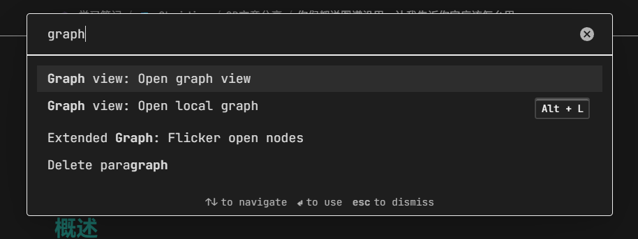
Now, let’s set off down this forking little path.
Mysterious sound effects representing the journey unfold
Local Graph
You have chosen the first path!
Not bad, it’s a easy one.
Quick, follow my steps.
Trust me—the local graph is an absolute treasure.
Unlike that giant global graph view crammed with nodes, the local graph only shows the nodes related to your current note.
It is a visualization of your bidirectional links.
Its information is constrained, refined, and easy to focus on.
Compared to a flashy blob of thousands of little dots, “which notes the current note links to” is far more meaningful.

Sorry for the language, but translating my notes’ names is kind of troublesome

The whole point of using the graph is this:
selectively surface the information that actually brings you value.
The traditional two link panes are still useful, of course, but if you want a more intuitive view, check out this difference:
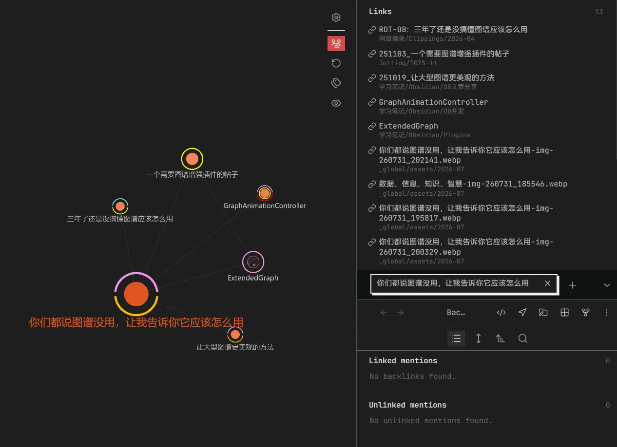
On the left is the link relationship in graph form, on the right is the traditional link pane. Both describe “the connections of the current note.”
Tips
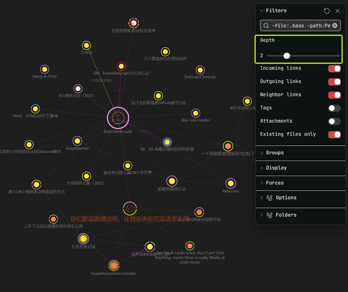
When you feel the local graph is showing too little, you can adjust the Depth—try increasing it to 2 or 3—but not too much, or you’ll sink into a swamp of cluttered information.
The right amount of depth lets you take in a limited, expanded set of information and look at a wider range of “the tangled relationships between notes.”
Besides, the local graph is an independent tab, so you can place it in a sidebar.
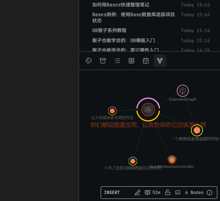
Personally, I keep it in the bottom-right corner
When I’m writing a note (like this very article), I’ll glance at the related notes through the small sidebar window.
When needed, I move my mouse over, zoom, look, and click to jump to a related note.
When you’re writing a note and need to rely on some related notes for reference or citation, you’ll realize just how handy this little thing is.
Bonus
I know what you want to ask.
“Why does my graph look different from yours?”
The answer is: ExtendedGraph.
The one true god of graph plugins. I even wish the official team would consider adopting this plugin, even though it might feel too heavy for lightweight users.
It can give your graph a total makeover—
Without it, the graph looks like this:
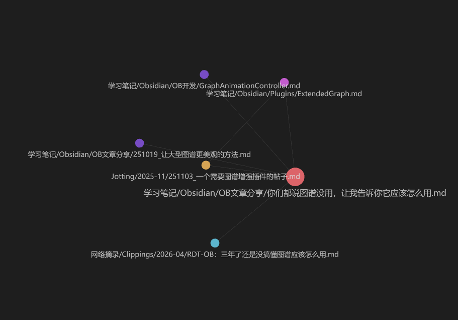
Original appearance of local graph
With it—see every image in this article. 
It can:
Shorten your display names, show images inside nodes, customize node color and size rules, display specific properties or tags as a ring around nodes, change node shapes and link styles…
Beyond the visual improvements, it can also store your graph configurations for quick switching, show node relationships in layers, or display the folder a node lives in—and so on, the list goes on.
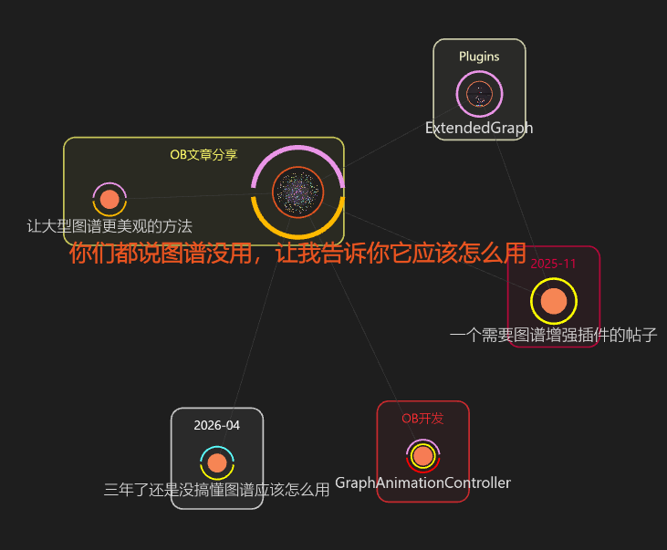
In short:
it can turn the graph into a genuine Graph Pro Max. 
Global Graph
It seems you’ve completed the first path—how did it feel?
Now it’s time to embark on the second journey. Watch your step, for this road will be a bit bumpy.
OK, now we get to the real issue—
Graph View, or rather, the global graph.
The most maligned “beautiful but useless” feature.
Let’s look at a concrete example.
This is my graph:
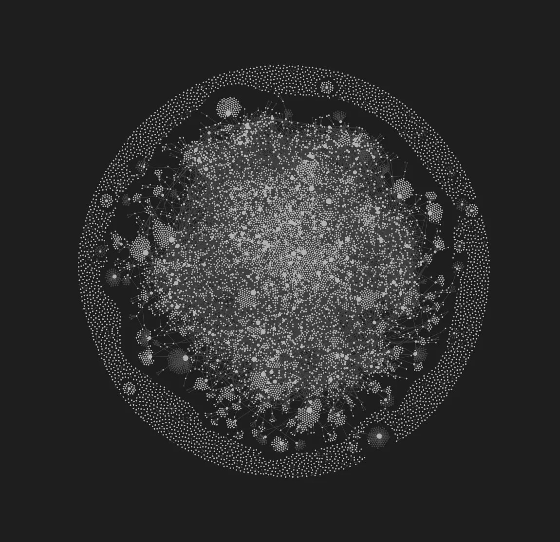
Is a graph like this useful?
No. Because it lacks real information density.
It has a lot of “data”—thousands of nodes—but it doesn’t “carry information.” Or rather, amidst such a dense mass of data, it’s nearly impossible for you to effectively absorb any information.
Data that can’t be distilled and organized is just data—not information, let alone knowledge.
According to this famous diagram—
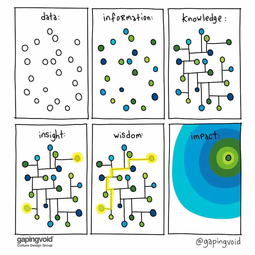
We need to classify, filter, and organize data before we can possibly gain insight.
Now, look at this:
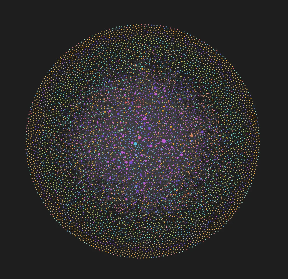
This is also my graph. From the very same vault.
If I tell you that the deep purple notes are Obsidian-related and the light purple notes are about Obsidian plugins, what information can you extract?
—“This guy is an Obsidian fanatic.”
Exactly, which is also why I write these kinds of nerdy articles for you here 
But you see, doesn’t this organized data give you effective information?
When we take messy, massive amounts of data, filter and classify it by certain criteria, information and insight condense and take shape.
If you can feel this level of “effect”, then you can continue reading.
Otherwise, stop here, save your time, and do something more meaningful.
How to Do It - Clean Up First
For the global graph, the first step is: Filter.
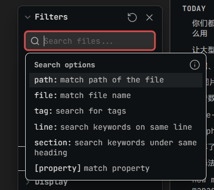
Filter out those periodic notes (unless you genuinely need them), filter out the random articles and videos clipped from the web, filter out the notes you don’t really care about right now… What’s left is the qualified raw material.
Use the
-symbol to exclude things. For example,-path: xxxexcludes notes in the xxx path, and-tag: uselessexcludes a specific tag. See Obsidian’s search syntax for details.
In fact, you can even do the reverse first— Directly use path: My ideas to restrict it to a specific folder, to get a feel for a more “pure” global graph.
For example, this is my “Resources” folder. Compared to the full-vault view, doesn’t this look much cleaner?
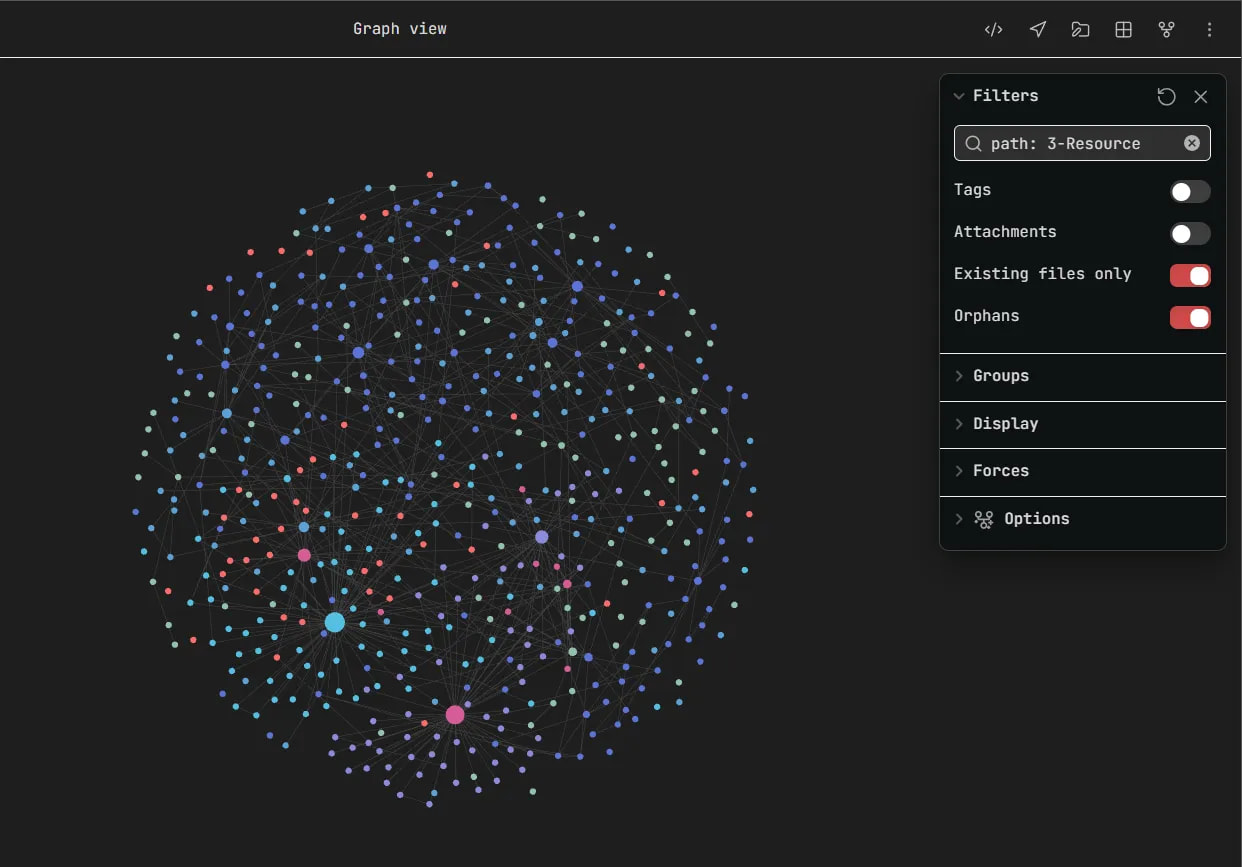
Very often, if you want to gain information, you first need to reduce information. When weeds fill your field of view, how can you appreciate the flowers?
Then, Start Classifying
Step two: Grouping.
While grouping, the group color scheme helps you understand what type these notes belong to.
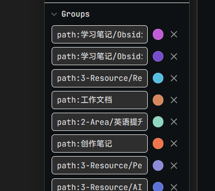
Here too you use search syntax, which can be based on path, tags, or filename keywords.
 Here’s a little tip:
Go from large to small—first add groups to the largest-volume notes, then temporarily filter them out, and keep grouping what remains.
This will make your grouping process much easier—and a lot of fun—it’s like some kind of coloring game!
(I might post a dedicated thread later to describe the details.)
Typically, once you’ve completed this step, you can glean macro-level information about your own vault from the global graph:
What kinds of notes you’re actually taking, and how your notes cluster together.
Going even further, you can look at it from a historical dimension:
At a specific point in time, what did your note composition look like? And after a year, what has changed in your vault?

In this process, how have the focal points of your life shifted?
And what kind of trend does your work content show?
Many people say, “notes are a second brain.”
Well then, these are slices of your brain at different points in time.
A single slice may be unremarkable, but when stacked together, you’ll see the growth rings of time.
If you’re willing to observe and reflect, I believe you’ll produce valuable insights.
This feature requires a new plugin I’m currently developing, which I’m not ready to release yet.
Time To FOCUS
Step three: Focus
The size of a graph node depends on the number of its links—the bigger the node, the more links.
You can freely browse by interest—pick a larger node, or pick one at random, and look at its note relationships.
If you want to focus on a specific note—use Extended Graph’s “Zoom on note” feature, which can help you quickly locate a particular note:
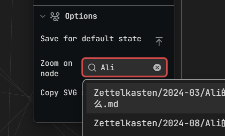
Another little tip: While left-click-dragging a node, you can use the mouse wheel to zoom the graph out very, very small, and then—relying on the power of physics—pull it to the edge of the graph, dragging all its related notes along with it.

This way, you can comfortably examine its relationship network.
Then, think about these questions:
- What type of node is it?
- What types of nodes are connected to it? And why are they connected?
- Which node is closest to it? Which is farthest?
If you follow its threads outward, what new central node does it point to?
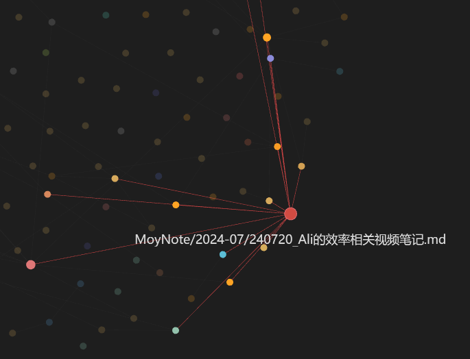
When you unfold your exploration around a specific node, you’ll get a different feeling.
Tips
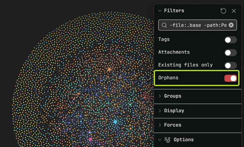
You can hide orphan nodes here, helping yourself filter out the “connected” nodes.
You can also toggle Orphans on and off to make all isolated nodes show up at the outermost layer.
Then, you can flip through the orphan note nodes and see what characteristics they show, whether they have anything in common.
If a lot of notes have absolutely no links, then ask yourself:
Are these notes useful? Or are they just piles of scrap paper tossed into the vault and never looked at or edited again?

Disclaimer: I’m not saying that every note must have links. Like many of my English-learning notes—each one is a single learning case on its own, so being isolated is perfectly normal.
What I want to express is that the number of links is a reference indicator for judging the nature of a note.
Something I Must Clarify
 Please note: When I say the “graph” is useful, I don’t mean it can give you some kind of divine revelation that suddenly grants you enlightenment.
First, it itself depends heavily on link relationships—if your notes are all isolated, “finding relationships” is out of the question. Second, what I hope to share are some methods for extracting information from a global graph that is “nothing but pretty.”
It can’t utilitarianly guarantee “you will definitely get something,” but—if you give it a try, you might make some interesting discoveries.
It’s like a jungle—if you plunge in blindly, you’ll only get lost in it. But if you have a compass and know how to find a path—you might discover treasure buried in the woods, or you might come up empty-handed.
Now, I’ve given you the compass.  As for the treasure—good luck!
Finally
I’m sorry I used such a seemingly controversial title and opening. I hope you won’t dislike this post because of it—at least don’t let it make you dislike the knowledge it contains (and the graph itself).
I used this bait so that more people would click in and take a look—and, if possible, so that some of you might discover the parts where the graph is actually useful.
Thanks for reading! If you have any opinions or thoughts, feel free to share them!