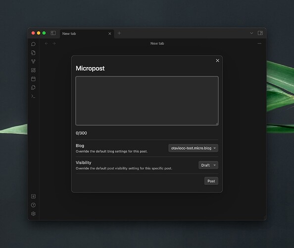
I have developed a plugin enabling users to publish and edit posts and pages on a Micro.blog hosted blog directly. I’m now integrating a “quick post” feature. This feature facilitates publishing microposts (posts under 300 characters) directly, without the need to create a note in Obsidian.
The interface uses a TextAreaComponent, but I’m encountering two issues:
- Mobile Issue: On mobile, when the text area is focused, its height is not maintained. It collapses to a single line, which is not the intended behavior.
- Desktop Issue: The text area is resizable on desktop, achieved by dragging the corner. I would like to disable this feature to maintain a uniform appearance.
My specific questions are:
- Primary Concern: How can I set the text area’s height so that it remains consistent on mobile, even when focused?
- Secondary Concern: Is there a method to prevent users from resizing the text area on the desktop version?
For reference, this is the code I currently have:
new TextAreaComponent(contentEl)
    .setValue(this.viewModel.content)
    .onChange(value => {
        this.viewModel.content = value
    })
    .then(textArea => {
        textArea.inputEl.style.width = "100%";
        textArea.inputEl.rows = 10;
    })
Thank you for your assistance!
Cheers,
OC
