I’m not sure if this is a bug, a feature request, or just a comment: the word counter widget at the bottom right obscures the last part of the bottom line. This is annoying if I have to think and then check where I was. For me, it would be OK if I could collapse/expand the word counter. But it isn’t a big problem.
I haven’t used custom CSS, so I don’t know if that might solve this.
Can you post a screenshot? That doesn’t sound right.
And what theme are you using? (make sure to update your installer, and themes and plugins. That might help.)
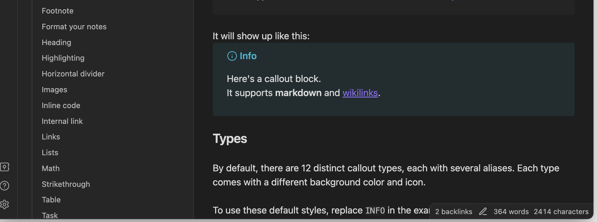
I think they mean this:
Fresh Sandbox vault, default theme, restricted mode.
I usually run Quick Explorer which fills out the bottom status bar, but I’ve noticed this a few times in the Sandbox vault or playing with a test vault.
@pumpapa I suppose you can make your Obsidian window bigger (to keep it off to the right of your writing area). This only seems to happen with a smaller window.
1 Like
Oh yeah, my mistake sorry. I see what you mean now.
I also have “Quick Explorer” installed, which makes a full screen status bar. I didn’t know it was doing that.
1 Like
I use this snippet to only make the statusbar appear when hovering as I don’t need to see it all the time, maybe that’s of use to you:
/* <<------- Statusbar in bottom right corner (hover only) ------>> */
	.status-bar {
		opacity: 0;
	}
	.status-bar:hover {
		opacity: 1;
	}
3 Likes
Wow. Haven’t used this forum before, and I must say: all your replies are useful and to the point.
I hadn’t used custom CSS yet, but this was as good a reason as any, so now I have and works like a charm.
Also, I hadn’t looked at Quick Explorer, but now I have.
Thanks all! ![]()
![]()
1 Like
This topic was automatically closed 7 days after the last reply. New replies are no longer allowed.