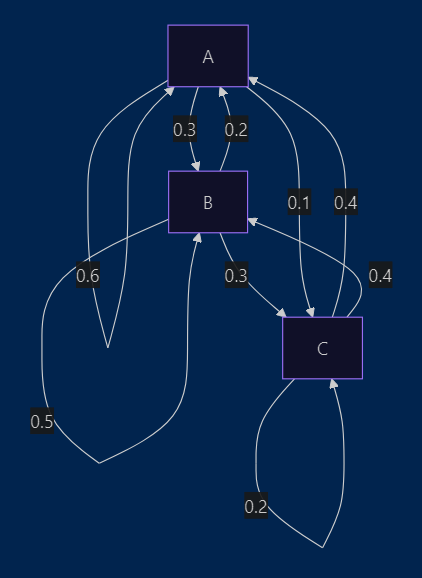
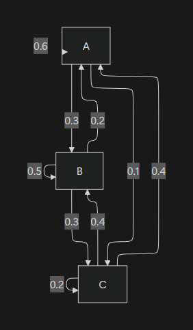
Hi everyone, I’ve been working with Mermaid diagrams in both Notion and Obsidian, and I’ve noticed that Notion consistently renders them in a more visually structured and polished way — especially when it comes to node spacing, alignment, and overall layout clarity.
In contrast, Obsidian’s Mermaid rendering often feels more compressed or uneven, even when using the same code.
Here’s what I’m trying to understand:
- What causes this difference in rendering between Notion and Obsidian?
- Is Notion using a custom Mermaid renderer or layout engine?
- How can I achieve similarly clean and orderly Mermaid diagrams inside Obsidian?
I’ve attached two examples below — one from Notion and one from Obsidian — using the same Mermaid code. I’d love to hear any tips, CSS tweaks, or rendering strategies that could help improve Obsidian’s output.
Thanks in advance!
```mermaid
graph TD
    A -- 0.6 --> A
    A -- 0.3 --> B
    B -- 0.5 --> B
    B -- 0.3 --> C
    B -- 0.2 --> A
    C -- 0.4 --> A
    C -- 0.4 --> B
    A -- 0.1 --> C
    C -- 0.2 --> C