I want to add some styling to callouts, so I created the css snippet to add the borders to them. It’s simple snippet than doesn’t supposed to break anything. But for some reason it results in some weird overlapping of callouts if there are several of them in the note. It only happens in live preview and I noticed this on mobile (I’m not currently able to check if this happens on desktop too). Edited: it doesn’t seem to happen on desktop, as far as I can see.
Steps to reproduce
- Create the note with several callouts, like this:
> [!note]
> Text

> [!example]
> Text

> [!todo]
> Text

> [!danger]
> Text

> [!bug]
> Text

> [!summary]
> Text

> [!tip]
> Text

> [!example]
> Text

> [!note]
> Text

> [!danger]
> Text
- Turn on the snippet:
.callout {
    border: 1px solid rgba(var(--callout-color), 0.5);
}
- Go to the live preview on mobile and scroll a little bit.
Did you follow the troubleshooting guide? [Y]
I created the new vault without any plugins and themes, and only added this one snippet to it. The bug persists.
Expected result
I expected to see the normal callouts with borders.
Actual result
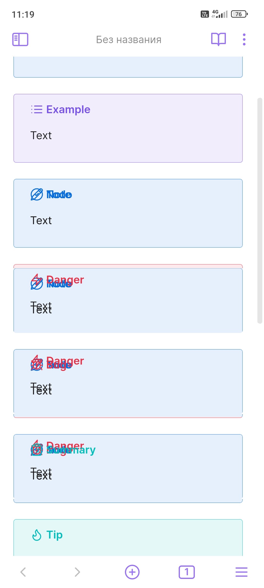
Callouts get borders as expected, but also weirdly messed up:
Environment
SYSTEM INFO:
Operating system: android 14 (Xiaomi 23030RAC7Y)
Obsidian version: 1.5.8 (126)
API version: v1.5.8
Login status: not logged in
Live preview: on
Base theme: adapt to system
Community theme: none
Snippets enabled: 1
Restricted mode: on
Additional information
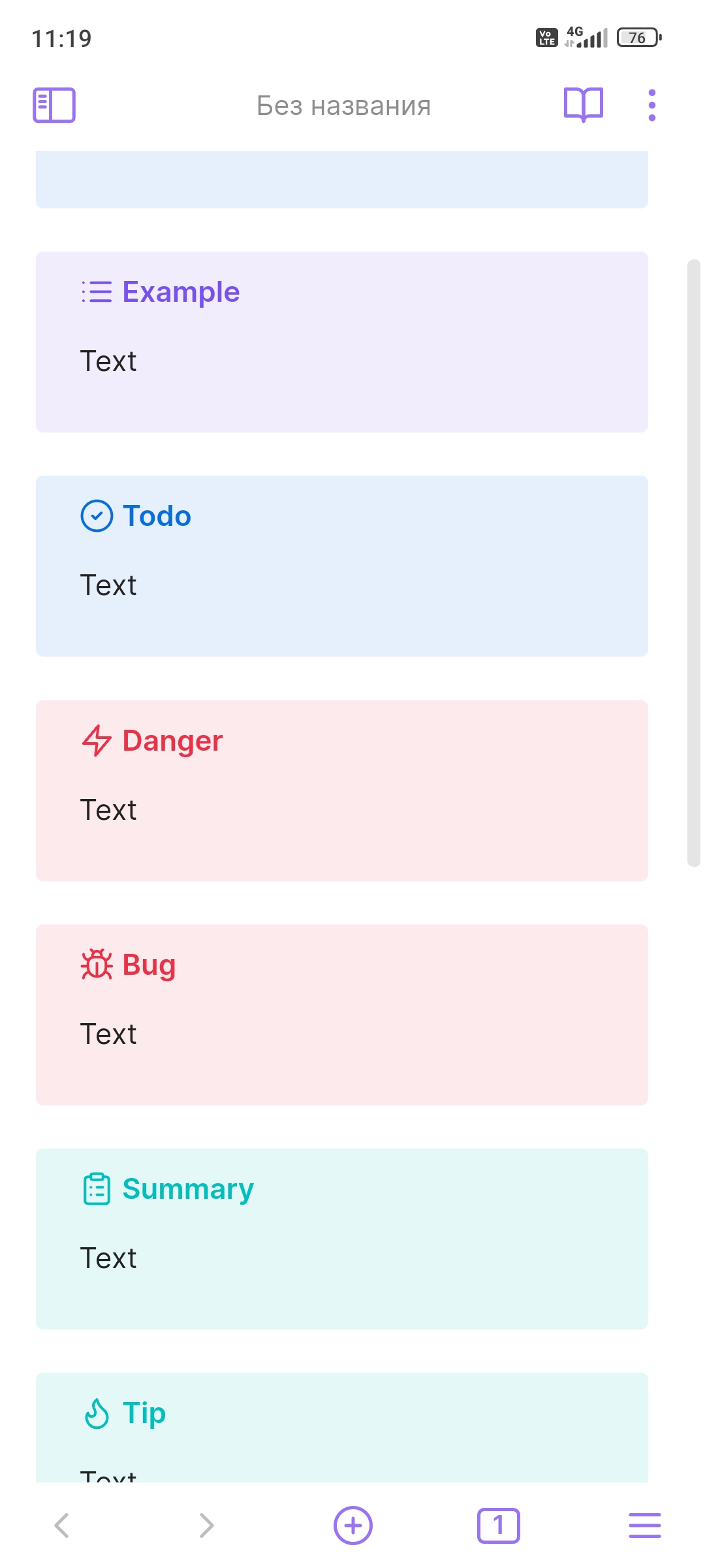
If I turn the snippet off, callouts look normal, like this:
I’m not sure if I should post it in bug section or in the developers section, but I decided to post it here, because it’s seems to be the problem with Obsidian itself, not with the css.