Use snippet and css variables to change background color

What I’m trying to do

alter appearance for individual notes using snippets and CSS variables

Things I have tried

I put the file myclass.css into .obsidian/snippets, enabled it in the settings and put cssclasses: [myclass] in the frontmatter of a test note.

myclass.css contains:

.myclass {
    --text-normal: #cccccc;
    --h1-color: #00cc00;
    --background-primary: #0f0f23;
}

The text color and color of the headings change as expected, but --background-primary has no effect.

I realize that I could do

body .myclass {
    background-color: #0f0f23;
}

which does change the background, but this breaks the style in multiple ways:

  • in editing mode, the cursor is not visible, independent of whether the rest of obsidian is in dark or light mode
  • in preview mode, callouts vanish completely if obsidian is in light mode

These things make no sense to me so my question is: how can I change the color of the background in a snippet, ideally using CSS variables, without breaking random other elements?

I haven’t seen a custom cssclass used with semantic colors before, but

body {
    --background-primary: orange;
}

works fine :smile: :tangerine: --background-primary is defined differently for light and dark themes and used all over the place, so even with a cssclass, it may affect more than you would like.

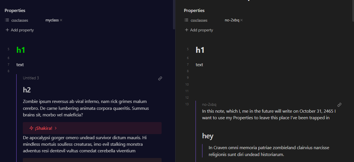
Instead of the body element, I would use .theme-dark to narrow down your .myclass so that it’s not spilling into the light theme, etc. That should get closer to where you want to be, I think.

.theme-dark .myclass {
    color: #cccccc;
    --text-normal: #cccccc;
    --h1-color: #00cc00;
    background-color: #0f0f23; 
}

Using this, the cursor is visible and callouts look fine (in both Live Preview and Reading view) for me.

There are a few other ways of doing this if you notice anything strange, but I checked in a few different themes and it looks alright.

edit: forgot to include color: #cccccc;


I’d recommend making a copy of the app.css (open the developer tools → Sources at the top → copy & paste it into a file) for yourself and start poking around if you are interested. A great guide is here if you haven’t seen it yet.

thank you a lot for your detailed answer!

yeah, setting --background-primary in body {.. works (minus the callout issue) but setting it in body .myclass {... it does not have any effect.

the thing is that I want certain notes to have that dark blue background no matter whether obsidian is in dark or light theme, so I’d have to add background-color: #0f0f23; to .theme-light .myclass { ... as well, which again breaks callouts (if in light mode and preview mode).

I guess I really have to fix it “manually” – thanks for the pointer to app.css!

1 Like

Got it. So callouts have blend modes ( --callout-blend-mode: ) depending on the light or dark theme. Forcing a dark background in the light theme messes that up. If we have them always follow what’s set for the dark theme in your .myclass, they should be alright without separating out theme-light and theme-dark.

The only strange thing I noticed was the text in Properties view being muted in the light theme. Added a quick fix for the time being.

.myclass {
    background-color: #0f0f23; 
    --callout-blend-mode: lighten;
    --text-normal: #cccccc;
    color: var(--text-normal);
    --h1-color: #00cc00;
}

.theme-light .myclass .metadata-content * {
    color: var(--text-normal);
}

If I was doing this, I would probably use something like this to be a bit more specific, but the results seem the same:

.workspace-leaf-content[data-type='markdown'] > .view-content .myclass {
    background-color: #0f0f23; 
    --callout-blend-mode: lighten;
    --text-normal: #cccccc;
    color: var(--text-normal);
    --h1-color: #00cc00;
}

.theme-light .myclass .metadata-content * {
    color: var(--text-normal);
}

Either way, a few things to play around with. :badminton:

fantastic. thank you!

This topic was automatically closed 7 days after the last reply. New replies are no longer allowed.