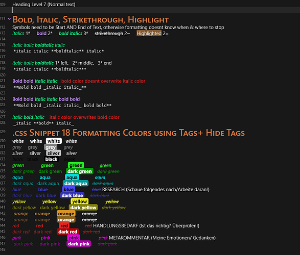
Use nested tag to manage 16 highlight colors,blod,italic

Features

  1. Use nested tag to easily manage(search/count) highlights text background, bold, italic with statistics on the tag panel.
  2. Toggle highlight nested tags in Editor mode by WYSIWYG editor css and Auto hide them in preview mode .
  3. 8 + 8 = 16 colors for higlight text ==background==, bold, italic.italic.

How to use

#h/COLOR_name

Highlight text background 
Highlight text bold 
Highlight text italic


#h/pink ==pink==

#h/pink **pink

#h/pink _pink_

Editor mode and Preview mode

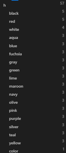
Highlight colors statistics

Highlight-text-background

Highlight-text-bold

Highlight-text-italic

Installation

  1. Download and move css file to /vault/.obsidian/snippets/ folder .
  2. Open Obsidianā€™s settings, go to Appearance.
  3. Active 8 + 8 highlight colors .

FAQ for code design

1 . Why donā€™t use html <mark> for highlight ?

Use <mark> need to hit many more times keyboard. <mark> ... </mark>
Not obvious statistics by typing color name to search.

2. Customize ā€˜#h/ā€™ ?

You can customize it, such as: # h-/pink, # hlt/red, # highlight/blue, # H/gray , # HLT/yellow, # h_/green, # HIGHLIGHT/lime, etc.

But #h/color is the balance option.
h is only one character and a lower case by without click ā€œshiftā€ key. Easy to remember and understand.

3. Why use nested tag ? Why not lessly typing ?

If donā€™t use nested tag, although we only need to type color name: pink, navy, lime, the color tags list is too long ,and mixed with other nested tag , and itā€™s not easy to manage color tags on the tag panel.

If use nested tag, all color tags are placed under the same ā€œhā€ parent tag. ā€œhā€ means highlight.

Itā€™s easy to search all pink color highlight contents in all pages, all blocks by just one click tag, and there are the highlight statistics on the tag panel.

4. Why add WYSIWYG editor css ?

If donā€™t use WYSIWYS edior css , the color tag always display. We use that css for toggle it.

5. If Obsidian have highlight toolbar in the future, Is this un-necessary ļ¼Ÿ

If Obisidan have highlight toolbar, AND allow ** search them by one click and have statistics** , This css snippet is not necessary any more.

But until today, thereā€™re no one toolbars can do both.

If Obisidan have highlight toolbar, AND Donā€™t allow search these highlight. This css snippet still works for easily search all highlight colors by just one click tag, and there are the highlight statistics on the tag panel.

6. Does ā€œ#h/ā€ conflict with '#h-'words tags ?

No conflict, you can download ā€˜#h-ā€™ words for testing.md .
No one hidden.

7. Imagining the best solution is ?

Probably I can imagine the best solution is toolbar will support nested tag for highlight without typing color name.

But until today, thereā€™re no one toolbars can search highlight colors by one click and have highlight colors statistics.

8. Is this the best solution ?

Compare all the things, using nested tag for manage highlights is the balance solution currently between creating highlight text background, bold, italic, search them, count them , hide nested tag , lessly typing and without 'h-'words conflict.

9. Bugs ? but not bugs

  1. Yellow color : In light theme, Every haze yellow background but perfect to hide text. You could change yellow to orange or others by css code. If you donā€™t know how to do, please feedback Iā€™ll build for you.

  2. If you use theme color is not dark or other colors like purple theme, pink theme, probably you have to change highlight colors for better looks. If you donā€™t know how to do, please feedback Iā€™ll build for you.

  3. After opened WYSIWYG css code for highlight, bold and italic.
    In editor mode, Itā€™s not much easy to select/copy texts by mouse and by ctrl + arrow keys, ctrl + shift + arrow keys. This is the WYSIWYGā€™s style, like Typora. but Default is opened it for looks good.
    In preview mode , you can still easy to select texts.

FAQ for highlight colors usage

Which highlight colors for specific contents ļ¼Ÿ

Do I need all 16 highlight colors ?

Nested tag colors confilct with highlight colors .

probably, You already have colorful tag or/and colorful nested tag.

such as

At this time, use colorful highlights for text background ,bold, italic.

The whole page looks very beautiful, but the colors make chaos, color chaos, right?

such as

How to distinguish different color text?

Itā€™s really hard to distinguish by eyes ,right?

Where the issue came from?

  • Is this issue about colors ? No, colors donā€™t do by themselves if you donā€™t use them.
  • Is this issue about so many colors ? No.
  • Is this issue about this css snippet ? No.

Probably, the problem came from nested tag and highlight color use different colors, Okay.

What looks like use the same colors for both nested tag and highlight?

Combine Nested tag colors and Highlight colors?

Such as

Hereā€™s code if you need :

Looks good, but still have many more colors.

Can solve this issue by build plugin?

Well, the plugin can solve issue that more easier to set what you want colors.

But the plugin canā€™t solve color chaos, right ?

How to solve color chaos issue?

How do I use nested tag with color and highligh color ?

In fact, I really rarely use tags, rarely use nested tag, so colorful tags and colorful nested tags are still rarely use. So , I donā€™t need colorful (nested) tags.

About highlight colors. Currently I just need to use 2 colors, white and black.

In the further, I wish I donā€™t use only 2 white and black highlight colors and also use white and black for highlight is temporary.

Yes, rarely use highlight colors is my final goal ,is my solution.

If I donā€™t use highlight colors , use what to highlight?

I use mind/heart to highlight text or background, not through code .

Why called 8 + 8 ? Why did I build 8 + 8 highlight colors?

This is the most valuable, interesting and mysterious thing.

And This is also why I built this css snippet after I discovered mysterious thing.

Download

8 + 8 highlight colors.css (11.0 KB)

Combine Nested tag colors and Highlight colors .css (5.6 KB)
20 Likes

@Steve_yang I appreciate you sharing this .css snippet with the community, itā€™s great for my purposes of color coding my notes. I am a beginner to CSS and Obsidian so please forgive me but I have a few questions regarding this snippet usage that I hope you can answer.

  1. I am not able to click on the last character (only the second to last character) when I am in editor mode after the highlighter formatting is done. Is there a way to enable clicking on the last character?

  2. Where in the CSS information will I be able to disable WYSIWYG in editor so I do not have to click to see the tag?

Thank you very much for this very helpful snippet that is perfect for how I write.

Best regards.

1 Like

Additionally, how could I change the .css to display a different color? Thank you for the help

  1. I donā€™t know. sorry.

  2. comment this code block:

/* Toggle highlight,strong,italic symbols div:not(.CodeMirror-activeline) > .CodeMirror-line span.cm-formatting-strong, div:not(.CodeMirror-activeline) > .CodeMirror-line span.cm-formatting-em, div:not(.CodeMirror-activeline) > .CodeMirror-line span.cm-formatting-highlight, div:not(.CodeMirror-activeline) > .CodeMirror-line span.cm-tag-hwhite, div:not(.CodeMirror-activeline) > .CodeMirror-line span.cm-tag-hblack, div:not(.CodeMirror-activeline) > .CodeMirror-line span.cm-tag-hred, div:not(.CodeMirror-activeline) > .CodeMirror-line span.cm-tag-haqua, div:not(.CodeMirror-activeline) > .CodeMirror-line span.cm-tag-hfuchsia, div:not(.CodeMirror-activeline) > .CodeMirror-line span.cm-tag-hpink, div:not(.CodeMirror-activeline) > .CodeMirror-line span.cm-tag-hgreen, div:not(.CodeMirror-activeline) > .CodeMirror-line span.cm-tag-hyellow, div:not(.CodeMirror-activeline) > .CodeMirror-line span.cm-tag-hblue, div:not(.CodeMirror-activeline) > .CodeMirror-line span.cm-tag-hgray, div:not(.CodeMirror-activeline) > .CodeMirror-line span.cm-tag-hsilver, div:not(.CodeMirror-activeline) > .CodeMirror-line span.cm-tag-hmaroon, div:not(.CodeMirror-activeline) > .CodeMirror-line span.cm-tag-hteal, div:not(.CodeMirror-activeline) > .CodeMirror-line span.cm-tag-hpurple, div:not(.CodeMirror-activeline) > .CodeMirror-line span.cm-tag-hlime, div:not(.CodeMirror-activeline) > .CodeMirror-line span.cm-tag-holive, div:not(.CodeMirror-activeline) > .CodeMirror-line span.cm-tag-hwhite, div:not(.CodeMirror-activeline) > .CodeMirror-line span.cm-tag-hnavy { display: none !important; position: relative; } */

  1. change color and background-color rgb value.
    RGB Color Codes Chart šŸŽØ
1 Like

@Steve_yang I appreciate your response and for helping me. I am really enjoying the snippet!

2 Likes

Thanks for this CSS!

About 1.

After ā€œ#h/ā€œ, the text and the cursor are out of position.

/* Toggle highlight colors */

display: none

ā†’ Isnā€™t this causing the cursor to shift?

Love your snippet! Itā€™s just what I was looking for, one of the last few things that were lacking for me in obsidian. Just one maybe dumb question :sweat_smile:, is there a way for the highlight tags to not be searchable? From what I read I understand why you did it this way but personally I donā€™t have a need for that and it makes my graph view a bit cluttered.
2 Likes

Sorry for bumping this thread,
but in order for this snippet to remove the #h/ in the new Live Preview one has to add the following to the beginning of the css file

div:not(.cm-active) > span.cm-tag-hwhite,
div:not(.cm-active) > span.cm-tag-hblack,
div:not(.cm-active) > span.cm-tag-hred,
div:not(.cm-active) > span.cm-tag-haqua,
div:not(.cm-active) > span.cm-tag-hfuchsia,
div:not(.cm-active) > span.cm-tag-hpink,
div:not(.cm-active) > span.cm-tag-hgreen,
div:not(.cm-active) > span.cm-tag-hyellow,
div:not(.cm-active) > span.cm-tag-hblue,
div:not(.cm-active) > span.cm-tag-hgray,
div:not(.cm-active) > span.cm-tag-hsilver,
div:not(.cm-active) > span.cm-tag-hmaroon,
div:not(.cm-active) > span.cm-tag-hteal,
div:not(.cm-active) > span.cm-tag-hpurple,
div:not(.cm-active) > span.cm-tag-hlime,
div:not(.cm-active) > span.cm-tag-holive,
div:not(.cm-active) > span.cm-tag-hwhite,
div:not(.cm-active) > span.cm-tag-hnavy
{
    display: none !important;
    position: relative;
}

There also is a bug, that there is an empty span in front of the highlighted text,
I donā€™t know whether this could be fixed with css.
Screenshot_2021-12-28_at_17.09.19

2 Likes

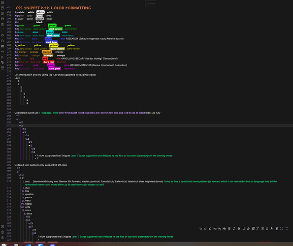
Coloring Text with minimal hidden letters that annoy you in live preview or unnecessarily enlarge your text size.

I changed it so that you only have to type "#+(1 or 2 letters)+* OR _ OR ==

Customised for Dark Mode; Colors supported:
w=white
s=silver
gr=grey
bl=black
r=red
dr=dark red
a=aqua
da=dark aqua
p=pink
dp=dark pink
g=green
dg=dark green
y=yellow
dy=dark yellow
b=blue
db=dark blue

My take on customizing Obsidian. However i want to further customize the 8+8 snippet but i dont know how.
SO I NEED YOUR HELP!
I would like to color text not by using a # but rather 1-2 letters before * or _ or ==
Examples: btext for blue italic text, rtext for red bold text, g==text== for green highlighted text

AND i want an additional function to just color text by using ()
Example: b(text) for blue text, r(text) for text to be red

Why? Well first off i am annoyed by accidentally clicking the # and change my side panel from file explorer to the search explorer. Secondly there is still something visual what doesnt need to be there.

Here are my css snippets for anyone interested. I use the Everforrest theme.
I also use colored bold, italics, strikethrough.
And a version of iterative rainbow colors for the file explorer. Which seemingly doesnt currently support grand children folders the perfect way. Theyre colored and the icon is there but the icon is too far on the left. File names itself doesnt need to be colored because then you can spot them easily.
BLACK background.css (211 Bytes)
CUSTOMISED 8 + 8 highlight colors.css (9.3 KB)
CUSTOMISED Bold italics combine NEW.css (443 Bytes)
CUSTOMISED Iterative Rainbow Folder Titles .css (16.2 KB)

If you want additional tools stranger:
power toys for windows on github has:

  1. fancy zones for ultra wide monitors
  2. color picker for easy css color changes for obsidian
  3. quick accentuation for all the weird greek letters that you need for advanced mathematics


CUSTOM 8 + 8 Highlight Colors.css (10.7 KB)

New version ive added orange because i now use purple as bold & green as italics color with minimal dark theme.

(Below you see custom ordered & unordered lists which is a showcase you find in my profile.)

New Version with new Features!

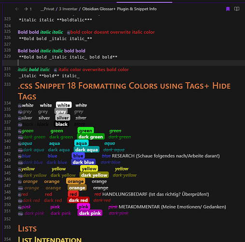
  • Hide Coloring Tags in Live Preview & Source Mode & Reading View (theyre still accessable)

New Name: 18 Text Colors Using Tags+ Hide Tags

-----KNOWN ISSUES:-----

  1. Orange and Dark Orange Strikethrough is broken
    -----WORKAROUND:-----
    the connection between italics and strikethrough seems to be the issue

  2. Does not work in Reading Mode when also using Minimal Theme and Colored Bold, italics,ā€¦

  3. With Introduction to Hide Color Tags you have to be aware that Tags Dissapear right after youve typed them. Depending on what you type afterwards you get different results. If you dont confirm the auto suggestion but type text you will end up in the line above, but wont be able to access the line below containing the tag in a quick manner. You can still access the line.
    -----WORKAROUND:-----
    #+letter+enter(confirm selected auto suggest tag)+text
    #+letter+enter(confirm selected auto suggest tag)+space+text

(I use Minimal Theme+ Minimal Theme Style Settings Plugin for the Coloring of Bold, Italics, Headings)

18 Text Colors Using Tags+ Hide Tags.css (13.2 KB)

If someone knows how to replace the #r with spaces instead of hiding the symbols entirely i would be greatful
.
.
.

New Features again!

  • I just got the idea to make them super small so there wont be issues with finding the tags or editing.

This version includes both ways of getting rid of tags you just have to change the comment start+end on both parts at the bottom

18 Formatting Colors Using Tags+ Hide or Shrink Tags.css (14.6 KB)

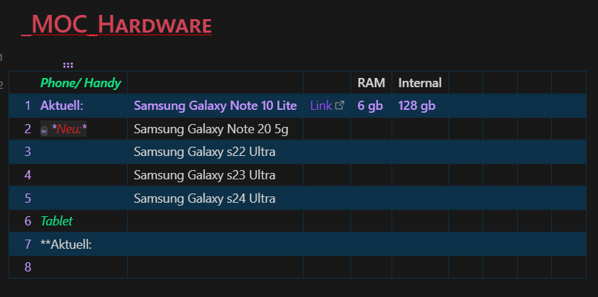
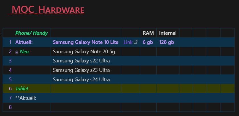
Drawback: ive noticed that the color does not display when the text is inside a Table but your cursor is not in the same cell or outside the table. It defaults to the italic/ bold color.

Does anyone has a solution for this?

So Iā€™ve found this project a while ago, and I thought itā€™d be neat if the tags were shrunk while in edit mode, and completely disappeared in preview mode.

With the little CSS knowledge I have, I made it happen. I also changed it so that the color tags must be written AFTER the formatted words you want to color in (let me know if you prefer it to be BEFORE). All credits go to Steve_yang and SomeDude for their incredible work. I took the liberty of centralizing all color values into a cluster of CSS variables for ease of editing, too, so users are able to change those at will without having to look for every single rgb() argument inside the file.

Iā€™ve also fixed some inconsistencies with two-letter colors conflicting with one-letter colors, and added salmon (tagged as #sa) as a color, because itā€™s my favorite color. Mister Yang, SomeDude, if you wish to take the modifications Iā€™ve made and add them to the OG project, feel free. If you want me to delete this, please let me know.

SADLY, this suffers from the same problem as the original, in that colors are hierarchized. Some colors will overtake others if there are multiple color tags in the same block of text. I donā€™t think this is something that can be fixed with CSS aloneā€¦

Color Formatting by Steve_yang (+ staidanom edit).css (17.4 KB)

In order to use this, simply type #first or first two letters of a color after a word/sentence written in bold/italic/highlighted. Example:

**This would be red** #r
==This would be black== #bl
_This would be blue_ #b
_This would be salmon_ #sa

Donā€™t forget the space between the formatted word and the tag.