Wasn’t sure whether this is a tiny cosmetic bug report or, if the appearance is intentional, a feature request on behalf of someone else. Either way.
Use case or problem
Bases
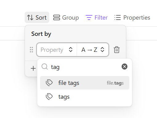
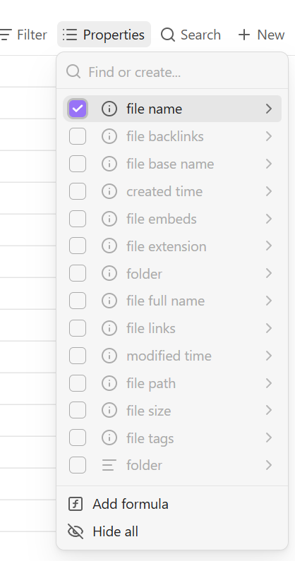
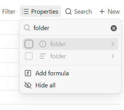
File properties in Properties have info icons:
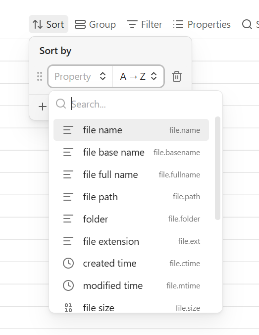
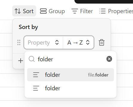
The same file properties in Sort, Group, and Filter have icons related to their type:
Cosmetic
They’re inconsistent and could cause confusion.
(The difference might have been the cause of a miscommunication on OMG recently.)
Feature
Even though drop-downs without the info icon have “file.whatever” labels, info icons would still help distinguish custom properties from file properties. Especially when a custom and file property share the same name.
Different icons for two “folder” properties in Properties:
The same icon for two “folder” properties in Sort:
Proposed solution
Use the same icon scheme throughout properties drop-downs in Bases.
I think the info icons are helpful. But whichever.
Additional information
SYSTEM INFO:
	Obsidian version: 1.14.4
	Installer version: 1.14.3
	Operating system: Windows 11 Pro for Workstations 10.0.26300
If you decide to standardize, you’ll probably catch these two subsets of the above, but I’ll draw attention to them in case.
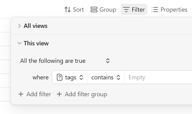
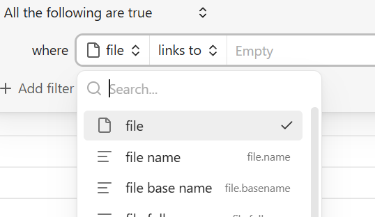
In Filter, file has a one-of-a-kind file icon whereas Properties of course has the info icon:
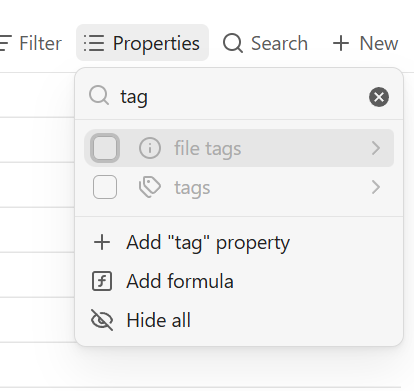
In Sort and Group, tags (not file.tags) has a tag icon. In Filter, it has a file question mark icon when no files have a tags value (as would happen for a custom property). In Properties, it has the info icon.