Steps to reproduce
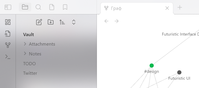
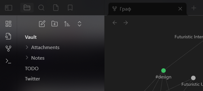
Turn on “Translucent window” in settings.
Expected result
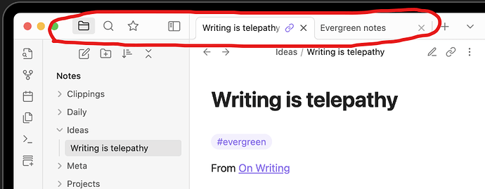
Icons and top bar text should look like on the screenshot from the official website
Actual result


You can clearly see that the color (or transparency) of the icons and text of the tabs has changed (compared to the other icons). They interactable, but intuitively look like inactive elements.
Environment
SYSTEM INFO:
Obsidian version: v1.2.8
Installer version: v0.14.6
Operating system: Windows 10 Pro 10.0.19045
Login status: not logged in
Insider build toggle: off
Live preview: on
Legacy editor: off
Base theme: dark
Community theme: none
Snippets enabled: 0
Restricted mode: on
RECOMMENDATIONS:
none
