Theme: Spectrum > Spectrum Companion Plugin in the making!

Hello everyone! :wave:

Spectrum

I am loving Obsidian so far, and I especially love the fact that I can customise my own CSS Theme for it, that’s really great! So I wanted to share with you all the Theme I am using: Spectrum.

You can find the Theme in the Community Themes, just search for “Spectrum”!

The GitHub Repo is here!

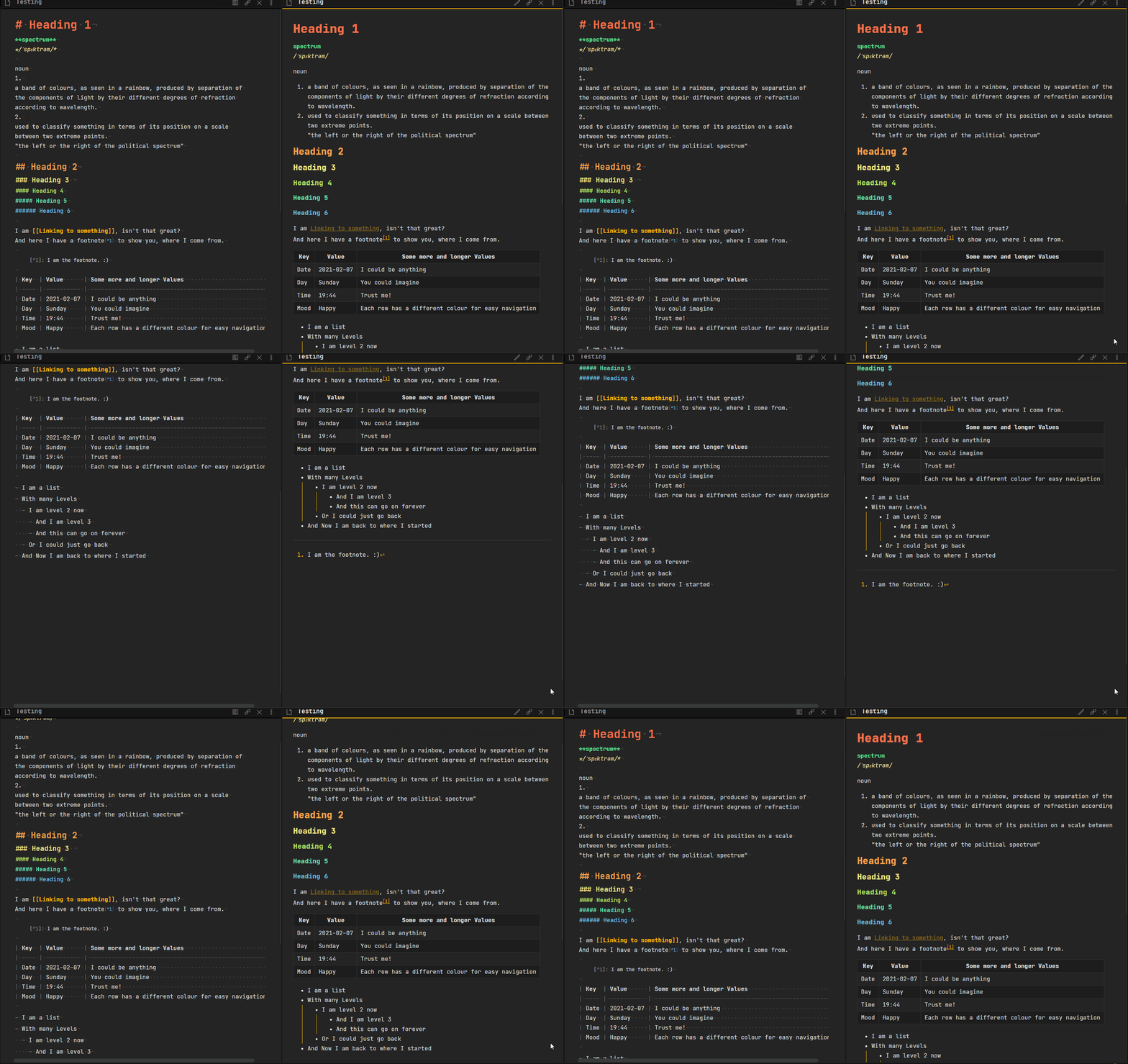
A preview of the theme in action:


Project Board: Spectrum · GitHub

Intro

Just like a Spectrum, the way you take notes can expand everywhere. And looking at it can become dull, so why not freshen it up a bit and also increase your productivity?
Spectrum ist meant to help with productivity, as well as to make the way you look at your notes more exciting. Easily distinguish between strong or emphasised text. Know the difference between internal and external links, just by a quick glance! And there is more.

Changes

A few changes that I have applied in the theme to Obsidian were:

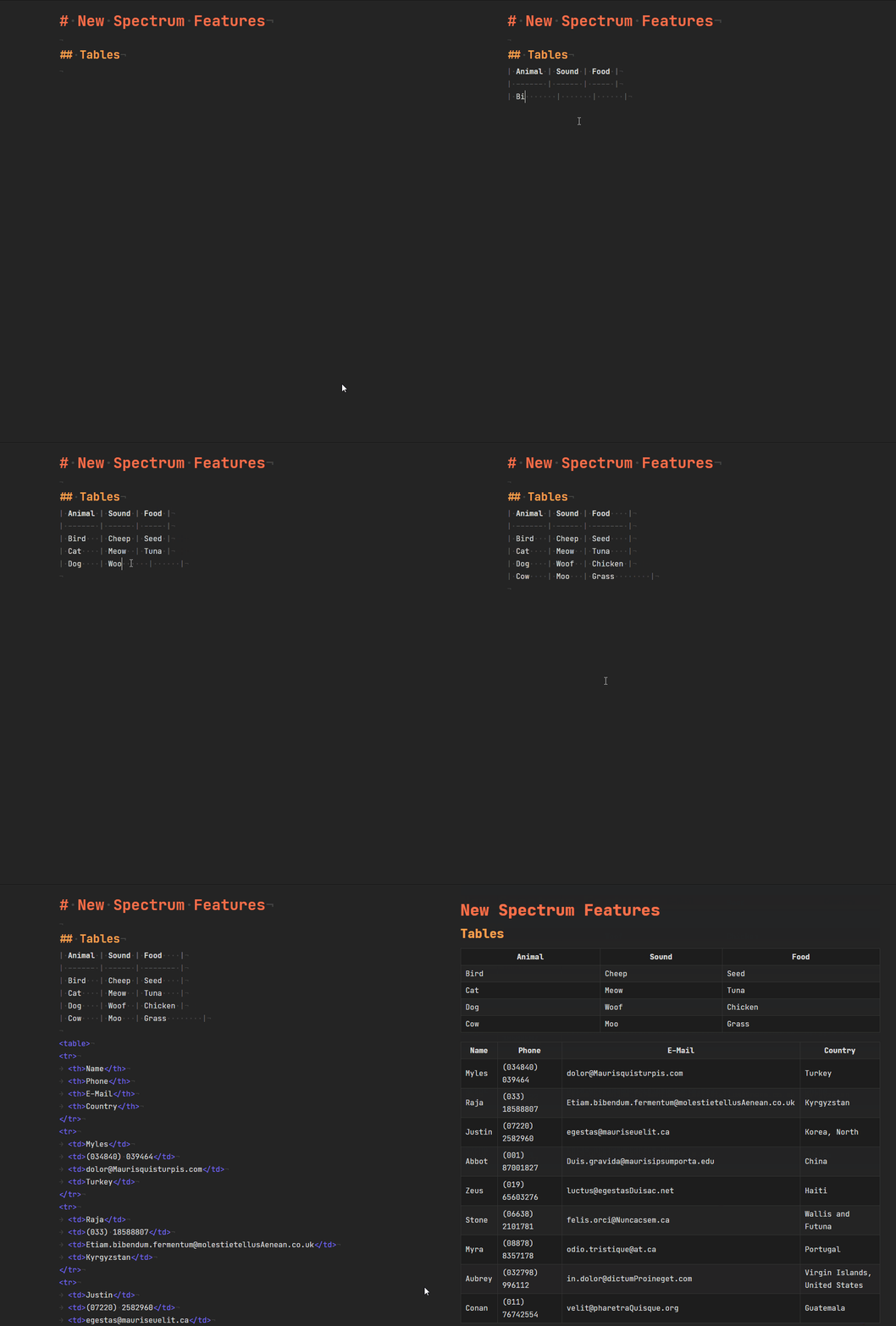
  • Tables AND Query Results with different row colours
  • Search Navigation icons stack
  • Folder Icons that open and close
  • Scrollbar is thinner
  • changed the Line Height and width of the text, for better readability

You can check out the Stylesheet in the repo more in-depth.
And if you have found a typo, do tell me about it. :slight_smile:

Features of this Theme

Some features for this theme are not self-explanatory. Seeing a different colour for the heading is one thing, but what about the hidden features you wouldn’t know unless someone told you about it? That’s what this section is for.

Font

This Theme is built with the JetBrains Mono font in mind. I recommend installing it. If you do not want to install the font, the next best monospace font will be used.

Kanban

With this theme you can create your very own wannabe kanban board! To create one, all you have to do is to set the cssclass to kanban inside your YAML frontmatter.

___
cssclass: [kanban]
---

Then you can start creating an unordered list, which will represent your kanban board. The vers first level of list items, are the boards. Every item a level deeper, represent the task or the subtask.

- Ideas
  - checklists
  - external links
- To-Do
  - git push
  - preview image for spectrum
- Doing
  - write the README
- Done
  - features of spectrum
    - Kanban
    - Floating Images

Floating Images

When writing a lot of text, some images have to be inserted to break up the paragraphs. Sometimes those images should be on the left or right of the text, with the text wrapping around it. Now it is possible! All you have to do is to give it the alternative text.

![float-right](./images/kanban.jpg)
![float-left](./images/kanban.jpg)

This is also possible with wikilinks of images that are already inside your vault!

![[kanban.jpg|float-right]]
![[kanban.jpg|float-left]]

Note: If your image is wider than the note itself, you will have to give it a smaller width for the floating to work. You might also have to either refresh Obsidian or just switch notes real quick, to see the changes. Sometimes Obsidian doesn’t live-reload the alternative text.

Feedback

I would love to know if anyone has any thoughts on this and how I could keep improving it!

Funding

You like the theme and would like to tip me? Sure! I have set up a Ko-Fi for people interested in tipping me:
ko-fi

22 Likes

I love the colors and the font. What font is that?

It’s JetBrains Mono. Inside the README I have linked to it. :slight_smile:

Very nice. I love it very much :heart_eyes_cat: Perfect mix of useful colour and minimalism. It really makes my notes comfortable to read in edit mode
2 things I would change which would make it perfect for me:

  • The default Obsidian purple could be replaced/tweaked with a more “pastel” shade to match your other colours
  • I hate the red colour for code and code block text. I hated it in the original and still hate it in Spectrum theme.

Thanks so much for sharing this. I’m keeping it active for now. Really enjoying it.

2 Likes

Hey, thanks for the feedback! :slight_smile:

The theme will be developed over time so changes like the ones you mentioned will be tackled. If you have a GitHub account you can follow the repo for updates. Otherwise, I will make an update here whenever a new version is out!

v0.6.0

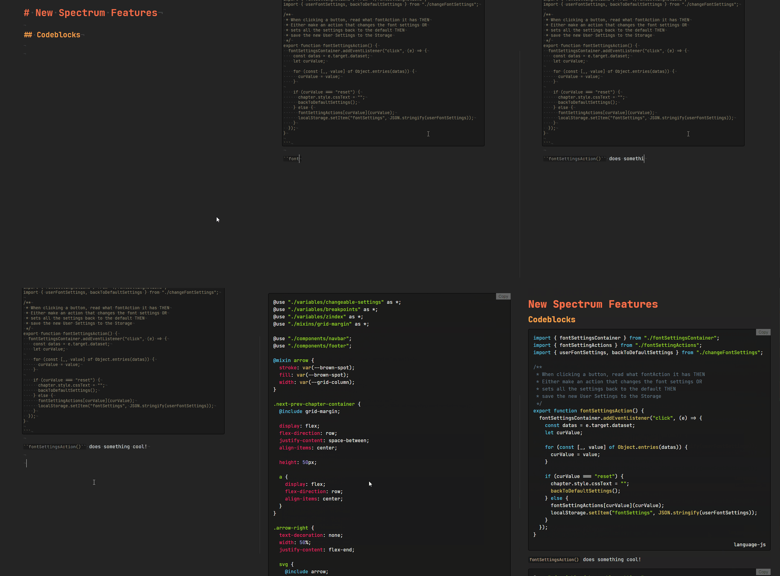
I have updated it with some easy on the eyes codeblocks.

1 Like

Looks very cool and at the same time minimalistic. I will give it a try.

1 Like

Changelog v0.7.0 - 2021.02.12

Workspace Sidebars

The Workspace banners and ribbons both have now the same colour, to create lease friction. Also the icons for them have been updated as well.

Tables

The tables have gotten a small update, they are now at full width of the Note. No more different sized tables in the same note, creating a weird balance.

2 Likes

Awesome! Love it even more now.

1 Like

Changelog v0.8.0 - 2021.02.15

Paragraphs

The text colour of the text was updated to a more calmer colour, with less contrast to the background. The first line of a paragraph now has a text identation, so you can more easily identify where a paragraph starts!

Lists

The list items now are no longer so close to each other.

Mermaid

A Mermaid Chart is now displayed at the center of your note, giving you the information you need!

Embed Notes

Embed Notes are now more easily recognised with a border around them.

I made two patches, where I decreased the max-width of the preview text to fit approx. 70 characters per line, which is better for reading, and the second patch was to match the same width for the editor mode.

Hi. I’m not a fan of the paragraph indent. Can you please point me to where this is specified in the CSS? I don’t have much experience with CSS.
Thanks

You can find it inside the Stylesheet as well! I always comment my code, so people can always just search it easily.

/** Paragraph */
.markdown-preview-view div p {
  text-indent: 1.5rem;
  margin-bottom: 1.5rem;
}

This is the part with the text-indent. To remove it, you can just put it at 0.

I am also still experimenting to see what would fit better. So if I add something today, it might be gone by tomorrow, because I realised, it was a poor choice.

Also, thanks for the feedback! That helps me betetr determine what is worth keeping and what not. :slight_smile:

1 Like

And speaking of which:

Version 0.9.0 is now available as well.

  • Fixed Highlight colours clashing with Emphasis and Strong
  • Blockquote now has the same width on each side
  • Text Cursor Indicator is yellow, fitting the theme
1 Like

Have you made this available yet through the Obsidian community theme picker?

Not yet! I am not sure, if it’s “polished” enough, for it to be there. But I can surely try and make a PR.

3 Likes

I have done the PR, now it is time to wait (and pray).

Also for the people using the Repo to learn about new features or that are going through the Stylesheet themselves. I will be soon editing a lot of it and refactor the code, as well as the Read Me file.

I might switch to SCSS and have that compile into CSS.

What I also have planned:

  • Use custom Class Names to have specific features available
  • Have external links that go to file:/// look different from normal external files
  • It was requested: Subtasks to look differently from main tasks!

If you happen to have more feedback or requests, go ahead and write them down.

1 Like

The Theme got a big overhaul.

It is now using SCSS for Styling, which will compile it into a CSS Stylesheet.

More changes are coming!

We as a users still just need to copy the spectrum.css code, yeah?

1 Like

That’s correct.

1 Like