Update
- Centered .hc Underlines & Recolored .hc h6
- Notion Alt Color Scheme added to Alternate Themes Snippet
- Dataview Cards css class included in ITS and as a snippet
- Excalidraw Plugin supported and re-styled to match the ITS Theme style
- Hover Editor Plugin Restyled to match ITS Theme style
- Image Adjustments now has
wfulloption to expand image to it’s full width (to be used in image grid callouts) - Style Settings now has icons for root sections!
Fixes
- Fix codeblock text sizing and Live Preview display
- D&D/WOTC snippet header issues fixed
- Scrollbars re-squared
-
Alternate Checkboxes
- Checkboxes now show default checkbox when using symbols not supported
- Text colors fixed
- Icons aligned horizontally to center now
- Checkbox alignment fixed for v0.14+
- Colored Lines & Bullets colors applied to default checkboxes properly
- Fix
centerfor Embed Adjustments - Alignment of numbered lists fixed
- Popover Preview for Hover Editor plugin spacing issues fixed
- Colored bullet colors fixed
- Table Header styling applies in LP
- Table border line color fixed
- Image Adjustment
ctr,center,left,rightshould work and work on publish as well - LP Blockquotes adjusted to look a little closer to Reading mode Blockquotes
- Fixed Bullets disappearing on Mobile when using
ul { columns: #; } -
Style Settings Fixes
-
Murf Rainbow List Lines settings removed, use Obsidian Indentation Guides instead
Settings > Editor > Indentation Guides - Neon List Lines moved to Obsidian’s Indentation Guides instead to avoid issues with Better Footnotes plugin
- Minimized Yaml/Frontmatter will now color red if your yaml is invalid
- Ligature Toggle should work again for lists, etc
-
Specific Heading Stylingshould now work
-
Murf Rainbow List Lines settings removed, use Obsidian Indentation Guides instead
- Heatmap Plugin styling fixed
Style Settings
- Rearranged style settings
-
Specific View Heading Changesmoved toNote Elements > Headers -
Note Elements: Headers, Frontmatter, Horizontal Lines -
Centered TablestoNote Elements > Tables > Center Tables -
Colorful Liststoggles moved out ofListand intoList Stylessection
-
- Removed
Fix Double Bullet Issuetoggle - Toggle to
Undo Mini Header Hash Styling - Added Toggle to Hide Live Preview Header Indicators
- Under:
Note Elements > Header > Hide Header Indicator
- Under:
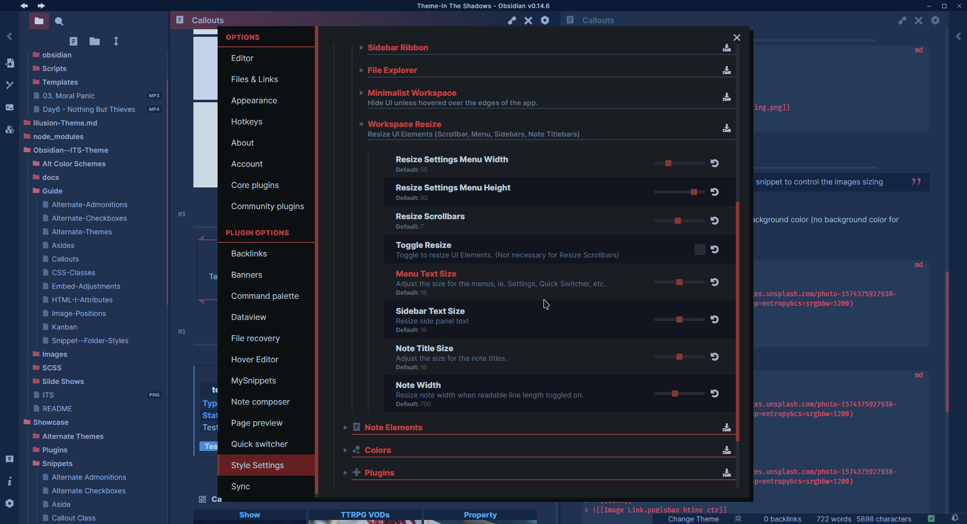
- Added sliders to resize the Settings Menu
UnderWorkspace > Workspace Resize > Resize Settings Menu Width/Height - Added
Note Widthslider - Added
Note Text Weightsslider - Added Toggle to disable List Lines
- Under:
Note Elements > Lists > Remove List Border Lines
- Under:
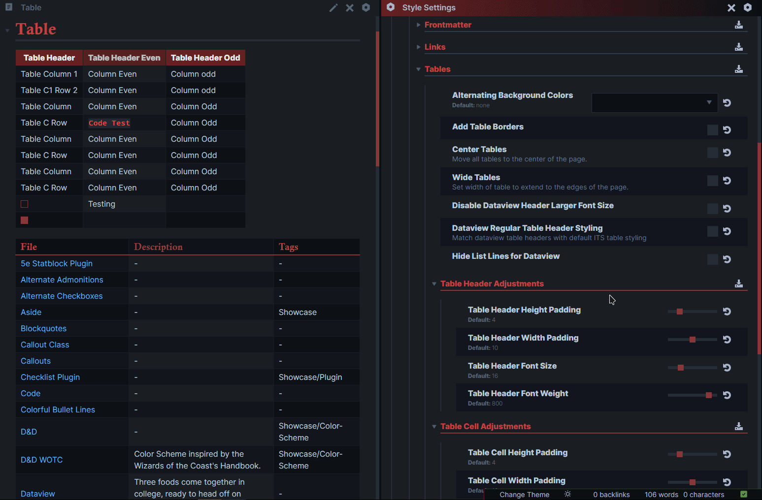
- Added
TablesSection:Note Elements > Tables- Sliders to adjust padding for table headings and cells
- Toggle to remove alternate background colors
- Toggle to add border lines to tables
- Toggle to Center tables or Widen tables
- Sliders to adjust cell and header font sizing
- Dataview Table Adjustments:
- Toggle to style dataview table headers like default tables
- Toggle to disable Dataview’s Table header larger font size
- Toggle to hide list lines in Dataview tables
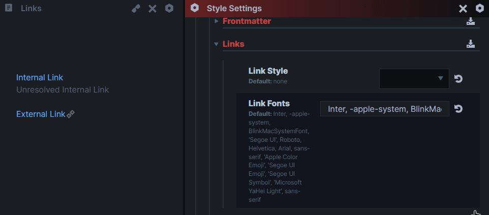
- Added
LinksSection:Note Elements > Links- Dropdown for different link styling
-
Added slider for edit mode frontmatter text
- Under
Note Elements > Frontmatter > Frontmatter Text Sizing
- Under
-
Cropped image in Popover css moved to class toggle
- Under
Note Elements > Crop Image Height In Popover
- Under
-
Undo codeblock wrapping
- Under
Note Elements > Disable Codeblock Wrapping
- Under
-
Tags
Note Elements > Tags- Colored text tags, no background color:
Colored Text Tagstoggle - Tag font size:
Tag Font Size ToggleandTag Font Sizeslider - Tag text left, right or, center
Tag Text Alignment
- Colored text tags, no background color:
-
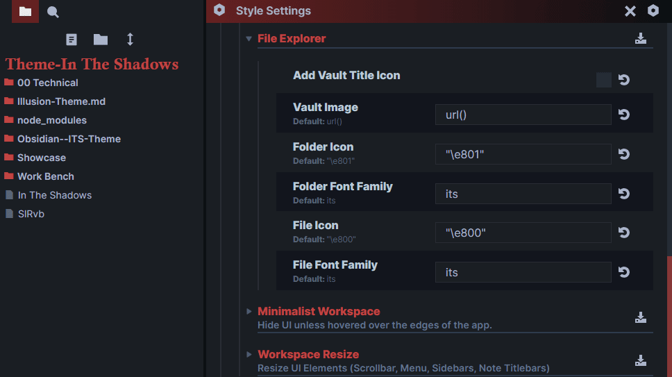
File Explorer
Workspace > File Explorer- Add Vault Title Icon toggle
- Change Folder/File Icon/font family
Callout Styling
-
Included in the theme and as a snippet
-
Callout Types:
- Image grids: [!grid]/[!masonry]
- Infoboxes: [!infobox]
- Kanban: [!kanban]
- Captions: [!caption]
- Recite: [!recite]
- Metadata: [!metadata]
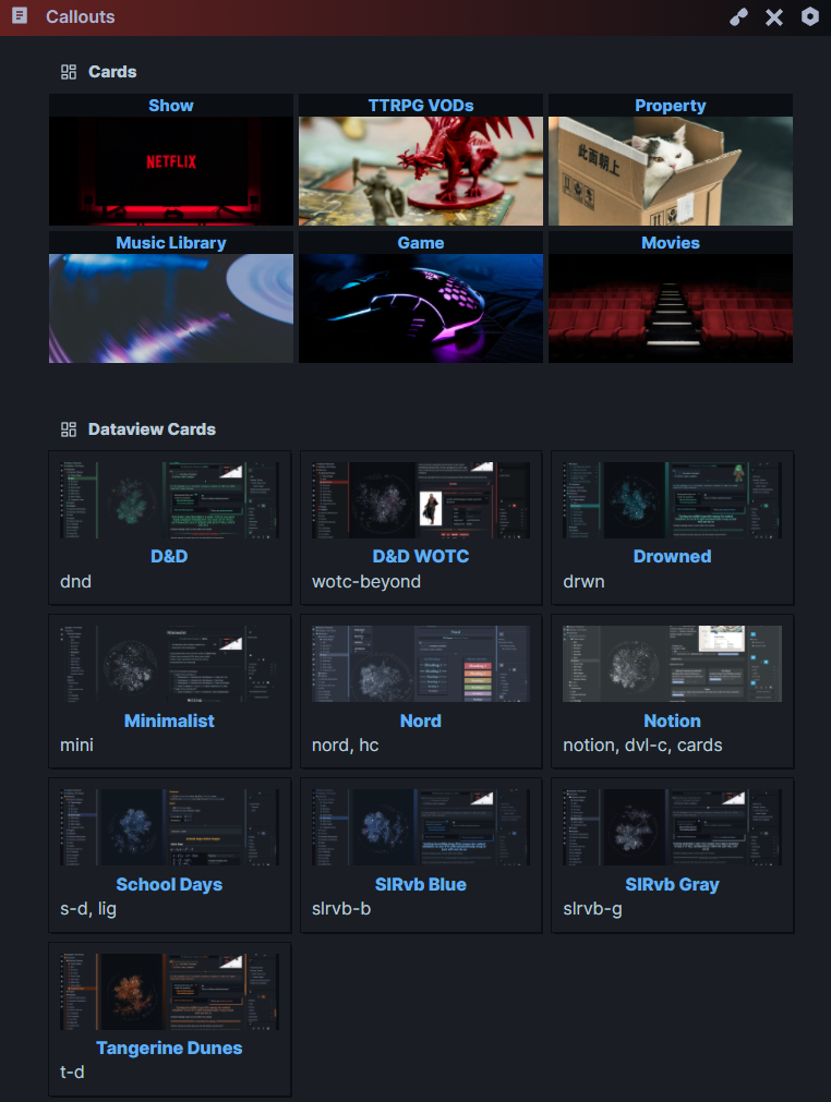
- Cards: [!cards] +
dataviewmetadata property to style dataview tables - Table: [!table]
-
Callouts can be resized using the same syntax as Image Adjustments
-
Alternate callout Styling Toggle