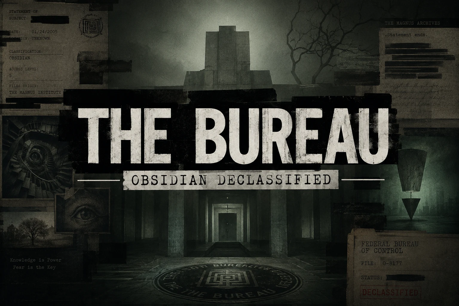
A noir theme for [Obsidian](https://obsidian.md). A worn case-file on a concrete desk, wired to a CRT that hums whether or not you’re listening.
[!IMPORTANT] Most of Bureau lives in the
[Style Settings](https://github.com/mgmeyers/obsidian-style-settings)plugin. Install it and you get a single Bureau panel (Settings → Style Settings → Bureau) with every option in one place. The theme runs fine without it — just on its built-in defaults.
I’ve always liked that redacted-bureau look. The brutalism of it: heavy type that doesn’t apologise, stamped labels, lines blacked out by someone who decided you didn’t need to read them. Documents with purpose, and what is Obsidian for most of us if not a collection of notes and documents that serve a purpose? A lot of themes are a pile of effects in a trench coat — gorgeous in the screenshot, unlivable by the second week. Pretty to look at but hard to work in. I themed hopped for months and never really felt at home. Like I was using someone elses desk. Settings that were cool but didnt work right or made editing difficult. Then there were things that some themes just could not do. I didn’t want effects. I wanted a room you could sit in at 2 AM and feel like the work mattered. One cohesive place I could spend hours in.
The mood comes from three places, and each one is an accent you pick — the single colour the whole UI, the glow, and every highlight read from, the way a room reads from one bad bulb:
- Control — the institutional dread of the Federal Bureau of Control, the red of a door you shouldn’t open. The default red accent.
- Magnus — The Magnus Archives: dust, quiet wrongness, a tape still running. The green accent.
- Deus — Deus Ex: black-and-gold cyber-renaissance, conspiracy with good lighting. The gold accent.
Most themes pick a side and defend it like an identity, Dark only, or if your lucky Dark and Light versions. But even the light versions are too bright and the dark versions are too dark. Bureau runs both; a near-black noir and a daylight case-file in paper. The interesting part is the ground between them.
Set the editor to the opposite palette of its chrome and you get a lit page on a dark desk, or a dark page in a lit room. The picture lives in that seam where light meets dark.
Everything textural is procedural SVG, drawn by the stylesheet instead of photographed and dragged in (mostly for sharpness and responsiveness). There’s a CRT layer if you want it: scanlines, phosphor glow, a white line that scans down the page and glitches like a loose wire, a power-on that fades up from black each time you open a note. None of it is load-bearing — leave it off and the theme still stands. Turn it on when you want the machine to feel haunted. On a phone it quiets all of that down on its own.
Disclaimer
Is this project open source? Yes
Is this project completely free? Yes
Is this project vibe-coded beyond the author’s ability to comprehend how it works? No
Community Directory:[Theme](https://community.obsidian.md/themes/bureau)
Github Repository for Issues:[Issues](https://github.com/Sonophage/Bureau)