Hi, I notice that Obsidian uses some special style for highlighted code blocks in the light default theme, which makes it looks different from other plain text code blocks (in the margin, padding, color, background color, etc.). Obsidian Publish has the same problem, it is … hmmm a little bit ugly.
I don’t understand this report
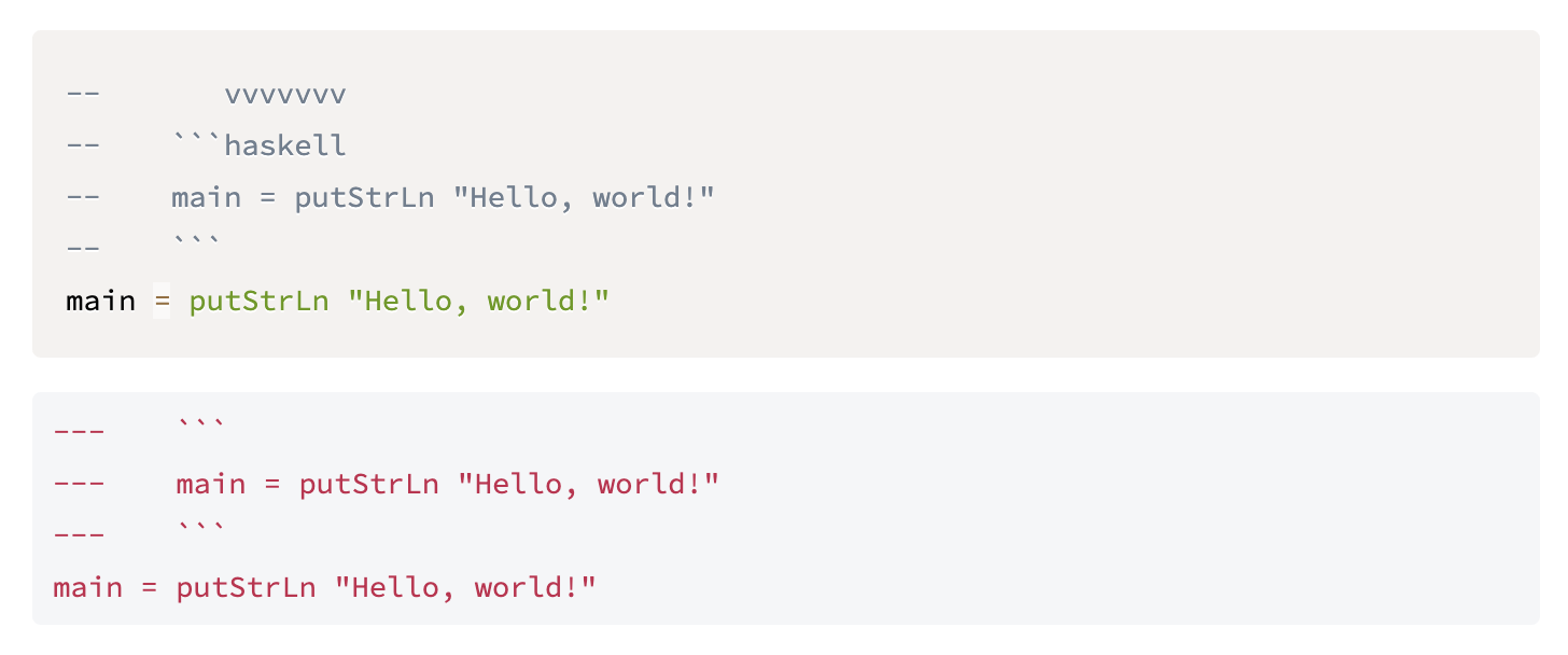
I just think the style of code blocks (whether it is highlighted or not) should be exactly the same. But the color and padding of these blocks in the picture are different. This is not a bug, but it makes me uncomfortable.
What’s the difference? That you added an extra - and specified the language?
Is there any difference with the default dark theme?
That looks like normal prism.js code highlighting in preview for me. If you specify a language (like in this case haskell), it highlights it as it should.
If you don’t add any language, it’ll be the standard red.
Yes, I know that … but don’t you think every <pre> should have the same background color? These blocks have different background colors if you look carefully.
Just copy the background-color for pre[class*="language-"] to every pre, like many custom themes.
This topic was automatically closed 30 days after the last reply. New replies are no longer allowed.