 Templater Script: Pick a Minimal Theme Checkbox Style via Modal
Hey everyone! 
I created this small Templater script to make it easier to use the various checkbox styles supported by the Minimal Theme – without introducing any extra plugin dependencies. Just Templater and you’re good to go! 
The main reason I went with this approach was that I didn’t want to install yet another plugin just to manage checkbox styles.
Also, to be honest: I could never remember which checkbox symbols were available or what their exact syntax was. Instead of constantly checking the docs or using trial and error, I wanted a clean, interactive way to pick them when needed. 
 What does it do?
When you run the template, it opens a modal that lists all the custom checkbox styles supported by the Minimal Theme (,  ,
,  ,
,  etc.). Once you pick a style, the matching checkbox line is inserted directly into your note.
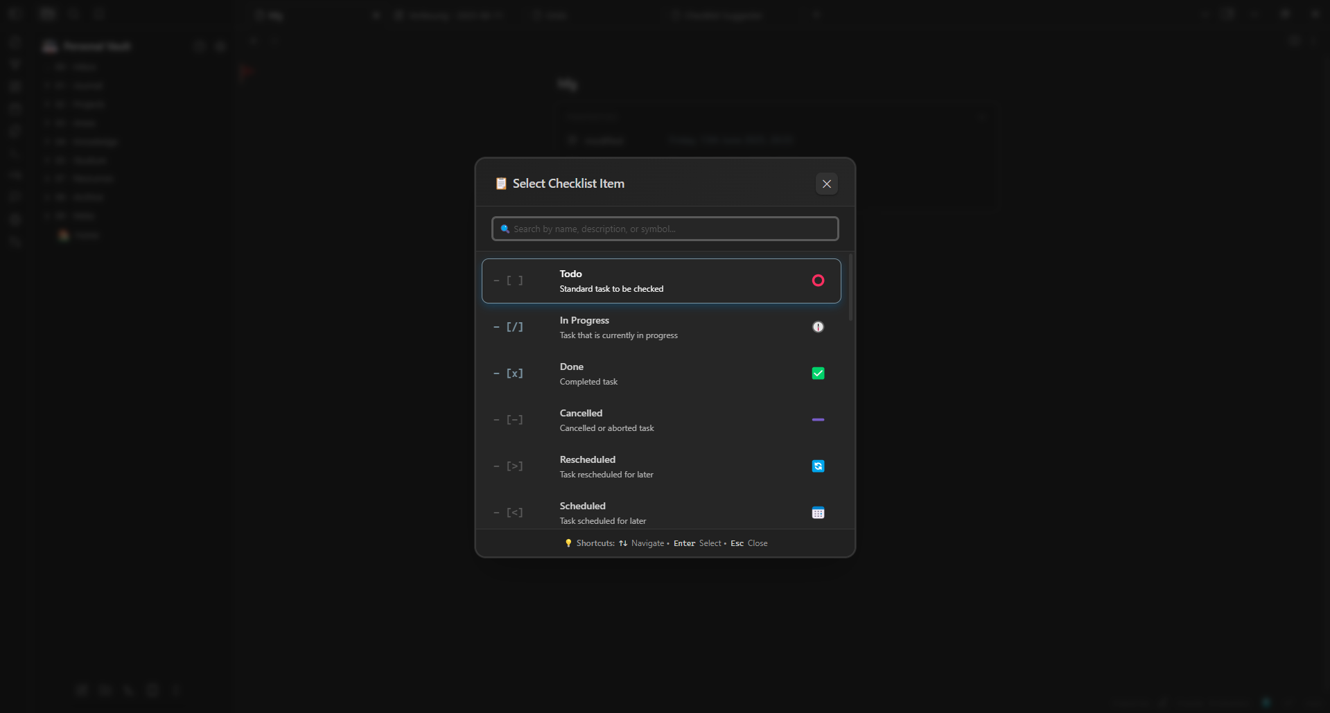
 Screenshot (Modal in action):
 The Templater Script
<%*
// Minimal Theme Checklist Items Templater Script
// Completely custom modal without external dependencies
class CustomChecklistModal {
// The constructor accepts a callback to run when an item is selected.
constructor(callback) {
this.callback = callback;
this.selectedIndex = 0;
this.isOpen = false;
this.currentItems = [];
// Extended checklist items for the Minimal Theme
this.checklistItems = [
{ symbol: '- [ ]', name: 'Todo', description: 'Standard task to be checked', color: 'var(--checkbox-border-color)', emoji: '⭕' },
{ symbol: '- [/]', name: 'In Progress', description: 'Task that is currently in progress', color: 'var(--checkbox-color)', emoji: '🕧' },
{ symbol: '- [x]', name: 'Done', description: 'Completed task', color: 'var(--checkbox-color)', emoji: '✅' },
{ symbol: '- [-]', name: 'Cancelled', description: 'Cancelled or aborted task', color: 'var(--text-faint)', emoji: '➖' },
{ symbol: '- [>]', name: 'Rescheduled', description: 'Task rescheduled for later', color: 'var(--text-faint)', emoji: '🔄️' },
{ symbol: '- [<]', name: 'Scheduled', description: 'Task scheduled for later', color: 'var(--text-faint)', emoji: '📅' },
{ symbol: '- [?]', name: 'Question', description: 'Question or item to be clarified', color: 'var(--color-yellow)', emoji: '❓' },
{ symbol: '- [!]', name: 'Important', description: 'Important or urgent task', color: 'var(--color-orange)', emoji: '⚠️' },
{ symbol: '- [*]', name: 'Star', description: 'Especially important task', color: 'var(--color-yellow)', emoji: '⭐' },
{ symbol: '- ["]', name: 'Quote', description: 'Quotation or significant statement', color: 'var(--color-cyan)', emoji: '💬' },
{ symbol: '- [l]', name: 'Location', description: 'Location information', color: 'var(--color-red)', emoji: '📍' },
{ symbol: '- [b]', name: 'Bookmark', description: 'Important reference or bookmark', color: 'var(--color-orange)', emoji: '🔖' },
{ symbol: '- [i]', name: 'Information', description: 'General information or note', color: 'var(--color-blue)', emoji: 'ℹ️' },
{ symbol: '- [S]', name: 'Amount', description: 'Monetary amount or quantity', color: 'var(--color-green)', emoji: '💲' },
{ symbol: '- [I]', name: 'Idea', description: 'New idea or inspiration', color: 'var(--color-yellow)', emoji: '💡' },
{ symbol: '- [p]', name: 'Pro', description: 'Advantage or positive aspect', color: 'var(--color-green)', emoji: '👍' },
{ symbol: '- [c]', name: 'Con', description: 'Disadvantage or negative aspect', color: 'var(--color-orange)', emoji: '👎' },
{ symbol: '- [f]', name: 'Fire', description: 'Extremely important or urgent', color: 'var(--color-red)', emoji: '🔥' },
{ symbol: '- [k]', name: 'Key', description: 'Key point or critical issue', color: 'var(--color-yellow)', emoji: '🔑' },
{ symbol: '- [w]', name: 'Win', description: 'Success or achievement', color: 'var(--color-purple)', emoji: '🎂' },
{ symbol: '- [u]', name: 'Up', description: 'Improvement or upward trend', color: 'var(--color-green)', emoji: '📈' },
{ symbol: '- [d]', name: 'Down', description: 'Decline or downward trend', color: 'var(--color-red)', emoji: '📉' }
];
// Set up the event handlers for keyboard and click events.
this.setupEventHandlers();
}
// Register global event handlers for keyboard and click outside the modal.
setupEventHandlers() {
// Global keyboard events handler.
this.keyHandler = (e) => {
if (!this.isOpen) return;
this.handleKeyPress(e);
};
// Handler for clicks outside of the modal to close it.
this.clickOutsideHandler = (e) => {
if (!this.isOpen) return;
if (!this.modalContainer.contains(e.target)) {
this.close();
}
};
}
// Opens the modal.
open() {
if (this.isOpen) return;
this.isOpen = true;
this.selectedIndex = 0;
// Copy the checklist items into the current items array.
this.currentItems = [...this.checklistItems];
this.createModalElements();
this.renderItems();
this.attachEventListeners();
this.focusSearchInput();
// Smooth fade-in animation using requestAnimationFrame.
requestAnimationFrame(() => {
this.overlay.style.opacity = '1';
this.modalContainer.style.transform = 'translateY(0) scale(1)';
});
}
// Create and assemble the modal HTML elements.
createModalElements() {
// Remove any existing modal.
this.cleanup();
// Create the overlay element.
this.overlay = this.createElement('div', 'checklist-overlay');
// Create the modal container.
this.modalContainer = this.createElement('div', 'checklist-modal');
// Create the header section.
this.header = this.createElement('div', 'checklist-header');
this.title = this.createElement('h2', 'checklist-title');
this.title.textContent = '📋 Select Checklist Item';
// Create the close button.
this.closeButton = this.createElement('button', 'checklist-close');
this.closeButton.innerHTML = '✕';
this.closeButton.onclick = () => this.close();
// Append title and close button to the header.
this.header.appendChild(this.title);
this.header.appendChild(this.closeButton);
// Create the search section.
this.searchContainer = this.createElement('div', 'checklist-search');
this.searchInput = this.createElement('input', 'checklist-search-input');
this.searchInput.type = 'text';
this.searchInput.placeholder = '🔍 Search by name, description, or symbol...';
// On input, filter the list.
this.searchInput.oninput = (e) => this.handleSearch(e.target.value);
this.searchContainer.appendChild(this.searchInput);
// Create the container for the checklist items.
this.itemsList = this.createElement('div', 'checklist-items');
// Create the footer with shortcut information.
this.footer = this.createElement('div', 'checklist-footer');
this.footer.innerHTML = '💡 <strong>Shortcuts:</strong> <kbd>↑↓</kbd> Navigate • <kbd>Enter</kbd> Select • <kbd>Esc</kbd> Close';
// Assemble the modal by appending all sections.
this.modalContainer.appendChild(this.header);
this.modalContainer.appendChild(this.searchContainer);
this.modalContainer.appendChild(this.itemsList);
this.modalContainer.appendChild(this.footer);
this.overlay.appendChild(this.modalContainer);
// Append the styles to the document head and add the overlay to the document body.
this.addStyles();
document.body.appendChild(this.overlay);
}
// Helper function to create an element with a specific class.
createElement(tag, className) {
const element = document.createElement(tag);
element.className = className;
return element;
}
// Adds the CSS styles for the modal. Removes existing ones if present.
addStyles() {
// Remove existing styles element if it exists.
const existingStyles = document.getElementById('custom-checklist-styles');
if (existingStyles) existingStyles.remove();
const styles = document.createElement('style');
styles.id = 'custom-checklist-styles';
styles.textContent = `
.checklist-overlay {
position: fixed;
top: 0;
left: 0;
width: 100vw;
height: 100vh;
background: rgba(0, 0, 0, 0.6);
backdrop-filter: blur(4px);
display: flex;
align-items: center;
justify-content: center;
z-index: 99999;
opacity: 0;
transition: opacity 0.3s cubic-bezier(0.4, 0, 0.2, 1);
}
.checklist-modal {
background: var(--background-primary, #ffffff);
border: 2px solid var(--background-modifier-border, #e0e0e0);
border-radius: 16px;
width: 550px;
max-width: 95vw;
max-height: 85vh;
box-shadow:
0 25px 50px -12px rgba(0, 0, 0, 0.25),
0 0 0 1px rgba(255, 255, 255, 0.1);
transform: translateY(-20px) scale(0.95);
transition: all 0.3s cubic-bezier(0.4, 0, 0.2, 1);
display: flex;
flex-direction: column;
overflow: hidden;
}
.checklist-header {
padding: 20px 24px 16px;
border-bottom: 1px solid var(--background-modifier-border, #e0e0e0);
display: flex;
align-items: center;
justify-content: space-between;
background: linear-gradient(135deg, var(--background-secondary, #f8f8f8), var(--background-primary, #ffffff));
}
.checklist-title {
margin: 0;
font-size: 18px;
font-weight: 600;
color: var(--text-normal, #2e3440);
display: flex;
align-items: center;
gap: 8px;
}
.checklist-close {
background: var(--background-modifier-hover, #f0f0f0);
border: none;
border-radius: 8px;
width: 32px;
height: 32px;
display: flex;
align-items: center;
justify-content: center;
cursor: pointer;
font-size: 16px;
color: var(--text-muted, #666);
transition: all 0.2s ease;
}
.checklist-close:hover {
background: var(--background-modifier-border, #e0e0e0);
color: var(--text-normal, #2e3440);
transform: scale(1.05);
}
.checklist-search {
padding: 16px 24px;
border-bottom: 1px solid var(--background-modifier-border, #e0e0e0);
background: var(--background-secondary, #f8f8f8);
}
.checklist-search-input {
width: 100%;
padding: 12px 16px;
border: 2px solid var(--background-modifier-border, #e0e0e0);
border-radius: 10px;
background: var(--background-primary, #ffffff);
color: var(--text-normal, #2e3440);
font-size: 14px;
box-sizing: border-box;
transition: all 0.2s ease;
}
.checklist-search-input:focus {
outline: none;
border-color: var(--interactive-accent, #007acc);
box-shadow: 0 0 0 3px var(--interactive-accent-hover, rgba(0, 122, 204, 0.1));
}
.checklist-search-input::placeholder {
color: var(--text-muted, #666);
}
.checklist-items {
flex: 1;
overflow-y: auto;
padding: 8px;
max-height: 400px;
}
.checklist-item {
display: flex;
align-items: center;
padding: 12px 16px;
margin: 2px 0;
border-radius: 10px;
cursor: pointer;
transition: all 0.2s cubic-bezier(0.4, 0, 0.2, 1);
border: 1px solid transparent;
position: relative;
}
.checklist-item:hover {
background: var(--background-modifier-hover, #f0f0f0);
transform: translateX(4px);
border-color: var(--background-modifier-border, #e0e0e0);
}
.checklist-item.selected {
color: var(--text-on-accent, #ffffff);
transform: translateX(6px) scale(1.02);
box-shadow: 0 4px 12px rgba(0, 122, 204, 0.3);
border-color: var(--interactive-accent, #007acc);
}
.checklist-symbol {
font-family: var(--font-monospace, 'JetBrains Mono', monospace);
font-weight: 700;
font-size: 15px;
min-width: 80px;
margin-right: 16px;
display: flex;
align-items: center;
position: relative;
}
.checklist-item:not(.selected) .checklist-symbol {
color: var(--text-accent, #007acc);
}
.checklist-info {
flex: 1;
min-width: 0;
}
.checklist-name {
font-weight: 600;
font-size: 14px;
margin-bottom: 4px;
display: flex;
align-items: center;
gap: 8px;
}
.checklist-description {
font-size: 12px;
opacity: 0.8;
line-height: 1.4;
}
.checklist-emoji {
position: absolute;
right: 20px;
font-size: 18px;
pointer-events: none;
}
.checklist-item.selected .checklist-description {
opacity: 0.95;
}
.checklist-footer {
padding: 12px 24px;
background: var(--background-secondary, #f8f8f8);
border-top: 1px solid var(--background-modifier-border, #e0e0e0);
font-size: 12px;
color: var(--text-muted, #666);
text-align: center;
}
.checklist-items::-webkit-scrollbar {
width: 6px;
}
.checklist-items::-webkit-scrollbar-track {
background: var(--background-modifier-border, #e0e0e0);
border-radius: 3px;
}
.checklist-items::-webkit-scrollbar-thumb {
background: var(--text-muted, #666);
border-radius: 3px;
}
.checklist-items::-webkit-scrollbar-thumb:hover {
background: var(--text-normal, #2e3440);
}
/* Animations */
@keyframes itemAppear {
from {
opacity: 0;
transform: translateY(10px);
}
to {
opacity: 1;
transform: translateY(0);
}
}
.checklist-item {
animation: itemAppear 0.2s ease forwards;
}
`;
// Append the style element to the head.
document.head.appendChild(styles);
}
// Renders the checklist items into the modal.
renderItems() {
// Clear the list container.
this.itemsList.innerHTML = '';
// Iterate over the filtered/current items.
this.currentItems.forEach((item, index) => {
const itemEl = this.createElement('div', 'checklist-item');
// Highlight the selected item.
if (index === this.selectedIndex) {
itemEl.classList.add('selected');
}
// Create the symbol element with its associated color.
const symbolEl = this.createElement('div', 'checklist-symbol');
symbolEl.textContent = item.symbol;
symbolEl.style.color = item.color;
// Create the info section containing the name and description.
const infoEl = this.createElement('div', 'checklist-info');
const nameEl = this.createElement('div', 'checklist-name');
nameEl.textContent = item.name;
const descEl = this.createElement('div', 'checklist-description');
descEl.textContent = item.description;
infoEl.appendChild(nameEl);
infoEl.appendChild(descEl);
// Create the emoji element to be displayed on the right.
const emojiEl = this.createElement('div', 'checklist-emoji');
emojiEl.textContent = item.emoji || '';
// Append the symbol, info, and emoji elements to the item container.
itemEl.appendChild(symbolEl);
itemEl.appendChild(infoEl);
itemEl.appendChild(emojiEl);
// Register click event to select the item.
itemEl.onclick = () => this.selectItem(item);
// Update the selected index on mouse over.
itemEl.onmouseenter = () => {
this.selectedIndex = index;
this.updateSelection();
};
// Append the item element to the items list.
this.itemsList.appendChild(itemEl);
});
}
// Filter checklist items based on the search query.
handleSearch(query) {
const filtered = this.checklistItems.filter(item =>
item.name.toLowerCase().includes(query.toLowerCase()) ||
item.description.toLowerCase().includes(query.toLowerCase()) ||
item.symbol.includes(query)
);
this.currentItems = filtered;
this.selectedIndex = 0;
this.renderItems();
}
// Handler for keyboard events.
handleKeyPress(e) {
switch (e.key) {
case 'ArrowDown':
e.preventDefault();
// Move selection down.
this.selectedIndex = Math.min(this.selectedIndex + 1, this.currentItems.length - 1);
this.updateSelection();
this.scrollToSelected();
break;
case 'ArrowUp':
e.preventDefault();
// Move selection up.
this.selectedIndex = Math.max(this.selectedIndex - 1, 0);
this.updateSelection();
this.scrollToSelected();
break;
case 'Enter':
e.preventDefault();
// Select the current item if available.
if (this.currentItems[this.selectedIndex]) {
this.selectItem(this.currentItems[this.selectedIndex]);
}
break;
case 'Escape':
e.preventDefault();
// Close the modal.
this.close();
break;
}
}
// Update the visual selection of items.
updateSelection() {
const items = this.itemsList.querySelectorAll('.checklist-item');
items.forEach((item, index) => {
if (index === this.selectedIndex) {
item.classList.add('selected');
} else {
item.classList.remove('selected');
}
});
}
// Scroll the selected item into view.
scrollToSelected() {
const selectedItem = this.itemsList.querySelector('.checklist-item.selected');
if (selectedItem) {
selectedItem.scrollIntoView({
block: 'nearest',
behavior: 'smooth'
});
}
}
// When an item is selected, call the callback and close the modal.
selectItem(item) {
this.callback(item);
this.close();
}
// Attach the global event listeners.
attachEventListeners() {
document.addEventListener('keydown', this.keyHandler);
document.addEventListener('click', this.clickOutsideHandler);
}
// Remove the global event listeners.
removeEventListeners() {
document.removeEventListener('keydown', this.keyHandler);
document.removeEventListener('click', this.clickOutsideHandler);
}
// Focus the search input after a short delay.
focusSearchInput() {
setTimeout(() => {
if (this.searchInput) {
this.searchInput.focus();
}
}, 100);
}
// Closes the modal with a fade-out animation.
close() {
if (!this.isOpen) return;
this.isOpen = false;
this.removeEventListeners();
// Smooth fade-out animation.
if (this.overlay) {
this.overlay.style.opacity = '0';
this.modalContainer.style.transform = 'translateY(-20px) scale(0.95)';
setTimeout(() => {
this.cleanup();
}, 300);
}
}
// Clean up the modal elements and styles from the DOM.
cleanup() {
if (this.overlay && this.overlay.parentNode) {
this.overlay.parentNode.removeChild(this.overlay);
}
const styles = document.getElementById('custom-checklist-styles');
if (styles) {
styles.remove();
}
}
}
// Function to insert the checklist item into the editor.
function insertChecklistItem(item) {
// Directly access the active editor via app.workspace.
const activeLeaf = app.workspace.activeLeaf;
if (!activeLeaf || !activeLeaf.view || !activeLeaf.view.editor) {
new Notice('❌ No active editor found');
return;
}
const editor = activeLeaf.view.editor;
const cursor = editor.getCursor();
const currentLine = editor.getLine(cursor.line);
// Intelligent insertion with correct cursor positioning.
if (cursor.ch === 0 || currentLine.trim() === '') {
// If at the beginning of the line or on an empty line, insert symbol with a space.
const textToInsert = item.symbol + ' ';
editor.replaceRange(textToInsert, cursor);
// Set the cursor right after the inserted symbol and space.
editor.setCursor(cursor.line, textToInsert.length);
} else {
// Otherwise, create a new line.
const textToInsert = '\n' + item.symbol + ' ';
editor.replaceRange(textToInsert, cursor);
// Set the cursor in the new line after the symbol and space.
editor.setCursor(cursor.line + 1, item.symbol.length + 1);
}
// Focus the editor to ensure the cursor is visible.
setTimeout(() => {
if (editor.focus) {
editor.focus();
}
}, 50);
// Success notification.
new Notice(`✅ ${item.name} inserted: ${item.symbol}`, 2000);
}
// Start the modal
try {
const modal = new CustomChecklistModal(insertChecklistItem);
modal.open();
} catch (error) {
new Notice('❌ Error opening the modal: ' + error.message);
console.error('Custom Checklist Modal Error:', error);
}
%>
 More styles & documentation:
 Minimal Theme Checklist Docs
Minimal Theme Checklist implementation
 Customization Tips
You can easily extend the list with your own checkbox types, icons, or labels. Just add another object to the checklistItems array:
{ symbol: '- [g]', name: 'Growth', description: 'Growth or improvement', color: 'var(--color-green)', emoji: '🌱' }
Remember:
If you create a custom shortcode (like[g]), you’ll also need to manually define the CSS for it.
This means writing a small snippet and saving it in your.obsidian/snippetsfolder.
This makes it super flexible to tailor the modal to your own workflows, habits, or visual preferences. 
Tip: Make it even smoother with Slash Commands
To trigger this template even faster, you can use Obsidian’s built-in Slash Commands Core Plugin or if you prefer a more customizable version use the Slash Commander Plugin:
 Assign a Hotkey to your Templater template
→ Open Templater settings, scroll down to “Template hotkey”, click on “Add new hotkey for template” and select your template file Enable the Slash Commands Core Plugin
→ Go to Core Plugins and enable “Slash Commands”. Pin your template to the Command Palette (optional)
→ Open the Command Palette, search for your Templater command, and pin it. Remember that this will also pin the template to the regular Command Palette!
Now, just type /<YOUR_TEMPLATE_NAME>, pick your style from the modal and insert the checkbox directly.
Hope this is helpful!
Let me know if you have ideas to improve or expand this. 