On an iOS device, set your Appearance to ‘Adapt to system’.
Open at least two tabs.
Open one of the tabs (doesn’t matter which).
Toggle dark mode on or off (depending on what mode you’re in when you started this test) at the iOS level (not within Obsidian).
Did you follow the troubleshooting guide? Y
Test vault, default theme, restricted mode on.
Expected result
All tabs have been switched to the new color scheme (dark or light).
Actual result
Only the active tab uses the new color scheme. Other tabs do not change until you manually open them.
Environment
SYSTEM INFO:
	Operating system: ios 18.3 (Apple iPhone16,1)
	Obsidian version: 1.8.4 (186)
	API version: v1.8.4
	Login status: logged in
	Language: en
	Catalyst license: vip
	Live preview: on
	Base theme: adapt to system
	Community theme: none
	Snippets enabled: 0
	Restricted mode: on

RECOMMENDATIONS:
	none
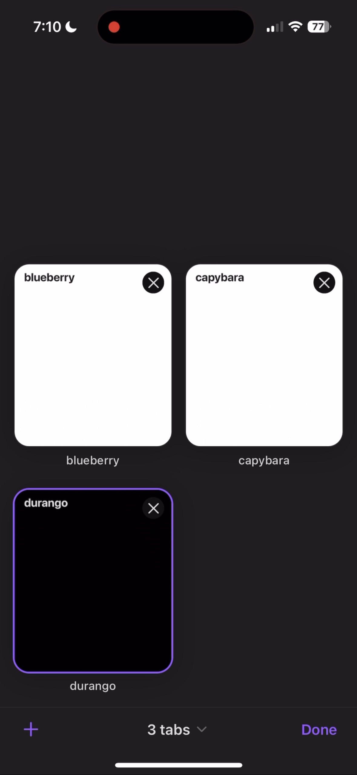
Are referring to the “tab previews” in the new tab switcher UI being the wrong color?
That happens on Android as well. I am not sure we should do anything about it.
Yes, referring to the tab previews (attaching photo, to ensure that I’m referring to the right thing when I agree with you).
Since I take advantage of the automatic dark mode available in iOS, it means that twice a day I have previews that are using the wrong color palette. Everything’s still useable, it’s just a little unpleasant to have all this color inconsistency (especially at night).
I understand that this is absolutely lower in priority vs bugs that impact user functionality, so I’m not demanding a fix. I think that it could be a nice bit of UI polish, primarily for that intersection of people of who use lots of tabs + use automatic dark mode, but I can live with it as is.
Everything’s still useable, it’s just a little unpleasant to have all this color inconsistency (especially at night).
That depends on your Photosensitivity level.
I understand that this is absolutely lower in priority VS bugs that impact user functionality, SO I’m not demanding a fix. I think that it could be a nice bit of UI polish, primarily for that intersection of people of who use lots of tabs + use automatic dark mode J but can live with it as is
For some it’s more than a bit of UI polish, it would be fixing major UX anti pattern that happens everyday. Can it be fixed without giving up automatic (Dark/Light) switching?