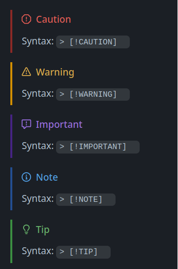
Obsidian currently appears to support three different GitHub “admonitions” with their own colors and symbols/icons, for drawing attention to certain parts of a Markdown document. GitHub now supports five different admonition words, and renders them in each in different colors and with different symbols.
These are not part of any Markdown standard, but I’ve found all of GitHub’s five admonitions useful in different circumstances on GitHub for READMEs, Wiki articles and other rendered Markdown areas.
Since Obsidian has supported three of the admonitions so far, it would be nice to update that support to include the newer admonitions (CAUTION and TIP are the newer ones, I believe).
Thanks, I saw the docs about custom callouts. But I don’t like “customizing” things when I don’t absolutely have to. I just want to see the already existing partial support for three GitHub admonitions in Obsidian expanded to cover all five. So everyone can enjoy using them.
And I like the fact that they would be usable on both GitHub and Obsidian with the same syntax, since I use both.
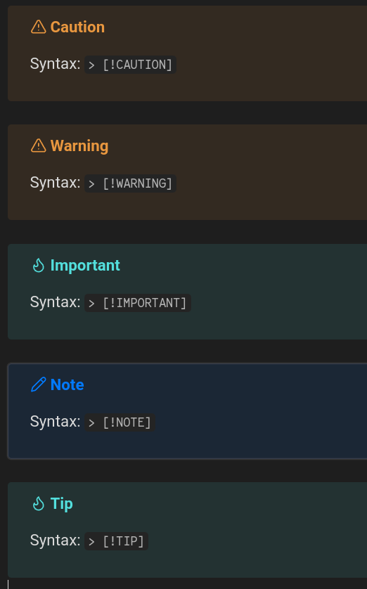
Well, as you already saw, the “missing ones” already exist… They’re just aliases for another type of callout (so they’re displayed/rendered following the CSS of that “parent” type) …
And while I understand the “not wanting to customise things unless absolutely necessary” bit, how these “missing” callouts are rendered/displayed within Live Preview/Reading doesn’t take much customisation to get the desired result (or a closer one) within minutes .
It absolutely won’t change the raw markdown syntax of the callouts… just de-aliasing/separate them from their “parent type” so they can be rendered in a distinctive fashion, somewhat like on GitHub (at least when it comes to the color and/or icon).
Well, once I read the instructions and made the CSS file, it worked. I’ll have to do it in every vault where I want it to take effect though.
Since it wasn’t particularly difficult to implement, I’m sure the Obsidian devs shouldn’t find it a difficult task to integrate something similar natively.
I had to close one note to get it to refresh the colors and symbols completely.
The symbols are slightly smaller than capital letter height in one vault, but slightly larger like your screenshot in another vault. Can’t seem to figure out why. I reset the font choices to defaults (or there were no custom fonts) and reset the theme.
Ah, the base font size setting. It was different between the two vaults. Seems to have a different effect on the text versus the symbols. Or, the symbols have a set size, so they don’t grow or shrink when you change the font size. That seems to be how it works. Wonder if there’s a way to make the symbols more responsive to the text size, since they’re SVG. Probably, but it’s been a long time since I’ve done much with CSS.
Anyway, that was incredibly gracious of you to put that together. Nice job matching the colors and symbols to the GitHub appearance.
Looking at the CSS I’m pretty sure I never could have put that together myself. Not without a lot of help and fiddling around.
 :
: .
.