I have searched through the forum and found a lot of similar questions and answers, however, I’m just a little bit confused with the terminologies, etc and also quite new to Obsidian.
What I’m trying to do
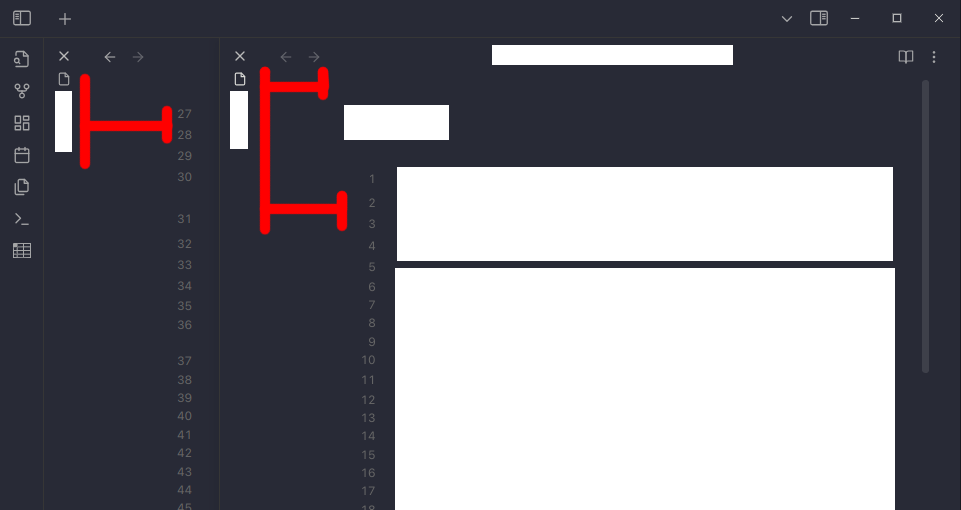
Using the stacked tabs option view - I can’t seem to figured out why there is so much empty space and how do I adjust it so I can maximize the width of the editor?
Also, if I’m not using stacked tabs, that wasted space is still there where I marked up in red on the screenshot attached.
It’s pretty frustrating, visually for me, as I have Obsidian tiled to the left side of my screen for writing notes and a browser tiled to the right side; from where I am reading stuff.
Things I have tried
I’ve toggled off the option in the display of the editor settings for Readable line length. I’ve also attempted to read through the custom CSS section and some of the previous forum posts answering similar questions. I simply don’t understand how to go about it or if it is even possible?
Any help or direction would be appreciated, thank you.
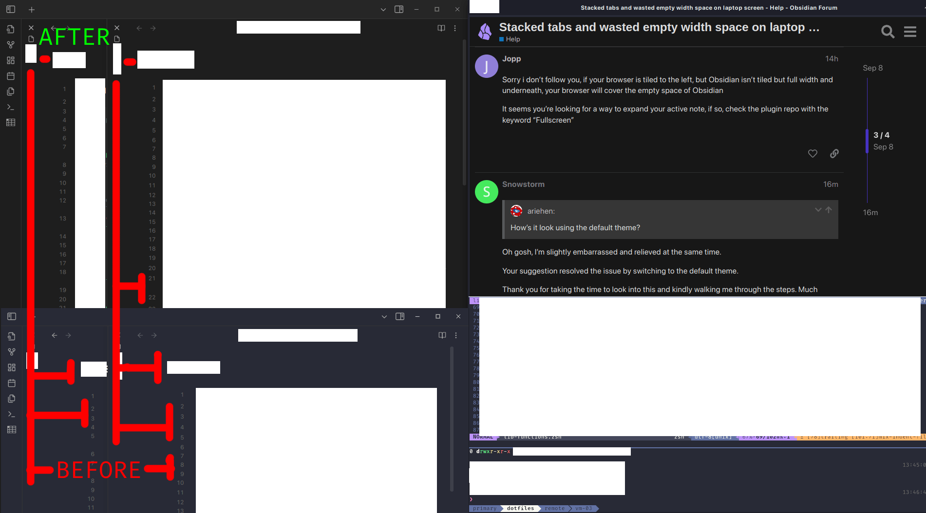
That space between the line numbers and vertical header does seem excessive.
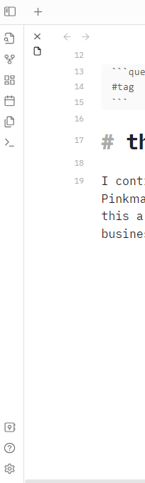
I opened a few tabs, flipped on stacked tabs, and cycled through a few different themes. I couldn’t reproduce that spacing. To the left of the line numbers mostly looks like this for me (a slight variation here or there depending on the theme):
Sorry i don’t follow you, if your browser is tiled to the left, but Obsidian isn’t tiled but full width and underneath, your browser will cover the empty space of Obsidian
It seems you’re looking for a way to expand your active note, if so, check the plugin repo with the keyword “Fullscreen”