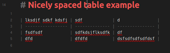
When you look at a table in source mode, Obsidian automatically adds appropriate whitespace (and uses a monospaced font) to make the table still look like a table. This is very nice:
Personally I am motivated to resolve this somehow, as I use vim (video is funny and related but not important), and vim gets funky in Obsidian live-view tables so I often want to edit tables in source mode
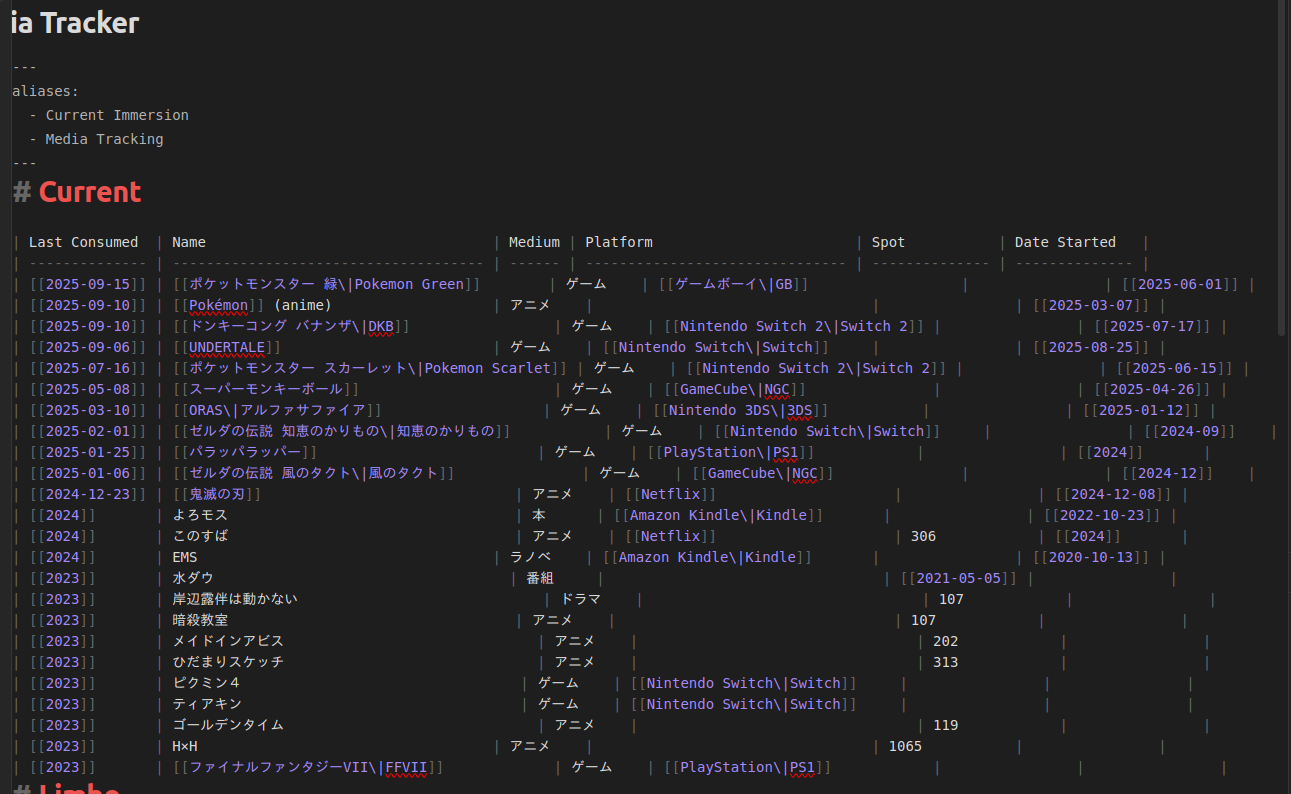
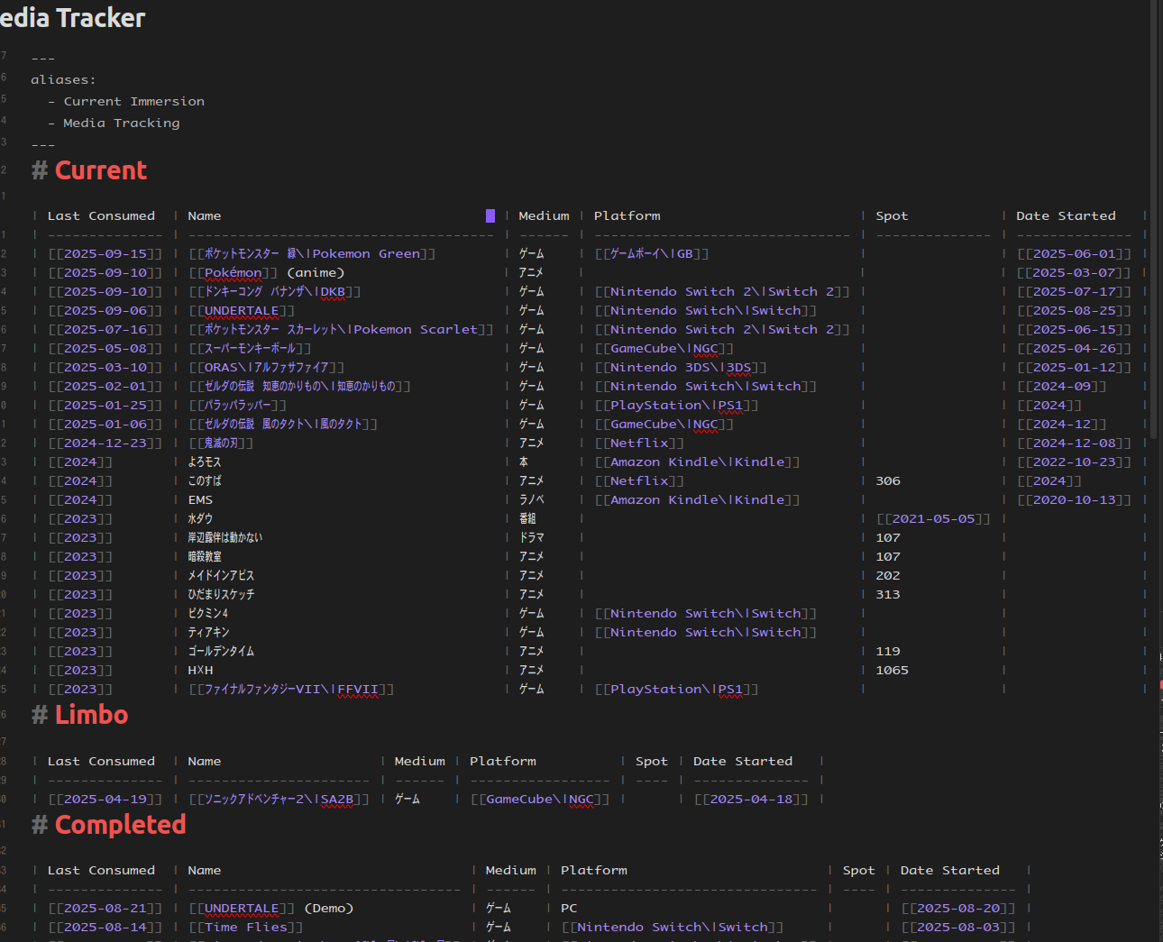
Most of my tables have a mixture of latin and Japanese text, so I actually didn’t realize until recently that tables purely with latin text have nice pretty spacing in source mode, and now I am jealous
Proposed solution
I’m pretty sleep deprived atm but I think the solution requires two steps:
Use a monospaced font with proper Japanese support. As in, 全角 (“full width”) characters are square, and 半角 (“half width”) characters are half as wide. In general, Japanese characters are 全角 while latin characters are 半角 (exceptions below)
When automatically adding whitespace, properly account for the number of 全角 vs 半角 characters
I assume you can do step 1 yourself right now simply by specifying your own monospaced font here in the Obsidian settings:
But I haven’t tried it, as I don’t have a Japanese monospace font installed on the machine I’m currently using
I assume step 2 would require either a plugin to be developed, or a change to the base Obsidian code
Potential work around
One workaround would be to use a true monospaced font where Japanese and latin characters are all the same width. This is doable right now, and bypasses the need to mess with the automatic whitespace generation. However this would, to be frank, suck ass.
Either Japanese characters would be too narrow and hard to read, or latin characters would be too wide and look silly / waste space
You would lose the ability to distinguish beteen characters that have both 全角 and 半角 versions. For example カタカナ vs カタカナ or Yeet vs Yeet
Of course, the latin chars are too wide and the Japanese chars are too narrow, and I’m sure there are some messed up glyphs mixed in there, but it’s a temporary workaround
Now the latin and Japanese chars are all the same width (全角), so we could stop here if we wanted. However, I want to reduce width to 66% to save space. So ctrl+a to select all chars
Go back to the transform menu, but this time set X to 66%. Now all the chars are 2/3角
Emojis are not part of whatever monospaced font you’re using (I believe they’re defined at the system level), so the width of an individual emoji glyph is not likely the same the width as the monospaced characters nor is it necessarily the same width as other emojis.
Given this you’ll never get the | characters to align in the edit mode if you’re using emojis. However, in reading mode, the rendered table will draw with the cell borders in the correct locations.
I tried the instructions for altering the Osaka font and using that, then realized I only have a problem in Source view, which the font change doesn’t appear to affect.
Is there a way to do that? When I look up CSS for obsidian, it only says how to set the font for table headers. Is there a way to set the font for the table body?